The capacity for perception depends on the amount, the kind and the availability of past experiences.... We see familiar things more clearly than we see objects about which we have no stock of memories.
— Aldous Huxley
USERS OF WEB DOCUMENTS don't just look at information, they interact with it in novel ways that have no precedents in paper document design. The graphic user interface (GUI) of a computer system comprises the interaction metaphors, images, and concepts used to convey function and meaning on the computer screen. It also includes the detailed visual characteristics of every component of the graphic interface and the functional sequence of interactions over time that produce the characteristic look and feel of Web pages and hypertext linked relations. Graphic design and visual "signature" graphics are not used simply to enliven Web pages — graphics are integral to the user's experience with your site. In interactive documents graphic design cannot be separated from issues of interface design.
Concepts about structuring information today stem largely from the organization of printed books and periodicals and the library indexing and catalog systems that developed around printed information. The "interface standards" of books in the English-speaking world are well established and widely agreed-upon, and detailed instructions for creating books may be found in such guides as The Chicago Manual of Style. Every feature of the book, from the contents page to the index, has evolved over the centuries, and readers of early books faced some of the same organizational problems that users of hypermedia documents confront today. Gutenberg's Bible of 1456 is often cited as the first modern book, yet even after the explosive growth of publishing that followed Gutenberg's invention of printing with movable type, more than a century passed before page numbering, indexes, tables of contents, and even title pages became expected and necessary features of books. Web documents are undergoing a similar evolution and standardization.
Although networked interactive hypermedia documents pose novel challenges to information designers, most of the guidance needed to design, create, assemble, edit, and organize multiple forms of media does not differ radically from current practice in print media. Most Web documents can be made to conform to The Chicago Manual of Style conventions for editorial style and text organization. Much of what an organization needs to know about creating clear, comprehensive, and consistent internal publishing standards is already available in such publishing guides as the Xerox Publishing Standards: A Manual of Style and Design. Don't get so lost in the novelty of Web pages that basic standards of editorial and graphic design are tossed aside.
World Wide Web pages differ from books and other documents in one crucial respect: hypertext links allow users to access a single Web page with no preamble. For this reason Web pages need to be more independent than pages in a book. For example, the headers and footers of Web pages should be more informative and elaborate than those on printed pages. It would be absurd to repeat the copyright information, author, and date of a book at the bottom of every printed page, but individual Web pages often need to provide such information because a single Web page may be the only part of a site that some users will see. This problem of making documents freestanding is not unique to Web pages. Journals, magazines, and most newspapers repeat the date, volume number, and issue number at the top or bottom of each printed page because they know that readers often rip out articles or photocopy pages and will need that information to be able to trace the source of the material.
Given the difficulties inherent in creating Web sites that are both easy to use and full of complex content, the best design strategy is to apply a few fundamental document design principles consistently in every Web page you create. The basic elements of a document aren't complicated and have almost nothing to do with Internet technology. It's like a high school journalism class: who, what, when, and where.
Who is speaking? This question is so basic, and the information is so often taken for granted, that authors frequently overlook the most fundamental piece of information a reader needs to assess the provenance of a Web document. Whether the page originates from an individual author or an institution, always tell the reader who created it. The flood of Web sites propagating incorrect or intentionally misleading material on the Florida vote problems of the 2000 American presidential election offers a vivid example of how "information" of no known origin and of dubious authenticity can quickly cloud legitimate inquiry and discussion.
All documents need clear titles to capture the reader's attention, but for several reasons peculiar to the Web this basic editorial element is especially crucial. The document title is often the first thing browsers of World Wide Web documents see as the page comes up. In pages with lots of graphics the title may be the only thing the user sees for several seconds as the graphics download onto the page. In addition, the page title will become the text of a browser "bookmark" if the user chooses to add your page to his or her list of URLs ("Universal Resource Locator," the formal term for Web addresses). A misleading or ambiguous title or one that contains technical gibberish will not help users remember why they bookmarked your page.
Timeliness is an important element in evaluating the worth of a document. We take information about the age of most paper documents for granted: newspapers, magazines, and virtually all office correspondence is dated. Date every Web page, and change the date whenever the document is updated. This is especially important in long or complex online documents that are updated regularly but may not look different enough to signal a change in content to occasional readers. Corporate information, personnel manuals, product information, and other technical documents delivered as Web pages should always carry version numbers or revision dates. Remember that many readers prefer to print long documents from the Web. If you don't include revision dates your audience may not be able to assess whether the version they have in hand is current.
The Web is an odd "place" that has huge informational dimensions but few explicit cues to the place of origin of a document. Click on a Web link, and you could be connected to a Web server in Sydney, Chicago, or Rome — anywhere, in fact, with an Internet connection. Unless you are well versed in parsing URLs it can be hard to tell where a page originates. This is the World Wide Web, after all, and the question of where a document comes from is sometimes inseparable from whom the document comes from. Always tell the reader where you are from, with (if relevant) your corporate or institutional affiliations.
Incorporating the "home" URL on at least the main pages of your site is an easy way to maintain the connection to where a page originated. Once the reader has saved the page as a text file or printed the page onto paper, this connection may be lost. Although newer versions of the most common Web browsers allow users to include the URL automatically in anything they print, many people never take advantage of this optional feature. Too many of us have stacks of printed Web pages with no easy way of locating the Web sites where they originated.
Every Web page needs:
Include these basic elements and you will have traveled 90 percent of the way toward providing your readers with an understandable Web user interface.
Graphic user interfaces were designed to give people control over their personal computers. Users now expect a level of design sophistication from all graphic interfaces, including Web pages. The goal is to provide for the needs of all your potential users, adapting Web technology to their expectations and never requiring readers to conform to an interface that places unnecessary obstacles in their paths.
This is where your research on the needs and demographics of the target audience is crucial. It's impossible to design for an unknown person whose needs you don't understand. Create sample scenarios with different types of users seeking information from your site. Would an experienced user seeking a specific piece of information be helped or hindered by your home page design? Would a casual reader be intimidated by a complex menu scheme? Testing your designs and getting feedback from a variety of users is the best way to see whether your design ideas are giving them what they want from your site.
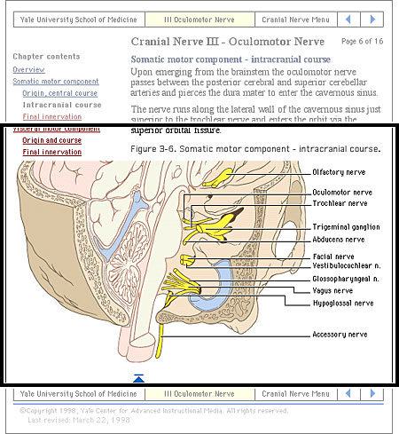
Most user interactions with Web pages involve navigating hypertext links between documents. The main interface problem in Web sites is the lack of a sense of where you are within the local organization of information:
Clear, consistent icons, graphic identity schemes, and graphic or text-based overview and summary screens can give the user confidence that they can find what they are looking for without wasting time.
Users should always be able to return easily to your home page and to other major navigation points in the site. These basic links should be present and in consistent locations on every page. Graphic buttons will provide basic navigation links and create a graphic identity that tells users they are within the site domain. In this site, for example, the graphic header appears on every page:
The button bar is efficient (offering multiple choices in a small space) and predictable (it is always there, at the top of every page), and it provides a consistent graphic identity throughout the site.
Web pages often appear with no preamble: readers can make or follow links directly to subsection pages buried deep in the hierarchy of Web sites. They may never see your home page or other introductory site information. If your subsection pages do not contain links to the home page or to local menu pages, the reader will be locked out from the rest of the Web site:
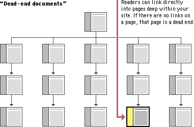
Make sure all pages in your site have at minimum a link back to the main "home" page or, better yet, a home page link along with links to the other sections of the site.
Users want to get information in the fewest possible steps. This means that you must design an efficient hierarchy of information to minimize steps through menu pages. Studies have shown that users prefer menus that present at least five to seven links and that they prefer a few very dense screens of choices to many layers of simplified menus. The following table demonstrates that you do not need many levels of menus to incorporate lots of choices:
Number of menu items listed | ||||
|---|---|---|---|---|
Number of nested menus | 5 | 7 | 8 | 10 |
1 | 5 | 7 | 8 | 10 |
2 | 25 | 49 | 64 | 100 |
3 | 125 | 343 | 512 | 1000 |
Design your site hierarchy so that real content is only a click or two away from the main menu pages of your site.
Users will not tolerate long delays. Research has shown that for most computing tasks the threshold of frustration is about ten seconds. Web page designs that are not well "tuned" to the network access speed of typical users will only frustrate them. If your users are primarily general public browsers "surfing" the Web via dial-up modem connections, it is foolish to put huge bitmap graphics on your pages — the average modem user will not be patient enough to wait while your graphics download over the phone line. If, however, you are building a university or corporate intranet site where most users will access the Web server at Ethernet speeds or better, you can be much more ambitious in the use of graphics and multimedia. Many home computer users can now use high-speed DSL (digital subscriber line) or cable modems to access the Web. However, industry observers expect that it will be at least another five years before Web designers can count on most home users' having access to high-speed Web connections. In general, be conservative with Web graphics. Even users with high-speed connections appreciate a fast-loading page.
Users are not impressed with complexity that seems gratuitous, especially those users who may be depending on the site for timely and accurate work-related information. Your interface metaphors should be simple, familiar, and logical — if you need a metaphor for information design, choose a genre familiar to readers of documents, such as a book or a library. Highly unusual, "creative" navigation and home page metaphors always fail because they impose an unfamiliar, unpredictable interface burden on the user.
The user interface for your Web site should follow the general navigation and layout conventions of major Web sites because your users will already be used to those conventions. Users spend most of their time on sites other than yours, so avoid highly unusual interfaces if you wish to attract and keep a large audience.
The best information designs are never noticed. An excellent model of interface design is the Adobe Corporation Web site. Graphic headers act as navigation aids and are consistently applied across every page in the site. Once you know where the standard links are on the page header graphics, the interface becomes almost invisible and navigation is easy:
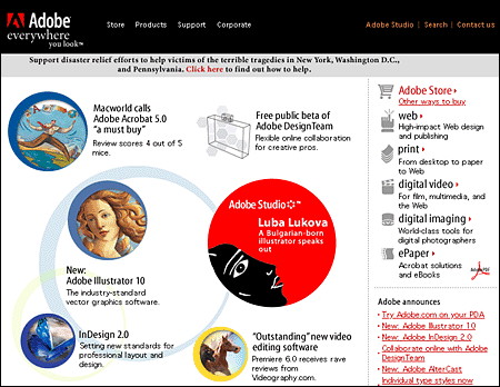
For maximum functionality and legibility, your page and site design should be built on a consistent pattern of modular units that all share the same basic layout grids, graphic themes, editorial conventions, and hierarchies of organization. The goal is to be consistent and predictable; your users should feel comfortable exploring your site and confident that they can find what they need. The graphic identity of a series of pages in a Web site provides visual cues to the continuity of information. The header menu graphics present on every page of the Adobe site create a consistent user interface and corporate identity:
Even if your site design does not employ navigation graphics, a consistent approach to the layout of titles, subtitles, page footers, and navigation links to your home page or related pages will reinforce the reader's sense of context within the site. To preserve the effect of a "seamless" system of pages you may wish to bring important information into your site and adapt it to your page layout scheme rather than using links to send the reader away from your site (be sure there are no copyright restrictions on copying the information into your site).
To convince your users that what you have to offer is accurate and reliable, you will need to design your Web site as carefully as you would any other type of corporate communication, using the same high editorial and design standards. A site that looks sloppily built, with poor visual design and low editorial standards, will not inspire confidence.
Functional stability in any Web design means keeping the interactive elements of the site working reliably. Functional stability has two components: getting things right the first time as you design the site, and then keeping things functioning smoothly over time. Good Web sites are inherently interactive, with lots of links to local pages within the site as well as links to other sites on the Web. As you create your design you will need to check frequently that all of your links work properly. Information changes quickly on the Web, both in your site and in everyone else's. After the site is established you will need to check that your links are still working properly and that the content they supply remains relevant.
Your Web design should offer constant visual and functional confirmation of the user's whereabouts and options, via graphic design, navigation buttons, or uniformly placed hypertext links. Feedback also means being prepared to respond to your users' inquiries and comments. Well-designed Web sites provide direct links to the Web site editor or Webmaster responsible for running the site. Planning for this ongoing relationship with users of your site is vital to the long-term success of the enterprise.
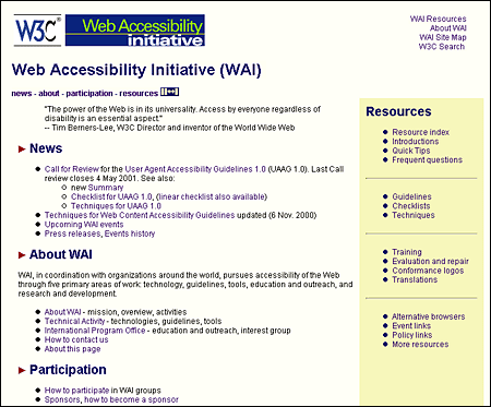
One of the defining principles of the Web is that it should provide all people, regardless of physical or technological readiness, with access to information. Since the Web took off as a visual medium, the goals of design have been at odds with the goals of accessibility. When designers began to use large images, proprietary media formats, and complex page layouts to produce well-designed documents, the Web became a better-looking place, but those users who require clean HTML for access were shut out from many pages. Today, the course of Web design is shifting back to its original purpose. HTML has matured to offer more visual controls, so designers have more tools at hand to create structured and navigable Web sites without resorting to hacks and workarounds. Around the world, initiatives are under way to mandate that disabled users have equal access to Internet resources, including the guidelines issued by the Web Accessibility Initiative (WAI) of the World Wide Web Consortium (W3C) and, in the United States, the amendments to Section 508 of the Rehabilitation Act of 1973. The result is that Web interface design is intricately tied to accessibility design. It is the responsibility of Web designers to understand and support the needs of disabled users.
The underlying principle of Web accessibility guidelines is simple: if you provide information in any medium besides plain text, you should always provide an alternate, or fallback, version. The notion of fallbacks is at the core of the language of the Web, allowing rich and varied content to transform gracefully under different conditions. It also lies behind the injunction that no content should become outdated and inaccessible because of the progress of technology. To meet these goals, HTML includes methods for providing fallbacks for some types of nontext content.
As an example, one of the beauties of the Web and HTML is the ability to build in "alternate" text descriptions so that users without graphics capabilities can understand the function of graphics on your pages. Blind users using specially designed software will hear (via synthesized speech) the alternate messages you supply along with your graphics ("ALT" attributes in HTML) and so will not completely miss the content of your pictures and graphic navigation buttons. Users with text-only browsers or those who have turned off image display will see the alternate text in place of the visual content. If you use graphic menu systems for navigation, these text-based alternate menus are an especially important aid to users who cannot see your graphics (see Graphics, Accessibility). If you use graphics like single-pixel GIFs as spacers in your page layout, always be sure to include a blank ALT statement in the spacer image source tag (ALT=""). The blank ALT statement hides the graphic from text-only browsers and from browsers that read text aloud for visually impaired users:
<IMG SRC="pixel.gif" HEIGHT="1" WIDTH ="1" ALT="" HSPACE="5">You should also include alternates as part of your page design for users who cannot access your primary content. For example, provide an equivalent text-only navigation menu for visually impaired users who cannot use your graphical menus. Or if you have video of a lecture or presentation on your site, include a text transcript or subtitles so that deaf users can have access to the materials.
Your content can be made more accessible if you use Cascading Style Sheets (CSS) to style your pages. With CSS-styled pages, users can easily apply personalized formatting to Web documents. A page designed using red text against a green background, for example, presents a problem for users with red-green color blindness: the contrast between text and background may not be great enough for the text to be distinguishable. If the colors are set via a style sheet, users can set their browser preferences to override your settings and can apply their own style sheet to the page instead. With CSS-styled pages, the user can transform Web content into a format that addresses their requirements for accessibility.
All professionally designed Web sites or intranet sites should meet at least the minimum standards for accessibility as defined by the World Wide Web Consortium guidelines. The W3C Web site contains extensive information on the details of how to make your site reasonably accessible to blind, deaf, or other disabled users. Until recently Web designers faced difficulties in implementing many of the W3C accessibility suggestions because the most popular versions of the major Web browsers either did not implement newer technology standards like Cascading Style Sheets or implemented them inconsistently. Now that both Netscape Navigator 6 and Internet Explorer 5 are almost completely compatible with W3C standards, however, the reasons for not using CSS and other tools to increase the accessibility of Web information to disabled readers are disappearing.
We all hope that every reader will arrive using the latest version of a major Web browser and that their computers will be state-of-the-art models using fast connections to the Internet. The reality is almost always less than ideal. You don't need to design your Web site exclusively for the lowest common denominator of current computing and network technology, but you do need to consider what your site will look like to those readers who do not have the best equipment, current software, or good Internet connections. The problems here are aggravated by the fact that Web site developers generally have much better equipment than the average Web site reader. Don't design for your machine, design for your average reader.
Always check your page designs on typically sized display screens (800 x 600 pixels) to be sure that all major navigation and content areas fit well within the horizontal area of the screen. Usually that will limit your page layouts to no more than 760 pixels in width. Many users with slow modem connections routinely turn off the image display in their browser. Try turning off graphics in your Web browser and look at your pages — are they still intelligible and navigable? Do you use ALT statements for every graphic? Do you use blank ALT statements (ALT="") to hide irrelevant graphics or spacer graphics from text-only browsers?
Do not produce Web sites that depend on one browser technology or browser plug-in ("This site is optimized for Internet Explorer 5.5 and Macromedia Flash 5"). Such notes on the home page of a corporate or enterprise Web site look sophomoric and will drive away most adult users. Design for everyone using major browsers released in the two previous years. If you must depend on proprietary browser plug-ins, try to position the material that is dependent on the plug-in deeper within the site, where presumably the reader will already have made a commitment to your content and may not mind the bother of having to download a plug-in to see special features. Once readers have a clearer sense of what they might gain by bothering to download a browser plug-in, they can make an informed decision.
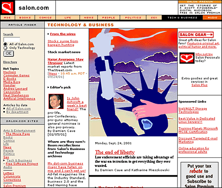
A rich set of graphic navigation and interactivity links within your Web pages will pull users' attention down the page, weaning them from the general-purpose browser links and drawing them further into your content. By providing your own consistent and predictable set of navigation buttons you also give the user a sense of your site's organization and make the logic and order of your site visually explicit. In this example the rich graphics and many links offered by the Salon technology and business page immediately draw the reader into the site:
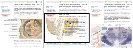
Readers need a sense of context, of their place within an organization of information. In paper documents this sense of "where you are" is a mixture of graphic and editorial organizational cues supplied by the graphic design of the book, the organization of the text, and the physical sensation of the book as an object. Electronic documents provide none of the physical cues we take for granted in assessing information. When we see a Web hypertext link on the page we have few cues to where we will be led, how much information is at the other end of the link, and exactly how the linked information relates to the current page. Even the view of individual Web pages is restricted for many users. Most Web pages don't fit completely on a standard office display monitor (800 x 600 pixels), and so there is almost always a part of the page that the user cannot see:
Web pages need to give the user explicit cues to the context and organization of information because only a small portion of any site (less than a page) is visible at one time:
As the Web page designer it is up to you to provide these functional and context cues.
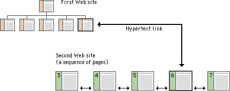
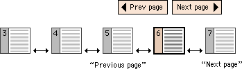
All hypertext systems share a common feature that has no direct precedent in print media: going "back" through a series of links you have previously visited is not the same as paging "back" through the preceding pages of an ordered sequence of pages. When users click on a hypertext link in a Web document they often are transported from one Web site to another, perhaps even from one country to another. Once made, the hypertext link is bidirectional; you can "go back" to the Web site you just left by clicking on the "Back" button of the viewer. Having hit the "Back" button, you can move to the new Web site again by hitting the "Forward" button:
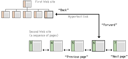
For the information designer hypertext links are a mixed blessing. The radical shifts in context that links create can easily confuse Web users, who need organized cues and interface elements if they are to follow and understand hypertext links from one Web page to another. This is particularly true when users need to be able to follow (or at least recognize) an ordered sequence of documents. Notice in the diagram above that although the user has entered the second Web site at page 6, the site is an ordered sequence of pages.
If the standard Web browser "Back" and "Forward" buttons are augmented with "Next Page" and "Previous Page" buttons built into the page, the user will have interface tools to navigate through the information in your site in the sequence you intended. Button bars can also display location information much as running chapter headers do in printed books:
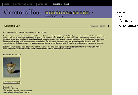
Unlike the "Back" and "Forward" buttons, whose functions are relative only to the pages you have seen most recently, "Next Page" and "Previous Page" buttons in a document are fixed links you provide to associated documents. By providing paging buttons and links to local home pages and contents pages you give users the tools to understand how you have organized your Web site information, even if they have not entered your Web of pages through a home page or contents page. The buttons don't prevent people from reading the information in whatever order they choose, but they do allow readers to follow the sequence of pages you have laid out:
Button bars are also the most logical place for links back to your home page or to other menu pages related to the current page. A button bar can be built with text-based links or a series of individual button graphics at the top or bottom of the page:

Brewer, Judy, ed. 2001. How people with disabilities use the Web. http://www.w3c.org/wai/eo/Drafts/pwd-Use-Web (31 March 2001).
Chisholm, Wendy, Gregg Vanderheiden, and Ian Jacobs, eds. 1999. Web content accessibility guidelines 1.0. http://www.w3c.org/tr/wai-webcontent/wai-pageauth.html (17 January 2001).
Fleming, Jennifer. 1998. Web navigation: Designing the user experience. Sebastopol, Calif.: O'Reilly.
Krug, Steve. 2001. Don't make me think! A common sense approach to Web usability. Indianapolis, Ind.: Que.
McCloud, Scott. 1993. Understanding comics: The invisible art. New York: HarperCollins.
Nielsen, Jakob. 1995. The alertbox: Current issues in Web usability. http://www.useit.com/alertbox.
———. 1999. Designing Web usability: The practice of simplicity. Indianapolis, Ind.: New Riders.
Rosenfeld, Louis, and Peter Morville. 1998. Information architecture for the World Wide Web. Sebastopol, Calif.:O'Reilly.
University of Chicago Press. 1993. The Chicago manual of style: The essential guide for writers, editors, and publishers, 14th ed. Chicago: University of Chicago Press.
Veen, Jeffrey. 1997. Hot Wired style: Principles for building smart Web sites. San Francisco: Wired Books.
———. 2001. The art and science of Web design. Indianapolis, Ind.: New Riders.
Xerox Corporation. 1988. Xerox publishing standards: A manual of style and design. New York: Watson-Guptill.
Apple Computer. 1992. Macintosh human interface guidelines. Reading, Mass.: Addison-Wesley.
Coe, Marlana. 1996. Human factors for technical communicators. New York: Wiley.
Mandel, T. 1997. The elements of human interface design. New York: Wiley.
Mullet, Kevin, and Darrell Sano. 1995. Designing visual interfaces: Communication-oriented techniques. Mountain View, Calif.: SunSoft.
Norman, Donald A. 1988. The psychology of everyday things. New York: Basic Books. [Now also published as The design of everyday things.]