Typography exists to honor content.
— Robert Bringhurst, The Elements of Typographic Style
TYPOGRAPHY is the balance and interplay of letterforms on the page, a verbal and visual equation that helps the reader understand the form and absorb the substance of the page content. Typography plays a dual role as both verbal and visual communication. As readers scan a page they are subconsciously aware of both functions: first they survey the overall graphic patterns of the page, then they parse the language, or read. Good typography establishes a visual hierarchy for rendering prose on the page by providing visual punctuation and graphic accents that help readers understand relations between prose and pictures, headlines and subordinate blocks of text.
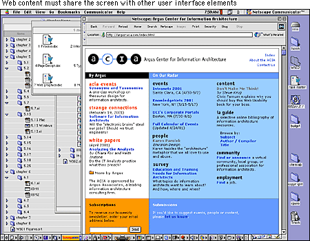
Although the basic rules of typography are much the same for both Web pages and conventional print documents, type on-screen and type printed on paper are different in crucial ways. The computer screen renders typefaces at a much lower resolution than is found in books, magazines, and even pages output from inexpensive printers. Most magazine and book typography is rendered at 1200 dots per inch (dpi) or greater, whereas computer screens rarely show more than about 85 dpi. Also, the useable area of typical computer screens is smaller than most magazine and book pages, limiting the information you can deliver on a Web page without scrolling.
But perhaps the most distinctive characteristic of Web typography is its variability. Web pages are built on the fly each time they are loaded into a Web browser. Each line of text, each headline, each unique font and type style is re-created by a complex interaction of the Web browser, the Web server, and the operating system of the reader's computer. The process is fraught with possibilities for the unexpected: a missing font, an out-of-date browser, or a peculiar set of font preferences designated by the reader. You should regard your Web page layouts and typography as suggestions of how your pages should be rendered — you'll never know exactly how they will look on the reader's screen.
The originators of HTML were scientists who wanted a standard means to share particle physics documents. They had little interest in the exact visual form of the document as seen on the computer screen. In fact, HTML was designed to enforce a clean separation of content structure and graphic design. The intent was to create a World Wide Web of pages that will display in every system and browser available, including browsers that "read" Web page text to visually impaired users and can be accurately interpreted by automated search and analysis engines.
In casting aside the graphic design and editorial management traditions of publishing, the original designers of the Web ignored human motivation. They were so concerned about making Web documents machine-friendly that they produced documents that only machines (or particle physicists) would want to read. In focusing solely on the structural logic of documents they ignored the need for the visual logic of sophisticated graphic design and typography.
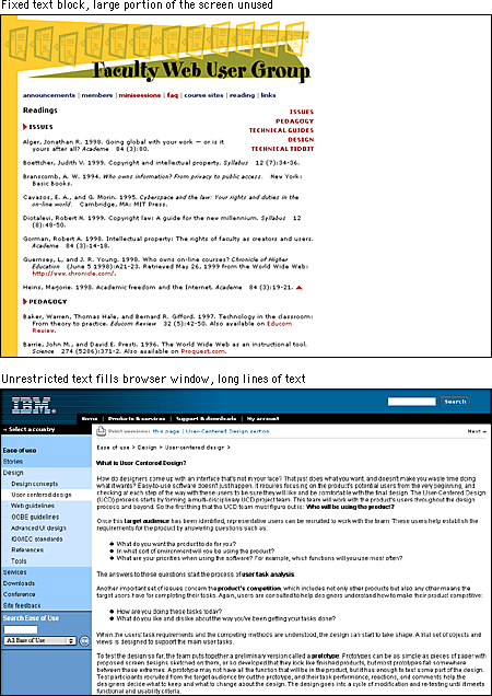
For example, most graphic designers avoid using the standard heading tags in HTML (H1, H2, and so on) because they lack subtlety: in most Web browsers these tags make headlines look absurdly large (H1, H2) or ridiculously small (H4, H5, H6). But the header tags in HTML were not created with graphic design in mind. Their sole purpose is to designate a hierarchy of headline importance, so that both human readers and automated search engines can look at a document and easily determine its information structure. Only incidentally did browser designers create a visual hierarchy for HTML headers by assigning different type sizes and levels of boldness to each header element.
This division between structural logic and visual logic is on its way to being reconciled through the use of Cascading Style Sheets (CSS). Style sheets provide control over the exact visual style of headers, paragraphs, lists, and other page elements. For example, if you prefer H3 headers to be set in 12-point Arial bold type, you can specify those details in a style sheet. In this way you can retain the logical use of HTML's structural tags without sacrificing graphic design flexibility.
At this writing, however, the major Web browsers offer inconsistent and incomplete CSS support. Although both Microsoft Internet Explorer version 3.0 and higher and Netscape Navigator version 4.0 and higher support CSS, their exact implementations of it differ. A most frustrating example of this is the margin property. Standard HTML headings float far above the paragraphs they describe. With style sheets authors can designate more suitable margins in a heading style declaration. Yet the Netscape browser adds the designated amount to the standard margin, whereas Explorer simply adds the margin defined in the style sheet. The upshot is that until the browsers offer a more consistent implementation of CSS, only a handful of properties can be used reliably.
So what do you do when you know the advantages of preserving the document structure but you want to design Web pages that are attractive and functional enough to capture and sustain an audience? You compromise. In the sites we create we use a grab bag of tricks to present as polished and sophisticated a page design as we can manage within the boundaries of "official" HTML. We use no proprietary HTML tags, such as those specific to Internet Explorer or Netscape Navigator. Our approach to typography emphasizes visual design over structural purity. Wherever possible, we use "plain vanilla" HTML to describe document structure and CSS to define visual layout. We do not strive for complete control and consistency for our pages but instead accept a certain degree of variability between platforms and browsers. Where CSS falls short, however, we dip into our grab bag of tricks rather than sacrifice visual integrity. We believe that this is the best compromise until everyone can shift over to a mature implementation of CSS and leave plain HTML behind.
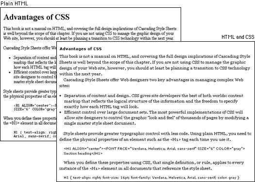
This book is not a manual on HTML, and covering the full design implications of Cascading Style Sheets is well beyond the scope of this chapter. If you are not using CSS to manage the graphic design of your Web site, however, you should at least be planning a transition to CSS technology within the next year.
Cascading Style Sheets offer Web designers two key advantages in managing complex Web sites:
Style sheets provide greater typographic control with less code. Using plain HTML, you need to define the physical properties of an element such as the <H1> tag each time you use it.
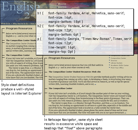
<H1 ALIGN="center"><FONT FACE="Verdana, Helvetica, Arial, sans-serif" SIZE="6" COLOR="gray">Section heading</H1></FONT>When you define these properties using CSS, that single definition, or rule, applies to every instance of the <H1> element in all documents that reference the style sheet.
H1 { text-align: center; font-size: 16pt; font-family: Verdana, Helvetica, Arial, sans-serif; color: gray }In addition, style sheets offer more formatting options than plain HTML tags and extensions. For example, interline spacing, or leading, can be controlled using style sheets, as can such text properties as letterspacing and background color. And fortunately the text formatting properties are implemented well enough across browsers to be used with some consistency.
Style sheets are not new. Every graphic Web browser (even back to Mosaic 1.0) has incorporated style sheets. It just wasn't possible to modify the fixed styles that browsers used to determine, for example, exactly how H1 headers look on the screen. The fundamental idea behind CSS is to let site authors and users determine the size, style, and layout details for each standard HTML tag.
If you have ever used the "styles" features of a page layout or word processing program, you will understand the basic idea behind CSS. The styles feature of a word processor is used to determine exactly how your titles, subheadings, and body copy will look, and then the copy is formatted when you apply a style to each element. Once all the copy has been styled, you can change the look of each occurrence of every element simply by changing the style information. CSS works in the same way, except that with CSS you can set up one master style sheet that will control the visual styling of every page in your site that is linked to the master style sheet:
Good typography depends on the visual contrast between one font and another and between text blocks, headlines, and the surrounding white space. Nothing attracts the eye and brain of the reader like strong contrast and distinctive patterns, and you can achieve those attributes only by carefully designing them into your pages. If you cram every page with dense text, readers see a wall of gray and will instinctively reject the lack of visual contrast. Just making things uniformly bigger doesn't help. Even boldface fonts quickly become monotonous, because if everything is bold then nothing stands out "boldly."
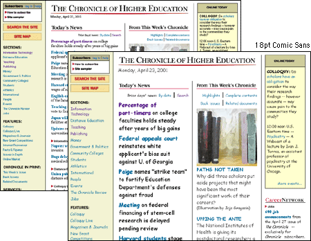
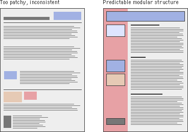
When your content is primarily text, typography is the tool you use to "paint" patterns of organization on the page. The first thing the reader sees is not the title or other details on the page but the overall pattern and contrast of the page. The regular, repeating patterns established through carefully organized pages of text and graphics help the reader to establish the location and organization of your information and increase legibility. Patchy, heterogeneous typography and text headers make it hard for the user to see repeating patterns and almost impossible to predict where information is likely to be located in unfamiliar documents:
Margins define the reading area of your page by separating the main text from the surrounding environment. Margins provide important visual relief in any document, but careful design of margins and other "white space" is particularly important in Web page design because Web content must coexist on the computer screen with the interface elements of the browser itself and with other windows, menus, and icons of the user interface.
Margins and space can be used to delineate the main text from the other page elements. And when used consistently, margins provide unity throughout a site by creating a consistent structure and look to the site pages. They also add visual interest by contrasting the positive space of the screen (text, graphics) from the negative (white) space.
Text blocks have different ways of sitting within margins. Left-justified, centered, right-justified, and justified text are the alignment options available on the Web.
Justified text is set flush with the left and right margins. Justified blocks of text create solid rectangles, and block headings are normally centered for a symmetrical, formal-looking document. In print, justification is achieved by adjusting the space between words and by using word hyphenation. Page layout programs use a hyphenation dictionary to check for and apply hyphenation at each line's end and then adjust word spacing throughout the line. But even with sophisticated page layout software, justified text blocks often suffer from poor spacing and excessive hyphenation and require manual refinement. This level of control is not even a remote possibility on Web pages. The most recent browser versions (and CSS) support justified text, but it is achieved by crude adjustments to word spacing. Fine adjustments are not possible on low-resolution computer displays and are impractical to implement in today's Web browsers. Also, Web browsers are unlikely to offer automatic hyphenation any time soon, another "must" for properly justified text. For the foreseeable future, the legibility of your Web documents will suffer if you set your text in justified format.
Centered and right-justified text blocks are difficult to read. We read from left to right, anchoring our tracking across the page at the vertical line of the left margin. The ragged left margins produced by centering or right-justifying text make that scanning much harder, because your eye needs to search for the beginning of each new line.
Left-justified text is the most legible option for Web pages because the left margin is even and predictable and the right margin is irregular. Unlike justified text, left justification requires no adjustment to word spacing; the inequities in spacing fall at the end of the lines. The resulting "ragged" right margin adds variety and interest to the page without interfering with legibility.
Titles and headings over left-justified body text should also be flush left. Centered headings pair well with justified text, but justified text should not be used on Web pages. Centered display type contrasts with the asymmetry of the ragged right margin of left-justified body text and produces an unbalanced page.
Until typographic options for Web pages become more sophisticated, we recommend that you use left-justified text blocks and headlines as the best solution for most layout situations.
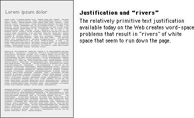
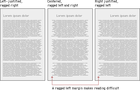
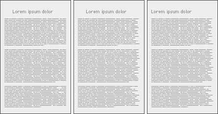
Text on the computer screen is hard to read not only because of the low resolution of computer screens but also because the layout of most Web pages violates a fundamental rule of book and magazine typography: the lines of text on most Web pages are far too long for easy reading. Magazine and book columns are narrow for physiological reasons: at normal reading distances the eye's span of acute focus is only about three inches wide, so designers try to keep dense passages of text in columns not much wider than that comfortable eye span. Wider lines of text require readers to move their heads slightly or strain their eye muscles to track over the long lines of text. Readability suffers because on the long trip back to the left margin the reader may lose track of the next line.
You can use invisible tables (BORDER="0") to restrict the text line length to about fifty to seventy characters per line (see Page Design, Page layout). The exact character count is difficult to predict because of the way different browser software and operating systems display type sizes. In conventional print layouts, columns of thirty to forty characters per line are considered ideal.
In the end, the decision to restrict line length is a philosophical one. From a design standpoint, a measure that is comfortable for reading is good practice. One of the fundamental principles of the Web, however, is that users should be able to structure their own view. Users with a large monitor may not want their text blocks circumscribed if it means that a large portion of their screen goes unused. A low-vision user with fonts set large will not appreciate being forced to view long pages with short lines of text. So although leaving text free to fill the browser window may affect readability, following conventions may also affect the accessibility and legibility of your documents.
When designing a fixed-width layout, we typically use page layout tables with text cells no wider than about 365 pixels. If 12-point Times New Roman type is used, this cell width yields a line about fifty characters long, averaging about nine to ten words per line. We believe that this achieves the best balance between space efficiency and legibility. If you choose a flexible layout approach, use CSS leading controls to increase line spacing to 15 or 16 points (see White space). Additional line spacing allows a somewhat longer line length without sacrificing legibility.
The vertical space in a text block is called leading, and it is the distance from one baseline of text to the next. Leading strongly affects the legibility of text blocks: too much leading makes it hard for the eye to locate the start of the next line, whereas too little leading confuses the lines of type, because the ascenders of one line get jumbled with the descenders of the line above. In plain HTML it is not possible to implement true leading, but CSS offers leading control (referred to as "line spacing" in CSS terminology). In print one general rule is to set the leading of text blocks at about 2 points above the size of the type. For example, 12-point type could be set with 14 points of leading. We suggest generous leading to compensate for longer line lengths and the lower resolution of the computer screen, for example, 12-point type with 14 to 16 points of leading.
There are two major schools of thought on denoting paragraphs. The classic typographic method uses indents to signal the beginning of a new paragraph (as we have in this book). However, many technical, reference, and trade publications now use a blank line of white space to separate paragraphs. Indented paragraphs work especially well for longer blocks of prose, where the indents signal new paragraphs with minimal disruption to the flow of text. Blank line spacing between paragraphs, in contrast, makes a page easy to scan and provides extra white space for visual relief. Either approach is valid as long as the paragraph style is implemented consistently throughout the site.
To indent paragraphs without using CSS, you can insert several non-breaking space characters ( ) at the start of each paragraph. You can also use a transparent single-pixel GIF graphic as a spacer and adjust its horizontal spacing. If you are using CSS you can set the exact spacing for the indentation using the "text-indent" property of paragraphs.
     To indent paragraphs without using CSS, ...

<IMG SRC="pixel.gif" HEIGHT="1" WIDTH ="1" ALT="" HSPACE="8">To indent paragraphs without using CSS, ...

<P STYLE="text-indent: 8pt">To indent paragraphs without using CSS, ...
To separate paragraphs with blank lines you could put a paragraph tag (<P>) at the end of each paragraph. The paragraph tag adds a full blank line between paragraphs. To adjust the amount to an amount less or more than a full blank line you can use the CSS "margin" property, but beware of spacing inconsistencies between browsers. You can also use the line break tag (<BR>) followed by a transparent single-pixel GIF graphic as a spacer to control the space between paragraphs. As always when using a spacer graphic, be sure to include empty ALT text to hide the image from assistive technologies and text-only browsers:
<BR>

<IMG SRC="pixel.gif" HEIGHT="1" WIDTH ="1" ALT="" VSPACE="2">
Each typeface has a unique tone that should produce a harmonious fit between the verbal and visual flow of your content. With the first versions of HTML, Web authors had no control over typefaces ("fonts" in personal computer terminology). Fonts were set by the browser, so pages were viewed in whatever font the user specified in his or her browser preferences. The more recent versions of HTML and CSS allow designers to specify the typeface. This is useful not only for aesthetic reasons but also because of the differing dimensions of typefaces. A layout that is carefully designed using one face may not format correctly in another.
In specifying typefaces you should choose from the resident default fonts for most operating systems. If you specify a font that is not on the user's machine, the browser will display your pages using the user-specified default font. Bear in mind, too, that users can set their browser preferences to ignore font tags and display all pages using their designated default font.
Some typefaces are more legible than others on the screen. A traditional typeface such as Times Roman is considered to be one of the most legible on paper, but at screen resolution its size is too small and its shapes look irregular. Screen legibility is most influenced by the x-height (the height of a lowercase "x") and the overall size of the typeface.
Times New Roman is a good example of a traditional typeface that has been adapted for use on computer screens. A serif typeface like Times New Roman (the default text face in most Web browsers) is about average in legibility on the computer screen, with a moderate x-height. Times New Roman is a good font to use in text-heavy documents that will probably be printed by readers rather than read from the screen. The compact letter size of Times New Roman also makes it a good choice if you need to pack a lot of words into a small space.
Typefaces such as Georgia and Verdana were designed specifically for legibility on the computer screen; they have exaggerated x-heights and are very large compared to more traditional typefaces in the same point size. These fonts offer excellent legibility for Web pages designed to be read directly from the screen. However, the exaggerated x-heights and heavy letterforms of these fonts look massive and clumsy when transferred to the high-resolution medium of paper.
The most conventional scheme for using typefaces is to use a serif face such as Times New Roman or Georgia for body text and a sans serif face such as Verdana or Arial as a contrast for headlines. We generally set our text-laden Web pages in Times New Roman because it produces a reasonable balance between density of information and overall legibility. Most readers expect a serif font for long blocks of text and find Times New Roman comfortable to read off-screen from paper printouts. Various studies purport to show that serif type is more legible than sans serif type and vice versa. You can truly judge type legibility only within the context of the situation — on the screen — as users will see your Web page.
You may use either a variation of the serif font or a contrasting sans serif face for the display type. It is safest to use a single typographic family and vary its weight and size for display type and emphasis. If you choose to combine serif and sans serif faces, select fonts that are compatible and don't use more than two typefaces (one serif, one sans serif) on a page.
The most useful fonts that ship with the Apple Macintosh and Microsoft Windows operating systems are reproduced here (we have omitted bitmap fonts and decorative or novelty typefaces):
The early versions of HTML did not allow designers to specify a typeface for Web documents. With version 3.2 came several new tags aimed at giving designers more control over the visual properties of elements, among them the FONT tag. Many of these have been "deprecated" by the World Wide Web Consortium, which means that they may be dropped from future versions of HTML. Although the added tags enable designers to create more elegant-looking pages, they also result in cumbersome code that is difficult to adapt and maintain. You can still use the FONT tag to set the type in your documents, but a better approach is to consolidate text formatting in style sheets.
You can specify any typeface for your Web pages, but many computers have only the default operating system fonts installed. If the typeface you specify is not available on the user's computer, the browser will switch to the default font (generally "Times New Roman" or "Times"). To increase the chances that the reader will see a typeface you are happy with, you can specify multiple fonts. The browser will check for the presence of each font (in the order given), so you can specify three or four alternates before the browser applies the default font, for example, "Verdana, Geneva, Arial, Helvetica." As a last-ditch effort you can end your font declaration with a generic font designation such as "sans serif." That way, if the browser cannot find any of the listed fonts, it will display the text in any available sans serif font.
P { font-family: "Times New Roman", Georgia, Times, serif }
Notice that multiword fonts like "Times New Roman" must appear within quotation marks.
A good way to make sure that your type settings are functioning correctly is to set your browser's default proportional font setting to something that is obviously different from your intended font. For example, set your browser's default font to Courier if you are not using Courier in your document. When you view your page, anything that appears in Courier must not be marked up properly.
Setting the size of type is a matter of some controversy. The Web is supposed to be a universal medium where users of all kinds have equal access to information. As opposed to a printed medium, where the layout and type are fixed, Web pages should adapt to meet the needs of all comers, so that, for example, low-vision users can set the type of Web documents to display at a size that they find legible. But these adjustments can skew a page layout and send the designer, who diligently designed the page around a specific size of type, into paroxysms. And though variation thwarts the designer who worked to fashion the layout, it is undeniable that the low-vision user ought to be able to gain access to the content.
With the introduction of the FONT tag, designers also gained the ability to set the font size. With CSS, designers have many methods for setting type size, although, as with many other CSS properties, all are not fully supported. The W3C recommends that you let users set the base font size in their browser and that you set all variations using the "em" unit. An em in the Web context is the same as the font height, which makes it a relative unit and therefore flexible. For example, if the user-set default is 12-point, then a 2-em text indent would be 24-point, but if the user used the text zoom feature of the browser to change the size to 16-point, the indent would change to 32-point to reflect the larger type size.
P { font-family: Verdana, Arial, Helvetica, sans-serif; font-size: 1em; text-indent:
2em }
As you might imagine, this flexibility can send page layouts into disarray. If you try this approach, use a flexible page layout that will hold up to large type.
You can also use points to define your type sizes, but bear in mind that this carryover from the print medium has little meaning on a computer screen. Because monitors display at different resolutions, 12-point type on one screen could approximate 14-point type on another. This can be particularly problematic for small point sizes. For example, 6-point type is legible on a Windows display, where the default resolution is 96 ppi, but on a Macintosh, at 72 ppi, it is illegible.

Still, points are familiar and, though variable, offer some means of declaring the relative size of type elements.
H1 { font-family: Verdana, Arial, Helvetica, sans-serif; font-size: 14 pt }

P { font-family: Georgia, "Times New Roman", Times, serif; font-size: 12 pt }
Just remember that declaring your type in points does not mean that the point size you specify is what will actually display on the user's monitor. And because this unit is not "fixed" — that is, type set in points can be resized in the browser — this approach also requires an adaptable layout.
If the integrity of your layout depends on specific type sizes, the most dependable option right now — until there is better CSS support — is to use pixel units in your style declarations. Text defined using pixels will be the same size regardless of the browser's default font size and resolution settings.
P { font-family: Georgia, "Times New Roman", serif; font-size: 12px }
Although this option does offer more stability, be aware that you may be shutting out those users who have good reasons for specifying different font settings.
Whether you choose uppercase or lowercase letters has a strong effect on the legibility of your text. Indeed, words set in all uppercase letters should generally be avoided — except perhaps for short headings — because they are difficult to scan.
We read primarily by recognizing the overall shape of words, not by parsing each letter and then assembling a recognizable word:
Words formed with capital letters are monotonous rectangles that offer few distinctive shapes to catch the eye:

We recommend downstyle typing (capitalize only the first word and any proper nouns) for your headlines, subheads, and text. Downstyle is more legible because as we read we primarily scan the tops of words:
Notice how much harder it is to read the bottom half of the same sentence:
If you use initial capital letters in your headlines, you disrupt the reader's scanning of the word forms:
A Web page of solid body text is hard to scan for content structure and will not engage the eye. Adding display type to a document will provide landmarks to direct the reader through your content. Display type establishes an information structure and adds visual variety to draw the reader into your material. The key to effective display type is the careful and economic use of typographic emphasis.
There are time-honored typographical devices for adding emphasis to a block of text, but be sure to use them sparingly. If you make everything bold, then nothing will stand out and it will seem as if you are shouting at your readers. A good rule of thumb when working with type is to add emphasis using one parameter at a time. If you want to draw attention to the section heads in your document, don't set them large, bold, and all caps. If you want them to be larger, increase their size by one measure. If you prefer bold, leave the heads the same size as your body text and make them bold. You will soon discover that only a small variation is required to establish visual contrast.
Italicized text attracts the eye because it contrasts in shape from body text. Use italics for convention — when listing book or periodical titles, for example — or within text for stressed or foreign words or phrases. Avoid setting large blocks of text in italics because the readability of italicized text, particularly at screen resolutions, is much lower than in comparably sized roman text.
Boldface text gives emphasis because it contrasts in color from the body text. Section subheads work well set in bold. Boldface text is readable on-screen, though large blocks of text set in bold lack contrast and therefore lose their effectiveness.
Underlined text is a carryover from the days of the typewriter, when such options as italics and boldface were unavailable. In addition to its aesthetic shortcomings (too heavy, interferes with letter shapes), underlining has a special functional meaning in Web documents. Most readers have their browser preferences set to underline links. This default browser setting ensures that people with monochromatic monitors or people who are color-blind can identify links within text blocks. If you include underlined text on your Web page it will certainly be confused with a hypertext link.
Although the use of color is another option for differentiating type, colored text, like underlining, has a special functional meaning in Web documents. You should avoid putting colored text within text blocks because readers will assume that the colored text is a hypertext link and click on it. Colored text does work well as a subtle means to distinguish section heads, however. Choose dark shades of color that contrast with the page background, and avoid using colors close to the default Web link colors of blue and violet.
Capitalized text is one of the most common and least effective methods for adding typographical emphasis. We recognize words in two ways, by parsing letter groups and by recognizing word shapes. Words or headlines set in all capital letters form rectangles with no distinctive shape. To read a block of text set in all capital letters we must parse the letter groups — read the text letter by letter — which is uncomfortable and significantly slows reading. As you read the following paragraph, notice how tiring the process is:
THE DESIGN OF THE SITE WILL DETERMINE THE ORGANIZATIONAL FRAMEWORK OF YOUR WEB SITE. AT THIS STAGE YOU WILL MAKE THE ESSENTIAL DECISIONS ABOUT WHAT YOUR AUDIENCE WANTS FROM YOU, WHAT YOU WISH TO SAY, AND HOW TO ARRANGE THE CONTENT TO BEST MEET YOUR AUDIENCE'S NEEDS. ALTHOUGH PEOPLE WILL INSTANTLY NOTICE THE GRAPHIC DESIGN OF YOUR WEB PAGES, THE ORGANIZATION OF THE SITE WILL HAVE THE GREATEST IMPACT ON THEIR EXPERIENCE.
One of the most effective and subtle ways to vary the visual contrast and relative importance of a piece of text is simply to isolate it or treat it differently from the surrounding text. If you want your major headers to stand out more without making them larger, add space before the header to separate it from any previous copy. Indentation is another effective means of distinguishing bulleted lists, quotations, or example text (such as the capitalization example above). HTML lists are automatically indented (too far, in our estimation), and you can use the BLOCKQUOTE tag to indent blocks of text. You can define your own indents using CSS.
As in traditional print publishing, high-quality Web sites adhere to established type style settings consistently throughout the site. Consistency gives polish to a site and encourages visitors to stay by creating an expectation about the structure of a text. If sloppy, inconsistent formatting confounds this expectation, you will confuse your readers and they may not return.
You should decide on such settings as fonts, inter-paragraph spacing, the size of subheads, and so on and then create a written style guide to help you maintain these settings as you develop the site. This step is especially critical for large sites that incorporate numerous pages.
If you choose to use CSS you will have powerful tools to maintain the consistency of styles throughout your site. This is particularly true if you opt to use a master style sheet for your whole site via the "Link" option in CSS (see Cascading Style Sheets).
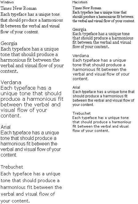
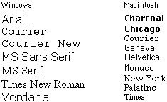
The Macintosh and Windows operating systems display type differently, even when the same typefaces are being used. In general, type displayed on Windows Web browsers will look 2 to 3 points larger than the equivalent face on the Macintosh. Thus a line of 12-point Times type on a Macintosh looks more like 14 points in Times New Roman on a Windows machine. This difference in font rendering can have a big impact on your page layouts. The following table shows the major Microsoft TrueType typefaces in their 12-point sizes, as displayed in both Windows and on a Macintosh.
If you don't have ready access to a machine with "the other" operating system and you use Netscape Navigator, you can use Netscape's "Preferences / Fonts" box to change the default text size from 12 to 14 (Mac users) or from 12 to 11 or 10 (Windows users). If you use Internet Explorer you can use the "Larger" or "Smaller" controls on the button bar to manipulate the default font size of the text.
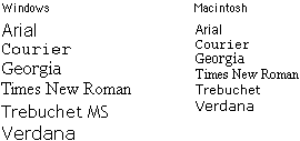
The basic fonts that come with Windows and the Macintosh operating system are listed below. If you are going to specify fonts for your Web documents, you should probably use the typefaces listed here, and you should always specify at least one typeface from each operating system (for example: "Arial, Geneva") to avoid having the browser render your pages in the default font:
Remember that many Macintosh users who have installed Microsoft Office or Microsoft's Internet Explorer Web browser will have "Windows" fonts installed on their systems. If you specify the fonts "Georgia, Times" in your font definitions, many Macintosh users will see their text set in Georgia, just as Windows users do.
Also note in the relative font sizes example on the preceding page that although "Trebuchet" and "Trebuchet MS" are basically the same typeface, the exact name you specify in the font list matters. If you want both Macintosh and Windows users to see the typeface Trebuchet, then use both names in your font declaration.
When considering type, the main accessibility issues are size and color. These attributes come into play for users who have vision disabilities such as low vision or color blindness. Vision-impaired users need to be able to transform text that they find illegible into a format that they can read. Low-vision users need to be able to increase the type size and set the text and page background colors for maximum contrast. Colorblind users also need control over text and background color. You need to pay attention to the following type and layout attributes to accommodate users with vision disabilities.
Users cannot easily enlarge text that is set using absolute size values, for example, text sized using pixels (see Type size). To ensure scalability, use relative units such as the em unit to control the typography — type size, margins and indents, leading — on the page. Use text graphics sparingly, and always offer a text-only equivalent. Text rendered to graphic form is no longer text but image and cannot be manipulated — enlarged, colored — as plain text can.
Text formatting done using presentation-style markup instead of style sheets limits users' ability to transform a layout to meet their needs. Some browsers have a feature that allows users to override author-defined style sheets with their own style sheet. This means that users can define a custom style sheet that meets their viewing needs. For example, a low-vision user might define a style sheet that renders all <P> text at 24 points, or a colorblind user might set the background to white and the text to black for maximum contrast. But these measures will not work, or will only work partially, on pages that are formatted using presentation markup. If text color is set using <FONT COLOR> and headings are set using <FONT SIZE> and <B> for emphasis, the user-defined style sheet will have nothing to apply itself to (no paragraph or heading tags). If you set presentation properties using style sheets, users who need to customize the page can do so.
If you use color alone to achieve typographic emphasis, users who cannot distinguish the colors will miss the emphasis. To emphasize text — for example, in headers or key phrases within text — so that it won't be overlooked, use bold formatting as well as color. (Indeed, colored text for anything that is not a link is a potential usability flaw that you might as well avoid altogether. See Colored text, above.) Also be sure that there is sufficient contrast between the background and text on your page. Although contrast is particularly important for vision-impaired users, all users will benefit from greater readability.
Most Web page layouts are not designed with large type in mind. For example, fixed layouts that limit the text column to a specified width are typically sized to accommodate 12-point type or smaller. Indeed, at large type sizes a fixed text column may contain only a few words, which makes the text awkward to read. For adaptable pages, use a flexible layout that transforms gracefully to accommodate larger type sizes. (For more on fixed and flexible layouts, see Page Design, Page layout.)
Typography cannot always be neatly separated from the graphics of your Web site. Graphic text can be tightly integrated with images in ways that are impossible in HTML text:
For aesthetic reasons you may choose to use graphical representations of type rather than manipulate HTML type. In either case you'll need to understand how to best render type within GIF (Graphics Interchange Format) and JPEG (Joint Photographic Experts Group) graphics.
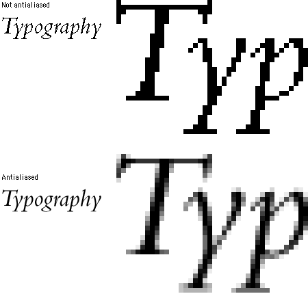
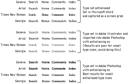
Antialiasing is a technique widely used in computer graphics to optimize the look of graphics and typography on the display screen. Antialiasing visually "smoothes" the shapes in graphics and type by inserting pixels of intermediate colors along boundary edges between colors. In typography, antialiasing removes the jagged edges of larger type characters. At normal viewing distances antialiasing gives the impression that the type is rendered at a higher resolution:
Sophisticated image editing programs such as Adobe Photoshop will create antialiased type automatically, and these "paint" image editors are where most Web designers create their graphic typography. If, however, you have a complex arrangement of typography and graphics (say, for a home page banner), you may wish to work first in a drawing program such as Adobe Illustrator or Macromedia FreeHand. Drawing programs are better at laying out text and will let you edit the text up to the final rendering into a paint (GIF or JPEG) graphic to use on the Web page. Final rendering is usually done by importing the graphic into Photoshop, where all text will automatically become antialiased:

We often use graphic type within banner or navigational graphics, but we rarely use graphic type simply as a stylistic substitute for headlines or subheads within a Web page. Purely graphic typography cannot be searched and indexed along with the HTML-based text on a Web page. Your best option is to repeat the textual content of the graphic inside an ALT tag and hope that search engines will pick up that content, too. Finally, bear in mind that graphic type is far more difficult to edit or update than HTML text.
Antialiasing is great for large display type, but it is not suitable for small type sizes, especially type smaller than 10 points. The antialiasing reduces the legibility of small type, particularly when you import it into Photoshop from a drawing program like Adobe Illustrator. If you need to antialias small type sizes, do it in Photoshop:
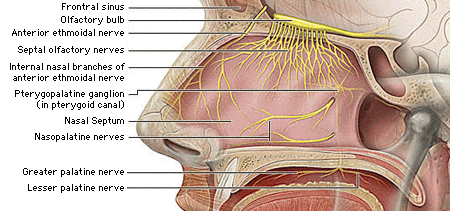
For the anatomic illustration below we used non-antialiased 9-point Geneva (a Macintosh screen font) for the illustration labels:
Brewer, Judy, ed. 2001. How people with disabilities use the Web. http://www.w3c.org/wai/eo/Drafts/pwd-Use-Web (31 March 2001).
Bringhurst, Robert. 1996. The elements of typographic style, 2d ed. Vancouver, B.C.: Hartley and Marks.
Carter, Rob, Ben Day, and Philip Meggs. 1993. Typographic design: Form and communication, 2d ed. New York: Van Nostrand Reinhold.
Chisholm, Wendy, Gregg Vanderheiden, and Ian Jacobs, eds. 1999. Web content accessibility guidelines 1.0. http://www.w3c.org/tr/wai-webcontent/wai-pageauth.html (17 January 2001).
Lie, Håkon Wium, and Bert Bos. 1999. Cascading Style Sheets: Designing for the Web, 2d ed. Reading, Mass.: Addison-Wesley.
Microsoft Corporation. 2000. Microsoft typography. http://www.microsoft.com/typography/default.asp.
Pring, Roger. 2000. www.type: Effective typographic design for the World Wide Web. New York: Watson-Guptill.
Spiekermann, Erik, and E. M. Ginger. 1993. Stop stealing sheep and find out how type works. Mountain View, Calif.: Adobe.
Williams, Robin. 1990. The Mac is not a typewriter: A style manual for creating professional-level type on your Macintosh. Berkeley, Calif.: Peachpit.
———. 1992. The PC is not a typewriter: A style manual for creating professional-level type on your personal computer. Berkeley, Calif.: Peachpit.
Wilson, Adrian. 1993. The design of books. San Francisco: Chronicle Books.