by Patrick J. Lynch
and Sarah Horton

11 Graphics
Images on the Screen
The primary challenge in creating images for web pages is the relatively low resolution of the computer screen. But today’s computer screens typically display millions of colors, and this wealth of color minimizes the limitations of screen resolution. Complex graphics or color photographs often look surprisingly good on web pages for two reasons:
- True-color (24- or 32-bit) displays show enough colors to reproduce photographs and complex art accurately, in as many as 16.8 millions colors; and
- The light transmitted from display monitors shows more dynamic range and color intensity than light reflected from printed pages.
Digital publishing is color publishing: on the web there is no economic penalty for publishing in color. Web pages may in fact be the best current means of distributing color photography—it’s a lot cheaper than color printing, and it’s more consistent and reliable than all but the most expert (and costly) color printing.
The screen versus printed color artwork
Relative to printed pages the computer screen is a low-resolution medium. When you look at illustrations, photographs, and other sophisticated imagery, however, the differences in quality between conventional four-color printing and the computer screen are not as great as you might expect.
In terms of resolution, the computer screen is limited to about 72 to 92 dots per inch of resolution. But most four-color magazine printing is done at 150 dpi, or only about four times the resolution of the computer screen (150 dpi is four times the resolution of 75 dpi because resolution is measured over area, 150 × 150 per square inch) (fig. 11.10).
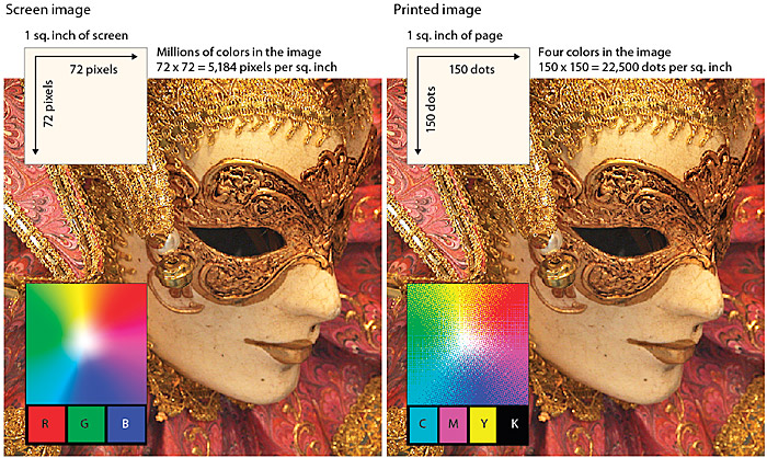
Figure 11.10 — Although the computer screen has much less resolution than color printing, the millions of colors available on the computer screen help make the screen image very comparable to print quality.
Four-color printed images are separated into four subtractive printing colors (cyan, magenta, yellow, and black). These four inks combined produce the illusion of a full range of colors on the printed page, but ultimately the typical magazine or textbook image is composed of only four colors. By comparison, today’s computer monitors can display millions of colors, producing a richness of color that easily rivals the best quality color printing. Also, computer screens display transilluminated images: the colored light shines out from the screen. Transilluminated images deliver a much greater range of contrast and color intensity than images printed on opaque paper, which depend on reflected light. Finally, computer displays show color images using the additive rgb color system, which can display a much broader and subtler range of colors than conventional four-color printing.
The bottom line: the computer screen is lower in resolution, but because of the other advantages of computer displays, images on web pages can easily rival color images printed on paper at equivalent size.
Complex illustrations or photographs
The cormorant illustration below (fig. 11.11) was originally painted at much higher resolution in Adobe Photoshop (1000 × 2000 pixels, 24-bit rgb file). We then reduced a copy to the size above and used Photoshop’s “Unsharp Mask” filter (at the 60 setting) to restore sharpness. Although this small version of the painting has lost some resolution and color detail, it still shows the detail and subtle nuances represented in the original. We chose the jpeg file format for the graphic because the artwork is relatively large for a web page graphic.
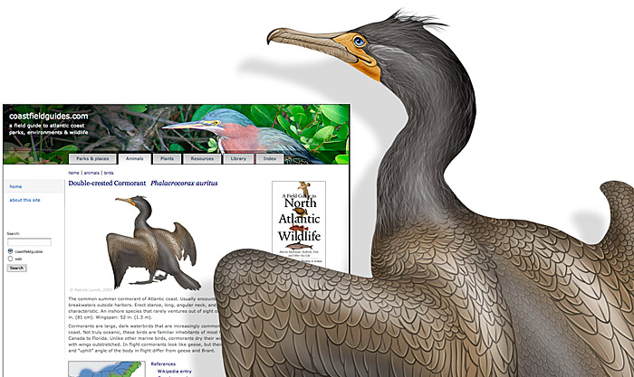
Figure 11.11 — Get the maximum flexibility for your media investments. Generate your custom artwork and photos at print resolution, then use Photoshop to bring them down to web resolution.
Diagrams for the computer screen
Basic diagrams also work well on the computer screen if they are carefully designed to match the grid of pixels on the screen. Graphics built with orthogonal lines (straight horizontal or vertical lines) or diagonal lines at 45-degree angles work best for the screen. Complex icons are hard to interpret, and they look mushy and confusing on the screen. Keep icons and navigation graphics as simple as possible. Simple isometric perspective graphics also work well because they depend on straight lines and 45-degree diagonals.
Although the restrictions of working within fixed line angles make the technique unsuitable for many diagrammatic graphics, it is possible to build complex illustrations using this technique. The regularity of the isometric line work and the absence of the complexities of perspective bring order to graphics that might otherwise be too complex for web page presentation. Another benefit of keeping diagrammatic art and maps simple is that graphic simplicity is ideally suited to the lzw encoding compression algorithm used in gif graphics (fig. 11.12). See gif Graphics, earlier in this chapter.
Figure 11.12 — Embrace the limitations of GIF. Carefully designed graphics aimed at optimizing the LZW compression allow you to put very large images on the screen without slowing the page download too much.
Be careful about choosing the proper sizes for this type of illustration. Graphics carefully built to match the pixel grid cannot be resized in Photoshop because Photoshop will anti-alias the lines. They must be redrawn by hand to larger or smaller sizes to avoid a mushy, fuzzy look that destroys their effectiveness (fig. 11.13).
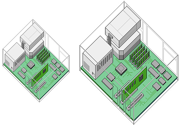
Figure 11.13 — Pixel graphics carefully designed for a particular screen size are not flexible. If you resize the graphic, you lose image quality.
For diagrams that do not follow the pixel grid and incorporate many curves or angles, use anti-aliasing to smooth the boundaries. At great magnification anti-aliased graphics may have fuzzy boundaries, but at normal magnification anti-aliasing produces smooth, natural-looking line work (fig. 11.14).
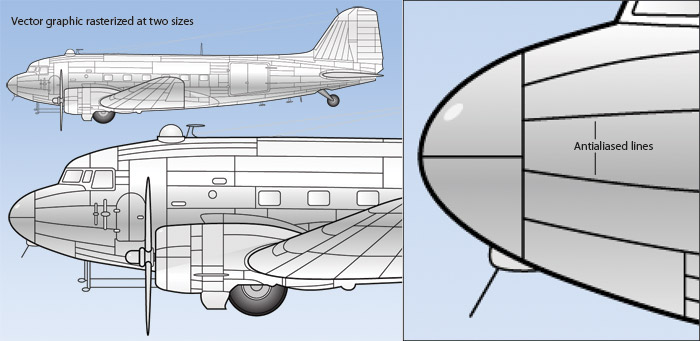
Figure 11.14 — Vector graphics (like Adobe Illustrator files) are a much better graphics investment. The same diagram can be rendered in many sizes without losing quality, and you can print your Illustrator graphics at high resolution.
Graphic text
Graphic typography in gif and jpeg graphics is invisible to screen readers. Search engines don’t load graphics as they scan and index web pages, but even if they did, a web graphic is merely a collection of differently colored pixels arranged over an area of the screen, and text that is contained in a graphic is simply differently colored pixels. As a result, software cannot make intelligent use of those graphics by, for example, reading the text aloud. Additionally, browsers cannot enlarge graphic text as elegantly as with regular text. The only option is to enlarge the image, which results in pixilated, fuzzy text that is difficult to read. In addition, graphic text cannot be recolored or styled by the user’s browser to make reading easier.
In general, the best approach is to use plain html text for text, particularly for essential functional elements of the interface, such as navigation links. Graphic text becomes an insurmountable barrier if it means that users cannot navigate your site. Graphic text is acceptable, however, for page elements whose purpose is purely visual, such as a banner graphic or logo, as long as other page elements contain the equivalent information, such as the page title and the graphic’s alternate text.
Working with large Images
One of the most effective methods for controlling the file size is reducing image dimensions: the fewer pixels in the image, the smaller the file size, and the faster the image loads. But clearly there are times when large images are necessary. An obvious example is the Photo of the Day feature on the National Geographic web site (fig. 11.15).
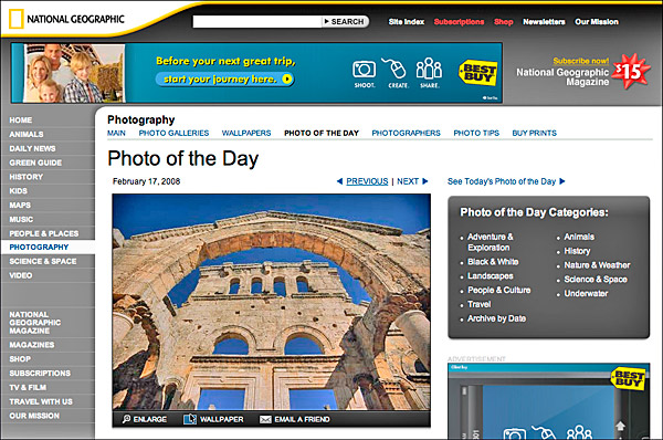
Figure 11.15 — Sometimes you have to splurge on graphics size, even if it means a slower page download.
The image is the featured content on the page and therefore cannot be reduced to a postage-stamp sized thumbnail. However, the interface is designed to display a modest-sized version of the photo, with links to the full-size or wallpaper version. The preview lets users decide whether they are interested enough in the image to take the time to load the large version.
Hiding graphics
In some contexts, graphics are unnecessary and potentially costly. Graphics on mobile devices do not display well when scaled to fit the small screen, and are time-consuming for users to download. In these contexts, the best approach is to use media style sheets to hide unnecessary graphics, and replace necessary graphics, such as navigation links, with text. Cascading Style Sheets make it easy to show and hide elements in different contexts, but you will need to anticipate what is needed in the document source to adapt to different contexts and make sure everything you need is in the page code (fig. 11.16).
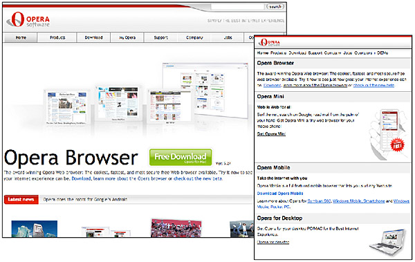
Figure 11.16 — Opera uses style sheets to display appropriate graphics for screen (left) and mobile (right) contexts.