
by Patrick J. Lynch
and Sarah Horton

3 Information Architecture
Presenting Information Architecture
Site planning with a team is often easier if you base your major structural planning and decisions on a shared master site diagram that all members of the group can work with. The site diagram should evolve as the plan evolves and act as the core planning document as changes are proposed and made in the diagram. Site diagrams are excellent for planning both the broad scope of the site and the details of where each piece of content, navigation, or interactive functionality will appear.
For major planning meetings consider printing at least one large diagram of the site organization, so that everyone can see the big picture as it develops from meeting to meeting. The site diagram should dominate the conference table, becoming a tactile, malleable representation of the plan. Everyone should be free to make notes and suggest improvements on the printed plan, and the revised diagram becomes the official result of the meeting.
Site diagrams
As your team works out the information architecture and major categories of content, site diagrams visualize the developing information hierarchy and help communicate the organizational concepts to the team and to stakeholders and project sponsors. This communications role is crucial throughout the project, as the site diagram evolves in iterations from a brainstorming and planning document into a blueprint for the actual site as it will be developed.
Site diagrams can range from simple hierarchical “org chart” diagrams to more complex and information-rich maps that show both the major divisions of the site as the user experiences them, but also act as an overview of the site directory and file structure. The well-known information architect Jesse James Garrett developed a widely used visual vocabulary for site diagrams that has become the de facto standard, and the symbols are broadly useful for portraying site structure and interactive relationships and user decision points (fig. 3.10).
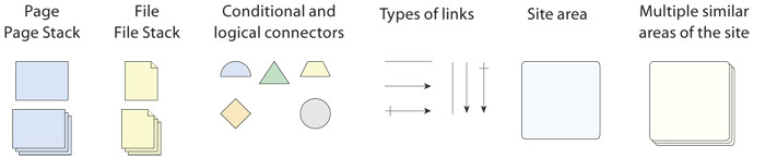
Figure 3.10 — Jesse James Garrett’s visual vocabulary for site design diagrams.
Major elements of a mature site diagram include:
- Content structure and organization: major site content divisions and subdivisions
- Logical functional grouping or structural relationships
- The “click depth” of each level of the site: How many clicks are required to reach a given page?
- Page type or template (menu page, internal page, major section entry point, and so on)
- Site directory and file structure
- Dynamic data elements like databases, rss, or applications
- Major navigation terms and controlled vocabularies
- Link relationships, internal and external to the site
- Levels of user access, log-ins required, or other restricted areas
Site diagrams start simply, and may evolve into two distinct variations: conceptual site diagrams that communicate at a general level the evolving site structure to clients and stakeholders, and more complex blueprint diagrams that are used by the technical, editorial, and graphic design teams as a guide to the structure of both the user interface and the directories and files.
Figure 3.11 depicts a simple site diagram for use in presentations and general overviews and the same site shown in greater detail for use by the site development team. These site diagrams can be developed with drawing software such as Adobe Illustrator but are usually developed with specialized diagrammatic software such as Microsoft Visio, ConceptDraw, or OmniGraffle.
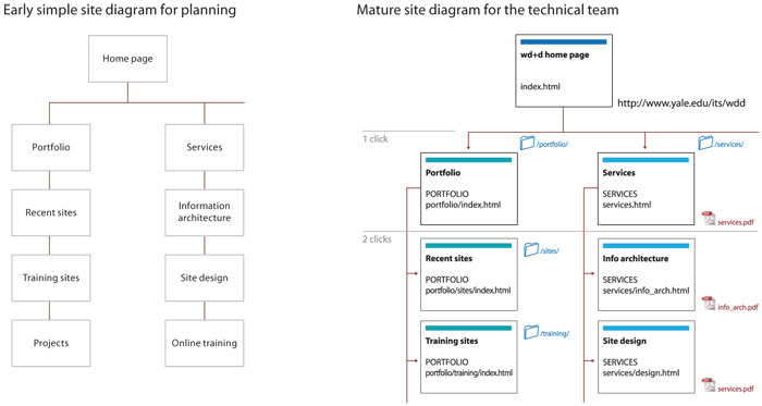
Figure 3.11 — Keep irrelevant technical details out of early planning diagrams. Diagrams gradually incorporate more details as the focus shifts from clients and content experts to the technical team who will build the site.
Site file and directory structures
Site diagrams are also useful when your project moves from planning to web page production. As the new site is built up in a directory on the web server, the site diagram is often the first place programmers look to gain an understanding of how the site files should be subdivided into directories (folders) on the server. The pattern of directories and subdirectories of the site files should mirror the major content divisions and structures as shown on the site diagram.
As the site directories and subdirectories are organized on the server, information on the exact names used for major directories and files should be added to the site diagram, so that everyone on the team has a ready current reference to the naming conventions and file locations in the site (fig. 3.12).
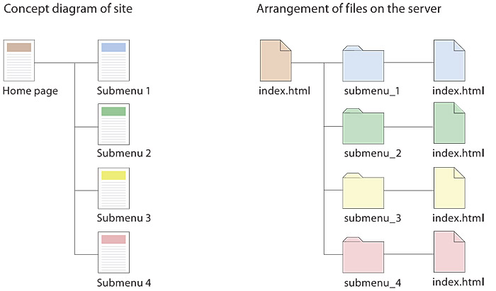
Figure 3.12 — Ideally the information architecture will be consistently reflected in the actual organization of files and directories in the site structure.
Wireframes
The information architecture process is fundamentally one of avoiding the particular while insisting on the general. At various points in this conceptual phase, stakeholders, clients, and even members of your design team may find it irresistible to launch into specific proposals for the visual design of pages. In particular, concern about the possible look and feel of the home page is notorious for throwing planning processes off the rails and into detailed discussions of what colors, graphics, or general character the home page should have, long before anyone has given serious thought to the strategic goals, functions, and structure of the site. Wireframes force teams to stay focused on the information architecture and structural design without getting sidetracked by the distraction of the visual layer.
If site diagrams provide the global overview of the developing web site, then wireframes are the “rough map” that will eventually be used by graphic and interface designers to create preliminary and final page designs for the site. Wireframes are rough two-dimensional guides to where the major navigation and content elements of your site might appear on the page. They bring a consistent modular structure to the various page forms of your site and provide the fundamental layout and navigation structure for the finished templates to come (fig. 3.13).
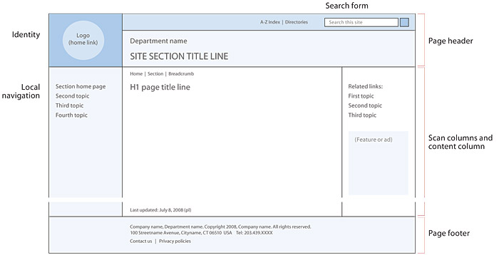
Figure 3.13 — A typical page wireframe diagram.
Things that might appear as standard elements of a web page wireframe include:
- Organizational logo
- Site identity or titles
- Page title headlines
- Breadcrumb trail navigation
- Search form
- Links to a larger organization of which you are a part
- Global navigation links for the site
- Local content navigation
- Primary page content
- Mailing address and email information
- Copyright statements
- Contact information
To keep the discussion focused on information architecture and navigation, keep your wireframe diagrams simple and unadorned. Avoid distinctive typography, use a single generic font, and use gray tones if you must to distinguish functional areas, but avoid color or pictures. Usually the only graphic that appears in a mature wireframe will be the organization logo, but even there it may be better simply to indicate the general location of the logo.
The page wireframe will acquire more complexity as your thinking about global and local navigation matures and you are more certain about the nature and organization of the primary site content.
Canonical form in web pages: Where to put things, and why
What governs how people scan pages of information, print or screen? According to classical art composition theory the corners and middle of a plane attract early attention from viewers. In a related compositional practice, the “rule of thirds” places centers of interest within a grid that divides both dimensions in thirds. These compositional rules are purely pictorial, however, and are probably most useful for displays or home pages composed almost entirely of graphics or photography. Most page composition is dominated by text, and there our reading habits are the primary forces that shape the way we scan pages. In Western languages we read from top to bottom, scanning left to right down the page in a “Gutenberg z” pattern. This preference for attention flow down the page—and a reluctance to reverse the downward scanning—is called “reading gravity” and explains why it is rarely a good idea to place the primary headline anywhere except the top of a page. Readers who are scanning your work are unlikely to back up the page to “start again.” Search engines also have a well-known bias toward items near the top of a page (fig. 3.14).
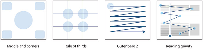
Figure 3.14 — Classic rules of composition and our reading habits combine to govern how we approach information displays.
Eye-tracking studies by the Poynter Institute of readers looking at web pages have shown that readers start their scanning with many fixations in the upper left of the page. Their gaze then follows a Gutenberg z pattern down the page, and only later do typical readers lightly scan the right area of the page (fig. 3.15a). Eye-tracking studies by Jakob Nielsen show that web pages dominated by text information are scanned in an “F” pattern of intense eye fixations across the top header area, and down the left edge of the text (fig. 3.15b).
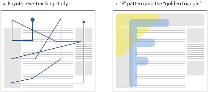
Figure 3.15 — Eye-tracking studies show that our page- scanning patterns are dominated by top-left scanning for the most important words and links on a page.
When readers scan web pages they are clearly using a combination of classic Gutenberg z page scanning, combined with what they have learned from the emerging standards and practices of web designers. As the web nears its twentieth anniversary some clear trends have emerged that will eventually form the basis for “best practice” recommendations in web page composition. Human interface researchers have done studies on where users expect to find standard web page components and have found clear sets of expectations about where some items are located on web pages (fig. 3.16).
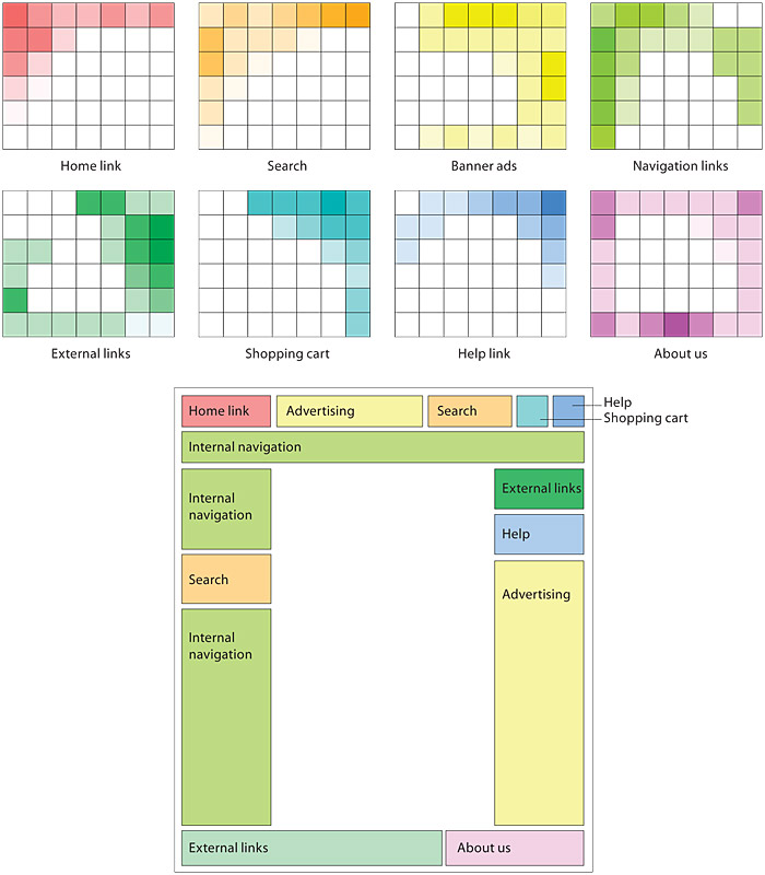
Figure 3.16 — Users have developed clear expectations about where common content and interface elements are likely to appear. Violate these expectations at your peril.
The web is still a young medium with no standards organizations to canonize existing typical page layout practices. Until we have a Chicago Manual of Style for the web, we can at least combine current mainstream web design practice, user interface research, and classic page composition to form recommendations for the location of identity, content, navigation, and other standard elements of pages in text-dominant, information-oriented web sites (fig. 3.17).
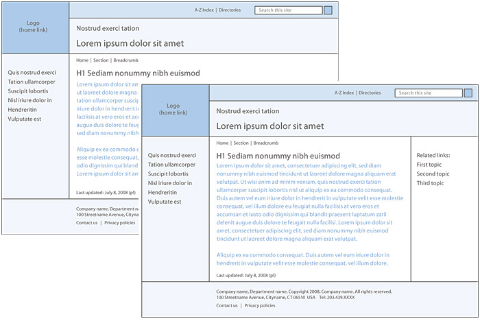
Figure 3.17 — Always consider web conventions and user expectations as you develop the basic structure of page designs.