by Patrick J. Lynch
and Sarah Horton

7 Page Design
Document Design
The documents that we produce for the web have a more complex purpose and functionality than those we create for a single medium, such as print. What works well in one context may be unusable in another. For instance, pages designed for viewing on a large display screen may not work well when printed on paper or viewed on a small cell phone display. When considering page design, look beyond the typical display screen and anticipate designs for other contexts, including print and mobile.
Adaptive design
Done right, web pages can adapt to different contexts without requiring multiple versions of a document. A web document that employs adaptive design can be used successfully on a cinema or cell phone display, a television or a projection screen, printed in ink or Braille, read by a person or a software application. From the designer’s perspective, there are two components to address to make this multipurpose system function effectively: the source document and media style sheets. With adaptive design, the source document contains all necessary information and functionality, and media style sheets adapt the source document for use in different contexts.
Defining styles
Styles can be defined in many ways: using the style attribute within element tags, in the head element of the page, or in an external style sheet. Generally speaking, external style sheets are the most effective; it’s easy to modify, for example, the body background color for an entire site when the body background color property is defined in one location. With adaptive design, we create a different external style sheet for each context and then reference the style sheet using the “media” attribute of the <link> tag. Although there are many media attributes in the html specification, we focus here on the most widely used and supported media types: screen, print, and handheld (fig. 7.1).
<link rel="stylesheet" type="text/css" href="screen.css" media="screen, handheld" />

<link rel="stylesheet" type="text/css" href="print.css" media="print" />

<link rel="stylesheet" type="text/css" href="handheld.css" media="handheld" />
In practice, most consideration of media style sheets is after the fact. We often design first for conventional computer screens and then modify the design for print and handheld. This approach yields designs that are less than ideal, because we often don’t address the requirements of the other media and viewing devices. To exploit the web environment fully, we need take a more holistic view from the start and create source documents that play well in multiple contexts.
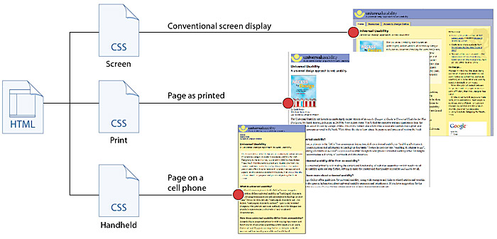
Figure 7.1 — Adapting the same HTML page for different display media, using CSS.
Document order
Document order is the sequence in which elements, such as site identity, navigation, primary content, related content, and provenance information, appear in the document source code. Though not evident in the visual context, document order has a significant effect on the machine-readability of web pages. Many search engines give greater weight to content that appears at the top of a document.
Screen readers begin reading web pages at the beginning of the page and read through the content in sequence. Many web browsers on small-screen devices collapse multicolumn layouts into one column for easier viewing. Print styling often makes use of a single-column layout to accommodate the aspect ratio of the page. The effectiveness of these contexts is largely dependent on document order.
Sequence is an important aspect of document order. Information is garbled when content elements do not follow a logical sequence—for example, when related links and advertising are jumbled in with the main content of the page. Elements must follow a logical sequence in the document source code, and each element must be fully articulated, without interruption by other elements (fig. 7.2).
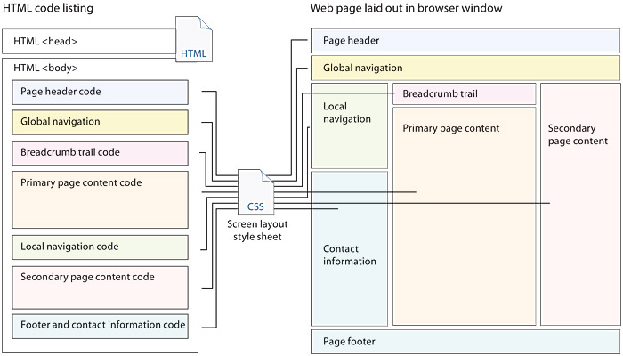
Figure 7.2 — Code ordering within the HTML code (left) and how each code block is arranged by the style sheet.
It’s also necessary to consider the relative importance of elements and to put the most important information at the beginning of the page. This approach, called “front-loading,” has many benefits. Nonvisual and small-screen users have more direct access to main content when it appears early in the source code, and keyboard users have more direct access to the functional elements of the page. And search engines do a better job of indexing pages when the relevant content is at the top of the document (fig. 7.3).
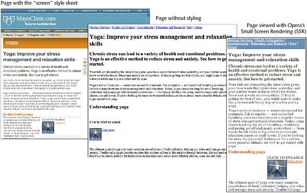
Figure 7.3 — For the best search engine visiblity, keep your most important keywords and headlines near the top of the page.
Selective display
Another aspect of document design is including elements that are relevant to different contexts and coding the document to allow elements to display or not, as appropriate. For example, although they are fundamental to any screen design, navigation links are not helpful when printed on paper. With a document coded for selective display, you can use css in the print style sheet to hide navigation links in printed versions of the page. And while we tend to focus on document design for the computer screen, and most of our document content addresses the needs of visual browsing, some elements are helpful in other contexts.
In print, the page url is helpful when you want to return to the page or cite the article. On screen, however, the page url is readily available, so there’s no need to display that information. In this case, you can use css to hide the url in the screen style sheet (fig. 7.4).
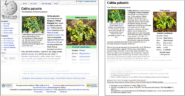
Figure 7.4 — The print version of Wikipedia articles does not include navigation and does include the page URL in the footer.
Text alternates
Web page design is concerned with providing both visual and nonvisual access to information and functionality. The primary reason we can meet the needs of such a broad and diverse audience in the online environment is that text can be read by software. Of course, not all of the information and functionality on the web is in text format; indeed, the web is continually enriched by other content such as images, video, and interactivity. The way to achieve universal usability in a complex and visually rich environment is to provide text equivalents for all relevant nontextual elements.
Alternate text comes in many forms. A descriptive caption is an alternative means to convey information contained in an image. Many sites use text links in the footer of the page to provide a text-only alternative to image-based links. You can provide alternate text in the code of the page: for example, using the “alt” attribute of the <img> tag to provide alternate text for images. Audio and video presentations are often presented with captions and a text transcript. The key concept is not so much how it is provided but rather that alternate text is provided in the source code so that the essential content and functionality of the page is machine-readable and therefore accessible and universally usable (fig. 7.5).
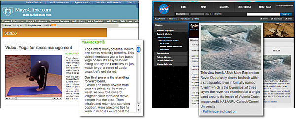
Figure 7.5 — Text transcripts of spoken audio and descriptive image captions are methods of providing text alternates.
Understand the medium
People experience web pages in different ways. For some, the web is a direct medium where pages are read online—on a large computer display, a small portable device, or read aloud by software. For others, the web is a delivery medium that allows access to information for offline use—downloaded to disk or printed onto paper. Your expectations about how people will typically use your site should govern your page design decisions.
Documents to be read online should be written for online reading (see chapter 9, Editorial Style), with a page design that adapts gracefully to different screen sizes and access methods. Documents that will probably be printed and read offline should ideally appear on one page and should use print style sheets to adapt the design to an optimal layout for print, by, for example, stripping the print page of extraneous site navigation links. Documents likely to appeal to mobile users should work in the hybrid mobile environment, readable both in a stripped-down version of the page and in a regular view that works on a full-blown, albeit small, mobile browser (fig. 7.6).
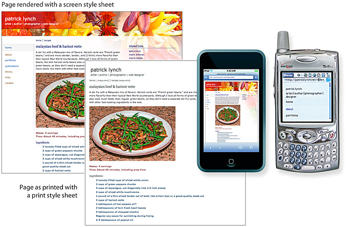
Figure 7.6 — Mobile web displays could be a stripped-down page or a small representation of the regular screen view.