by Patrick J. Lynch
and Sarah Horton
8 Typography
Legibility
Good typography depends on the visual contrast between one font and another, as well as among text blocks, headlines, and the surrounding white space. Nothing attracts the eye and brain of the reader like strong contrast and distinctive patterns, and you can achieve those attributes only by carefully designing contrast and pattern into your pages. If you cram every page with dense text, readers see a wall of gray and will instinctively reject the lack of visual contrast. Just making things uniformly bigger doesn’t help. Even boldface fonts quickly become monotonous: if everything is bold, then nothing stands out “boldly.”
When your content is primarily text, typography is the tool you use to “paint” patterns of organization on the page. The first thing the reader sees is not the title or other details on the page but the overall pattern and contrast of the page. The regular, repeating patterns established through carefully organized pages of text and graphics help the reader to establish the location and organization of your information and increase legibility. Patchy, heterogeneous typography and text headers make it hard for the user to see repeating patterns and logical content groups. The chaos makes it difficult to predict where information is likely to be located in unfamiliar documents (fig. 8.5).
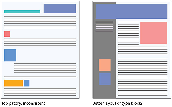
Figure 8.5 — Use contrast and logic to create meaningful repeating patterns of contrast to help the reader quickly make sense of your page layouts.
Alignment and white space
Margins define the reading area of your page by separating the main text from the surrounding environment. Margins provide important visual relief in any document, but careful design of margins and other white space is particularly important in web page design because web content must coexist on the computer screen with the interface elements of the browser itself as well as with other windows, menus, and icons of the user interface.
Margins and space can be used to delineate the main text from the other page elements. And when used consistently, margins provide unity throughout a site by creating a consistent structure and look to the site pages. They also add visual interest by contrasting the positive space of the screen (text, graphics) from the negative (white) space. If you want any understanding of graphic design or page layout, learn to see and appreciate the power and utility of “white space,” the ground field behind page elements. The spaces within the ground field are as important as any other element on the page.
Alignment options
Text blocks have different ways of sitting within margins. Left-justified, centered, right-justified, and justified text are the alignment options available on the web.
Justified text
Justified text is set flush with the left and right margins. Justified blocks of text create solid rectangles, and headings are normally centered for a symmetrical, formal-looking document. In print, justification is achieved by adjusting the space between words and by using word hyphenation. Page layout programs use a hyphenation dictionary to check for and apply hyphenation at each line’s end and then adjust word spacing throughout the line. But even with sophisticated page layout software, justified text blocks often suffer from poor spacing and excessive hyphenation and require manual refinement.
This level of control is not even a remote possibility on web pages. Modern browsers support justified text, but it is achieved by crude adjustments to word spacing. Fine adjustments are not possible on low-resolution computer displays and are impractical to implement in today’s web browsers. Also, web browsers are unlikely to offer automatic hyphenation any time soon, another “must” for properly justified text. For the foreseeable future, the legibility of your web documents will suffer if you set your text justified.
Centered and right-justified text blocks
Centered and right-justified text blocks are difficult to read. We read from left to right, anchoring our tracking across the page at the vertical line of the left margin. The ragged-left margins produced by centering or right-justifying text make that scanning much harder, because your eye needs to search for the beginning of each new line (fig. 8.6).
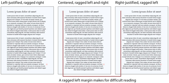
Figure 8.6 — Always use flush-left text alignment for web and other screen displays and for long text passages in print. Centered and flush-right designs are much harder to read.
Left-justified text
Left-justified text is the most legible option for web pages because the left margin is even and predictable and the right margin is irregular. Unlike justified text, left justification requires no adjustment to word spacing; the inequities in spacing fall at the end of the lines. The resulting ragged-right margin adds variety and interest to the page without reducing legibility.
Justification of headlines
Titles and headings over left-justified body text should also be flush left. Centered headings pair well with justified text, but justified text should not be used on web pages. Centered display type contrasts with the asymmetry of the ragged-right margin of left-justified body text and produces an unbalanced page. Until typographic options for web pages become more sophisticated, we recommend that you use left-justified text blocks and headlines as the best solution for most layout situations (fig. 8.7).
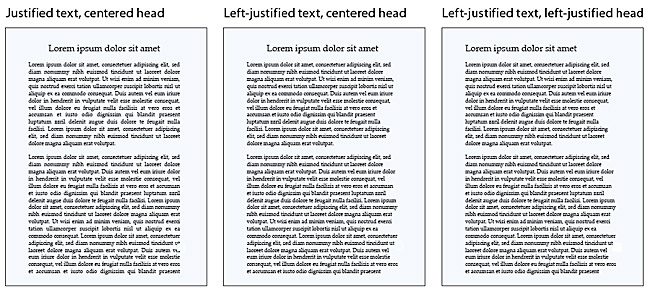
Figure 8.7 — The best alignment option for web pages is left-justified headings and left-justified text.
Line length
Text on the computer screen is hard to read not only because of the low resolution of computer screens but also because the layout of most web pages violates a fundamental rule of book and magazine typography: the lines of text on most web pages are far too long for ideal reading. Magazine and book columns are narrow for physiological reasons: at normal reading distances, the eye’s span of acute focus is only about three to four inches wide, so designers try to keep dense passages of text in columns not much wider than that comfortable eye span. Wider lines of text require readers to move their heads slightly or use their eye muscles to track over the long lines of text. Readability suffers because on the long trip back to the left margin the reader may lose track of the next line.
By using a fixed layout, you can attempt to restrict the text line length (see chapter 7, Page width and line length). However, the exact character count is difficult to predict because of the way different browser software and operating systems display type sizes and the variety among access devices and user-controlled browser settings. In conventional print layouts, columns of forty-five to seventy-five characters per line are considered ideal.
In the end, the decision to restrict line length is a philosophical one. From a design standpoint, a measure that is comfortable for reading is good practice. But a fundamental principle of the web is that users should be able to structure their own view. Users with a large monitor may not want their text blocks circumscribed if it means that a large portion of their screen goes unused. A low-vision user with fonts set large will not appreciate being forced to view long pages with short lines of text. So although leaving text free to fill the browser window may affect readability, following conventions may also affect the accessibility and legibility of your documents (fig. 8.8).
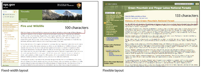
Figure 8.8 — Fixed-width layouts (left) offer some control over line length, whereas flexible layouts (right) expand to fill the browser window.
When designing a fixed-width layout, set text columns to no wider than 365 pixels. With standard text, this yields a line of about fifty characters, averaging about nine to ten words per line. If you choose a flexible layout approach, use css leading controls to increase line spacing (see Leading, below). Additional line spacing permits a slightly longer line length without sacrificing legibility.
Type color
When typographers speak of “type color,” they are speaking about the various ways of manipulating fonts, line spacing, and paragraphs to optimize the overall look and legibility of type on the page.
Leading
Leading is the vertical space in a text block, the distance from one baseline of text to the next. Leading strongly affects the legibility of text blocks: too much leading makes it hard for the eye to locate the start of the next line, whereas too little leading confuses the lines of type, because the ascenders of one line get jumbled with the descenders of the line above. In plain html it is not possible to implement true leading, but css offers leading control (“line-height”). In print the general rule is to set the leading of text blocks at about 2 points above the size of the type: for example, 12-point type with 14 points of leading. On the web we suggest more generous leading to compensate for longer line lengths and the lower resolution of the computer screen. Use relative measures, such as ems or percentages, to set leading relative to text size:
body { font: 1em/1.3em Georgia, "Times New Roman", serif; }
Indenting paragraphs
There are two major schools of thought on denoting paragraphs. The classic typographic method uses indents to signal the beginning of a new paragraph as in the book version of this guide (fig. 8.8a). However, many technical, reference, and trade publications use a blank line of white space to separate paragraphs, as we have done here in this site. Indented paragraphs work especially well for longer blocks of prose, where the indents signal new paragraphs with minimal disruption to the flow of text. Blank line spacing between paragraphs, in contrast, makes a page easy to scan and provides extra white space for visual relief. Either approach is valid as long as the paragraph style is implemented consistently throughout the site.
To separate paragraphs using indents, use the “text-indent” property of paragraphs:
<p style="text-indent: 2em">To separate paragraphs using indents…</p>
To separate paragraphs with blank lines, apply the margin property to your paragraphs:
<p style="margin-bottom: 1.2em">To separate paragraphs with blank lines…</p>
Figure 8.8a — In the book version of this guide we chose to set the type with indented paragraphs, as the high-resolution medium of print is easier on the reader's eye, and doesn't require the exaggerated paragraph spacing that we use on the relatively low-resolution computer screen.