8 Typography
Emphasis
A web page of solid body text is hard to scan for content structure and will not engage the eye. Adding display type to a document will provide landmarks to direct the reader through your content. Display type establishes an information structure and adds visual variety to draw the reader into your material. The key to effective display type is the careful and economic use of typographic emphasis.
There are time-honored typographical devices for adding emphasis to a block of text, but be sure to use them sparingly. If you make everything bold, then nothing will stand out and you will appear to be shouting at your readers. A good rule of thumb when working with type is to add emphasis using one parameter at a time. If you want to draw attention to the section heads in your document, don’t set them large, bold, and all uppercase. If you want them to be larger, increase their size by one measure. If you prefer bold, leave the heads the same size as your body text and make them bold. You will soon discover that only a small variation is required to establish visual contrast.
Italics
Italicized text attracts the eye because it contrasts in shape from body text. Use italics for convention—for example, when listing book or magazine titles—or within text for stressed or foreign words and phrases. Avoid setting large blocks of text in italics because the readability of italicized text, particularly at screen resolutions, is much lower than in comparably sized roman (“plain”) text.
Bold
Boldface text gives emphasis because it contrasts in weight from the body text. Section subheads work well set in bold. Boldface text is readable on-screen, though large blocks of text set in bold lack contrast and therefore lose effectiveness.
Underlining
Underlined text is a carryover from the days of the typewriter, when such options as italics and boldface were unavailable. In addition to its aesthetic shortcomings (too heavy, interferes with letter shapes), underlining has a special functional meaning in web documents. Most readers have their browser preferences set to underline links. This default browser setting ensures that people with monochromatic monitors or people who are color-blind can identify links within text blocks. If you include underlined text on your web page, it will certainly be confused with a hypertext link.
Color
Although the use of color is another option for differentiating type, colored text, like underlining, has a special functional meaning in web documents. You should avoid putting colored text within text blocks because readers will assume that the colored text is a hypertext link and click on it. Colored text does work well as a subtle means to distinguish section heads, however. Choose dark shades of color that contrast with the page background, and avoid using colors close to the default web link colors of blue and violet.
Bear in mind that some users cannot distinguish colors. To emphasize text—for example, in headings or key phrases within text—so that it won’t be overlooked, use bold formatting as well as color. Also be sure that there is sufficient contrast between the background and text on your page. Although contrast is particularly important for vision-impaired users, all users will benefit from greater readability.
Capitals
Capitalized text is one of the most common and least effective methods for adding typographical emphasis. Whether you choose capital or lowercase letters has a strong effect on the legibility of your text. Indeed, words set in all capitals should generally be avoided—except perhaps for short headings—because they are hard to scan.
We read primarily by recognizing the overall shape of words, not by parsing each letter and then assembling a recognizable word. Words formed with capital letters are monotonous rectangles that offer few distinctive shapes to catch the eye (fig. 8.11).

Figure 8.11 — We read by quickly assessing the shapes of familiar words. All-caps text makes monotonous word shapes that must be read slowly, letter-by-letter.
We recommend down-style typing (capitalize only the first word and any proper nouns) for your headlines, subheads, and text. Down style is more legible because as we read we primarily scan the tops of words (fig 8.12a). Notice how much harder it is to read the bottom half of the same sentence (fig. 8.12b). If you use initial capital letters in your headlines, you disrupt the reader’s scanning of the word forms (fig. 8.12c).
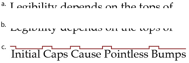
Figure 8.12 — The tops of words (a) are much more important to legibility than the bottoms (b). Initial caps disrupt and slow the scanning process (c).
To read a block of text set in all capital letters we must read the text letter by letter, which is uncomfortable and significantly slows reading. As you read the following paragraph, notice how tiring the process is:
THE DESIGN OF THE SITE WILL DETERMINE THE ORGANIZATIONAL FRAMEWORK OF YOUR WEB SITE. AT THIS STAGE YOU WILL MAKE THE ESSENTIAL DECISIONS ABOUT WHAT YOUR AUDIENCE WANTS FROM YOU, WHAT YOU WISH TO SAY, AND HOW TO ARRANGE THE CONTENT TO BEST MEET YOUR AUDIENCE’S NEEDS.
ALTHOUGH PEOPLE WILL INSTANTLY NOTICE THE GRAPHIC DESIGN OF YOUR WEB PAGES, THE ORGANIZATION OF THE SITE WILL HAVE THE GREATEST IMPACT ON THEIR EXPERIENCE.
Spacing and indentation
One of the most effective and subtle ways to vary the visual contrast and relative importance of a piece of text is to isolate it or treat it differently from the surrounding text. If you want your major headings to stand out more without making them larger, add space before the heading to separate it from any previous copy. Indentation is another effective means of distinguishing bulleted lists, quotations, or example text (such as the capitalization example, above). You can define margins and indents using css.
Semantic emphasis
Always consider the semantic meaning of any visual styles you apply to your words. Using Cascading Style Sheets you can style the semantic emphasis (<em>) and strong emphasis (<strong>) html tags to look any way you choose. If a word you wish to mark with boldface really reflects a strong semantic emphasis, then by all means mark it with a <strong> tag, and use css to style all <strong> tags to use a bold visual weight. Similarly, you can use css to control all aspects of the size, color, and font weight of other semantic html tags like <acronym>, <cite>, and <blockquote> (table 8.1). With semantic techniques and css you can add context and meaning to your words and visually style them at the same time.
| Abbreviation | <abbr> |
| Acronym | <acronym> |
| Address | <address> |
| Block quotation | <blockquote> |
| Citation | <cite> |
| Computer code | <code> |
| Defined term | <dfn> |
| Emphasis | <em> |
| Headings | <h1>, <h2>, <h3>, <h4>, <h5>, <h6> |
| Lists | <ol>, <ul>, <dl>, <menu>, <dir> |
| Strong emphasis | <strong> |
Table 8.1 — The semantic elements of HTML markup.


