by Patrick J. Lynch
and Sarah Horton

8 Typography
Display Typography with Graphics
Plain html text is best for typography because it provides the most flexibility across many display media, allows quick editorial changes, improves search engine visibility, and facilitates universal access. There are instances, however, where display typography using graphics is important. In enterprises with strong and consistent identity programs, you should always use the recommended “company” typefaces and logo treatments according to the corporate identity program, and usually that will mean rendering header-area logos and display typography within a graphics program like Adobe Photoshop (fig. 8.13).
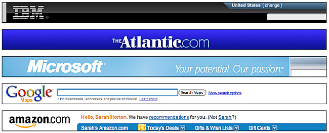
Figure 8.13 — Canonical header designs include the organizational logo graphic in the upper left. Quick recognition of a familiar graphic logo is key.
When using graphics for text, always provide the equivalent text using the “alt” attribute of the <img> tag so that the text is available to nonvisual users, users with images disabled, and software such as search engines:
<img src="page-headline.gif" alt="The major headline" width="300" height="90" />
Creating display typography
Most designers use Adobe Photoshop to create and finalize display typography for the web. Photoshop allows you to use any font installed in your computer’s operating system. Virtually all conventional display typography is done using Photoshop’s options for anti-aliasing type (sharp, crisp, strong, or smooth). In most instances we prefer the “sharp” option for rendering type, but you should explore the other smoothing options for your graphics. The heavier smoothing options can be useful in creating “demi-bold” weights of fonts in between the regular and bold weights.
Small labels within diagrams and illustrations
Type in sizes smaller than 10 points or 10 pixels is common in diagrams and illustrations prepared for the web. In instances where your type sizes are small, you may want to experiment with turning off anti-aliasing (the “none” option in Photoshop) to achieve crisper typography.