Chapter 9
Typography
Book design is not one of those crafts that allow for infinite and unfettered creativity.
—Richard Hendel, On Book Design
Typography is the balance and interplay of letterforms on the page—a verbal and visual equation that helps the reader understand the form and absorb the substance of the page content. Typography plays a dual role as both verbal and visual communication. When readers scan a page, they are subconsciously aware of both functions: first they survey the overall graphic patterns of the page, and then they parse the language and read.
Good typography establishes a visual hierarchy for rendering prose on the page by providing visual punctuation and graphic accents that help readers understand relations between prose and pictures, headlines and subordinate blocks of text. Good web typography encodes those relationships, and adapts gracefully to different contexts of use.
Characteristics of Web Typography
Web typography has several distinct differences from print typography:
- Encoded semantics: With web typography, hierarchy and relationships are encoded into text, such that the information is available programmatically and can be read by such tools as text-to-speech software, like screen readers, which read web pages aloud; and software that indexes documents for searching and retrieval, like search engines.
- Adaptable display: The visual display of text depends on many variables, such as user settings, context of use, device used, and size of the viewport. Good web typography adapts gracefully to these different contexts. In the end, the best pages are those that can be readily displayed by users, with designs that meet their needs and preferences. This is especially true for typographic design, since there is such variation in what makes for optimal readability and legibility.
Semantics
It may seem counterintuitive to begin a chapter on web typography by discussing semantic markup, but typography is visual semantics—the use of visual encodings to convey structure and meaning. On the web, we can encode structure and meaning into documents. With semantic markup, we describe content structure visually and programmatically to communicate more effectively to more users. We also use semantics to provide additional layers of experience, and make connections that are not possible through visual means only. For example, we can create a table of contents by extracting headings from a document and providing a document overview in outline format.
In Chapter 5, Site Structure, we covered the basic principles of semantic content markup. Here we focus on those elements that are specific to web typography.
Neutral space
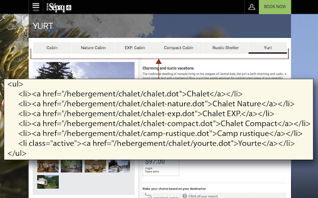
Neutral space is an attribute that we use to describe visually how elements are related and sequenced. With neutral space, such as margins, line height, indents, and blank lines, we guide readers through documents. From a semantic perspective, we can use html elements for a similar purpose, showing which elements are related and which are distinct. We can use semantic markup to encode the purpose of specific elements, and to describe the information hierarchy of page content. For example, sectioning markup is a way of encoding neutral space around a block of content, providing a boundary around the content and giving it a descriptive label.
| HTML | <body>, <fieldset>, <form>, <table>, <ul>, <ol> |
|---|---|
| HTML5 | <article>, <aside>, <footer>, <header>, <main>, <nav>, <section> |
| WAI-ARIA | application, banner, complementary, contentinfo, form, main, navigation, search |
Information hierarchy
We use typographic conventions to convey relationships among content elements. For example, we put a bullet character in front of each item in a list of words, phrases, or paragraphs to show visually that the items are related, and typically that they are specific details related to the content preceding the list. Another common example is a heading followed by a paragraph. We signal the heading visually, using larger, bold text. As in this book, we often have a hierarchical system of headings, with page headings, section headings, and subsection headings. We convey these visually, usually through the size and position of the headings. A large heading at the top of the page is likely the heading for all the page content. Section headings are smaller, and are interspersed through the page, and subsection headings are smaller still. We can use semantic markup to encode the information relationships and hierarchy so they are available programmatically.
We also use typography to emphasize individual elements, to make them stand out as different or particularly important. One way is to set a word or phrase in boldface or italicize it to make it stand out from its surrounding context. We can use semantic markup to distinguish words or phrases from surrounding content—for example, to mark the title of a work as a citation.
| Abbreviation | <abbr> |
|---|---|
| Acronym | <acronym> |
| Address | <address> |
| Block quotation | <blockquote> |
| Citation | <cite> |
| Computer code | <code> |
| Defined term | <dfn> |
| Emphasis | <em> |
| Headings | <h1>, <h2>, <h3>, <h4>, <h5>, <h6> |
| Lists | <ol>, <ul>, <dl>, <menu>, <dir> |
| Strong emphasis | <strong> |
Adaptation using style sheets
Visual typography did not have much of a role to play in the creation of the web. Tim Berners-Lee’s original concept of the Internet was to create “a web of data that can be processed directly or indirectly by machines.” The originators of html were scientists who wanted a standard means for sharing particle physics documents. They had little interest in the exact visual form of the document as seen on a particular computer screen. In fact, html was designed to enforce a clean separation between structure and presentation, such that pages would display on every system and browser available, work with assistive technologies such as screen reader software, and be accurately interpreted by automated search and analysis software. The visual logic of the content was at best a secondary concern. In focusing solely on the structural logic of documents, they ignored the need for the visual logic of sophisticated graphic design and typography.
This division between structural logic and visual logic was reconciled through the introduction of cascading style sheets, or CSS. With CSS, web sites can contain both encoded and visual structure and meaning. Style sheets offer web designers two key advantages in managing complex web sites:
- Separation of content and design: CSS gives site developers the best of both worlds: content markup that reflects the logical structure of the information, and the freedom to specify exactly how each html element will look.
- Efficient control over large document sets: The most powerful implementations of CSS allow site designers to control the graphic look and feel of thousands of pages by modifying a single master style sheet document.
Medium’s attention to design
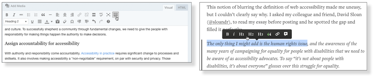
Designer Charles Eames said, “The details are not the details. They make the product.” This attention to detail is clearly part of the success of Webby award–winning Medium, in the Best User Experience category. Medium provides a platform for publishing stories and ideas, a concept that is neither revolutionary nor particularly innovative. Where Medium leaps ahead of its competitors is in interaction and graphic design. The author experience of using Medium to publish stories is focused on enabling the activity of sharing thoughts, stories, and ideas without distraction (see Medium’s streamlined editing toolbar, fig. 9.4). But most important, Medium pays close attention to ensuring that contributions display to their best effect, with lovely design and typography across devices, and even on paper (see the web site Printing Medium Stories).
In his book The Elements of Typographic Style, Robert Bringhurst’s first principle is, “Typography exists to honor content.” Medium’s success is largely a function of how it has embraced this principle by honoring the contributions of its authors.
Efficiency
If you have ever used the “styles” features of a page layout or word processing program, you’ll understand the basic idea behind CSS. The styles feature of a word processor is used to determine exactly how your titles, subheadings, and body copy will look, and then the text is formatted when you apply a style to each element. Once all the text has been styled, you can change the look of each occurrence of an element simply by changing its style information. For example, say that you set Heading 1 elements to be in Times New Roman. If you change your mind and want another font, you just change the Heading 1 style, and every Heading 1 in your document then changes to reflect the new font. CSS works in the same way. If you have one master style sheet controlling the visual styling of every page in your site, you can update the font property in your h1 declaration to use a new typeface and all level one headings in the site will display with the new font.
Consistency
As in traditional print publishing, high-quality web sites adhere to established type style settings consistently throughout the site. Consistency gives polish to a site and encourages visitors to stay by creating an expectation about the structure of a text. If sloppy, inconsistent formatting confounds this expectation, you will decrease your readers’ confidence in your words, and they may not return. You should decide on such settings as fonts, interparagraph spacing, subhead sizes, and so on and then create a style guide to help you maintain these settings as you develop the site (see the sidebar on style guides in Chapter 10, Editorial Style). This step is especially critical for large sites that incorporate numerous pages. And with CSS you will have powerful tools to maintain the consistency of styles throughout your site.
User preferences
Even if you follow typography best practices and conventions, people who have visual impairments may not be able to read your text. Some people need large text due to declining eyesight, or inverted colors due to sensitivity to light. For people who have reading disorders, such as dyslexia, there is a great deal of variation with respect to which font, color, and size work best. Everyone struggles with reading under certain environmental conditions, such as glare, and because of physical issues such as stress and fatigue. Some people simply prefer a specific reading mode and welcome sites that honor their preferences.
Most browsers have a feature that allows users to override author-defined style sheets with their own style sheets. This means that a user can define a custom style sheet that meets his viewing needs. A person who has low vision might define a style sheet that renders all headings and paragraphs at 32 pixels and sets the background to black and the text to white for maximum contrast.
Web typography in practice
For most people, creating good web typography does not involve writing CSS rules. Most content authors work in a text editor, creating and marking up text based on the available options. The resulting text displays using whatever styling was implemented with the web site. The important thing for content editors is to utilize good text markup practices, so that the development team’s carefully designed and engineered semantic and visual typography is correctly applied. This means:
- Use the semantic markup options as provided in the text editor: headings, lists, quotes, and column and row headers for tables.
- Do not use a specific element in order to achieve a visual effect. For example, don’t assign a heading level based on how it displays. Instead, assign the level that corresponds to the heading’s position in the information hierarchy.
- Avoid using the presentation options, such as size, font, and style (bold, italic, underlined), particularly when a semantic option exists. For example, don’t set a section heading as large and bold using the font size and style settings. Instead, use the format menu to choose the appropriate heading level and let the heading display as specified in the CSS. Steer clear of setting color options for text. Color is tricky. It’s easy to select a color that does not harmonize with the other colors on the page and, worse, one that does not provide sufficient contrast, causing issues for people with vision impairments. Let your text inherit the styling provided by the development team.
- Avoid using text characters for visual purposes, such as brackets for arrows, vertical bar or pipe for a border, asterisks for bullets. Screen reader software speaks whatever text is provided, and will speak the character (for example, “Home vertical bar About vertical bar Contact Us”).
- Do not put two spaces after a period. Period.
The development team should configure the text editor to support best practices for web typography. In most cases, this means removing functionality that comes with text editors, such as underline and text color options—these options should never be needed for web typography. It may also mean reordering options, putting the best options in the main toolbar and less desirable but still necessary options in a secondary drop-down menu or panel.
Elements of Typographic Design
Good typography depends on the visual contrast between one typeface and another, as well as among text blocks, headlines, and the surrounding white space. Nothing attracts the eye and brain of the reader like strong contrast and distinctive patterns, and you can achieve those attributes only by carefully designing contrast and pattern into your pages. If you cram every page with dense text, readers see a wall of gray and will instinctively reject the lack of visual contrast. Just making things uniformly bigger doesn’t help. Even boldface fonts quickly become monotonous: if everything is bold, then nothing stands out “boldly.”
When your content is primarily text, typography is the tool you use to “paint” patterns of organization on the page. The first thing the reader sees is not the title or other details on the page but the overall pattern and contrast of the page. The regular, repeating patterns established through carefully organized pages of text and graphics help the reader to establish the location and organization of your information and increase legibility. Patchy, heterogeneous typography and text headers make it hard for the user to see repeating patterns and logical content groups. The chaos makes it difficult to predict where information is likely to be located in unfamiliar documents.
Display type
A web page of solid body text is hard to scan for content structure and will not engage the eye. Many users will turn away from a “wall of words” because it’s not welcoming and inviting. Some users will have a significant struggle reading long blocks of text, with unbroken paragraphs; users with dyslexia, for example, may have difficulty keeping their place without the aid of line breaks and white space. Adding display type to a document will provide landmarks to direct the reader through your content. Display type establishes an information structure and adds visual variety to draw the reader in to your material.
Alignment and white space
Margins define the reading area of your page by separating the main text from the surrounding environment. Margins provide important visual relief in any document, but careful design of margins and other white space is particularly important in web page design because web content must coexist with the interface elements of the browser itself, as well as with other windows, menus, and icons of the user interface.
Margins and space can be used to delineate the main text from the other page elements. And when used consistently, margins provide unity throughout a site by creating a consistent structure and look to the site pages. They also add visual interest by contrasting the positive space of the screen (text, graphics) from the negative (white) space. If you want any understanding of graphic design or page layout, learn to see and appreciate the power and utility of “white space,” the ground field behind page elements. The spaces within the ground field are as important as any other element on the page.
Justified text
Justified text is set flush with the left and right margins. Justified blocks of text create solid rectangles, and headings are normally centered for a symmetrical, formal-looking document. In print, justification is achieved by adjusting the space between words and by using word hyphenation. Page layout programs use a hyphenation dictionary to check for and apply hyphenation at each line’s end and then adjust word spacing throughout the line. But even with sophisticated page layout software, justified text blocks often suffer from poor spacing and excessive hyphenation and require manual refinement to avoid “rivers” of white space that run through the text.
Modern browsers support justified text through word spacing and hyphenation, but the results are not optimal or consistent. The necessary fine spacing adjustments are not possible, and there are no options for customizing and refining hyphenation options. Narrow columns can end up with large spaces between letters and words, particularly with enlarged text. For the foreseeable future, the readability of your web documents will suffer if you set your text justified.
Centered and right-aligned text
Centered and right-aligned text blocks are difficult to read. We read from left to right, anchoring our tracking across the page at the vertical line of the left margin. The ragged-left margins produced by centering or right-justifying text make that scanning much harder, because your eye needs to search for the beginning of each new line.
Left-aligned text
Left-aligned text is the most legible option for web pages because the left margin is even and predictable and the right margin is irregular. Unlike justified text, left justification requires no adjustment to word spacing; the inequities in spacing fall at the end of the lines. The resulting ragged-right margin adds variety and interest to the page without reducing legibility.
Alignment of headings
Headings over left-aligned text should also be flush left. Centered headings pair well with justified text, but justified text should not be used on web pages. Centered display type contrasts with the asymmetry of the ragged-right margin of left-justified body text and produces an unbalanced page.
Line length
Printed magazine and book columns are narrow for physiological reasons: at normal reading distances, the eye’s span of acute focus is only about three to four inches wide, so designers try to keep dense passages of text in columns not much wider than that comfortable eye span. Wider lines of text require readers to move their heads slightly or use their eye muscles to track over the long lines of text. Readability suffers because on the long trip back to the left margin the reader may lose track of the next line.
On the web, there is no magic number representing a comfortable line length, or measure, given the variability and diversity of devices, window widths, and text size settings. The best approach is to use flexible units to specify the width of the text block and a responsive layout that will adapt to different text sizes as well as different devices (see Chapter 6, Page Structure).
Leading
Leading is the vertical space in a text block, the distance from one baseline of text to the next. Leading strongly affects the legibility of text blocks: too much leading makes it hard for the eye to locate the start of the next line, whereas too little leading confuses the lines of type, because the ascenders of one line get jumbled with the descenders of the line above.
In print the general rule is to set the leading of text blocks at about 2 points above the size of the type: for example, 12-point type with 14 points of leading. On the web we suggest more generous leading to compensate for longer line lengths. Use relative measures, such as ems or percentages, to set leading relative to text size.
Indents
There are two major schools of thought on denoting paragraphs. The classic typographic method uses indentation to signal the beginning of a new paragraph (as in this book). However, many technical, reference, and trade publications use a blank line of white space to separate paragraphs. Indented paragraphs work especially well for longer blocks of prose, where the indents signal new paragraphs with minimal disruption to the flow of text. Blank line spacing between paragraphs, in contrast, makes a page easy to scan and provides extra white space for visual relief. Either approach is valid as long as the style is implemented consistently throughout the site.
Text size
Scalable text is essential to the goals of universal usability. To ensure scalability, use relative units to control the typography—type size, margins and indents, leading—on the page. We recommend setting the body text to the default text size defined in users’ browser settings and setting all text variants (such as headings, captions, and links) using relative units, such as ems or percentages. An em in the web context is the same as the font height, which makes it a relative unit and therefore flexible. For example, if the user-set default is 16 pixels, than a two-em text indent would be double, or 32 pixels. But if the user used the text zoom feature of the browser to change the text size to 18 pixels, the indent would change to 36 pixels to reflect the larger type size. Use a responsive design approach that adjusts the layout in response to text size settings.
Responsive typography
The accessibility benefits of a responsive design approach are less touted than those for cross-device support. However, the adaptation behavior of responsive designs works well for users who have low vision and need large text to read. People with low vision can use screen magnification software to access online content and functionality. The experience of using screen magnification is like holding a magnifying glass over a portion of a page and moving the magnifier around the page to read. Only the portion of page below the magnifying glass is readable at one time.
In a responsive layout—designed using flexible units, such as percentages or ems—when the user enlarges text using the browser zoom feature, all the text, controls, and layout adjust to the larger text size. The layout will adjust at different breakpoints, as it would when viewed on a table or smartphone. And typographic devices that aid readability, such as line length and line height, adapt to the text size and layout, improving the readability at larger sizes.
Emphasis
There are time-honored typographical devices for adding emphasis to a block of text, but be sure to use them sparingly. If you make everything bold, then nothing will stand out and you will appear to be shouting at your readers. A good rule of thumb when working with type is to add emphasis using one parameter at a time. If you want to draw attention to the section heads in your document, don’t set them large, bold, and all uppercase. If you want them to be larger, increase their size by one measure. If you prefer bold, leave the heads the same size as your body text and make them bold. You will soon discover that only a small variation is required to establish visual contrast.
Italics
Italicized text attracts the eye because it contrasts in shape from body text. Use italics for convention—for example, when listing book or magazine titles—or within text for stressed or foreign words and phrases. Avoid setting large blocks of text in italics because the readability of italicized text is much lower than in comparably sized roman (“plain”) text.
Bold
Boldface text gives emphasis because it contrasts in weight from the body text. Section subheads work well set in bold. Boldface text is readable onscreen, though large blocks of text set in bold lack contrast and therefore lose effectiveness.
Underlining
Underlined text is a carryover from the days of the typewriter, when such options as italics and boldface were unavailable. In addition to its aesthetic shortcomings (too heavy, interferes with letter shapes), underlining has a special functional meaning in web documents. Most readers have their browser preferences set to underline links. This default browser setting ensures that people with monochromatic monitors or people who are color blind can identify links within text blocks. If you include underlined text on your web page, it will certainly be confused with a hypertext link.
Color
Although the use of color is another option for differentiating type, colored text, like underlining, has a special functional meaning in web documents. You should avoid putting colored text within text blocks, because readers will assume that the colored text is a hypertext link and click on it. When using color for emphasis, bear in mind that some users cannot distinguish colors. Use additional visual emphasis that is accessible without color, such as bold for headings and underlining for links.
Also be sure that there is sufficient contrast between the background and text on your page. Although contrast is particularly important for vision-impaired users, all users will benefit from greater readability.
Capitals
Capitalized text is one of the most common and least effective methods for adding typographical emphasis. Words set in all capitals should generally be avoided—except perhaps for short headings—because they are hard to scan. This is because we read primarily by recognizing the overall shape of words, not by parsing each letter and then assembling a recognizable word. Words formed with capital letters are monotonous rectangles that offer few distinctive shapes to catch the eye (fig. 9.11).
We recommend down-style typing (capitalize only the first word and any proper nouns) for your headlines, subheads, and text. Down style is more legible because as we read, we primarily scan the tops of words. Notice how much harder it is to read the bottom half of the same sentence. If you use initial capital letters in your headlines, you disrupt the reader’s scanning of the word forms.
To read a block of text set in all capital letters, we must read the text letter by letter, which is uncomfortable and significantly slows reading. As you read the following paragraph, notice how tiring the process is:
STRATEGIC PLANNING IS NOT A BAG OF TIPS, TRICKS, OR SPECIAL TECHNIQUES. IT’S NOT ABOUT PREDICTING THE FUTURE—WE CREATE STRATEGIES PRECISELY BECAUSE WE CAN’T PREDICT THE FUTURE. STRATEGIC PLANNING IS NOT A WAY TO ELIMINATE RISK. AT BEST STRATEGY IS AN ATTEMPT TO IDENTIFY AND TAKE THE RIGHT RISKS AT THE RIGHT TIMES.
Spacing and indentation
One of the most effective and subtle ways to vary the visual contrast and relative importance of a piece of text is to isolate or treat it differently from the surrounding text. If you want your major headings to stand out more without making them larger, add space before the heading to separate it from any previous copy. Indentation is another effective means of distinguishing bulleted lists, quotations, or example text (such as the capitalization example, above).
Typefaces
Each typeface has a unique tone that should produce a harmonious fit between the verbal and visual flow of your content. Most of the traditional serif typefaces we use today can trace their roots back to the typography of Imperial Rome, which you can still see today on monuments scattered throughout the Mediterranean world.
The variety of heavily used typefaces we have today originated mostly from the two centuries after Johannes Gutenberg invented movable metal type in around 1450. Printers such as Aldus Manutius (originator of italic faces), Nicholas Jenson, and Christophe Plantin designed or commissioned the early models for the Roman-derived “humanistic” or “old style” faces still in wide use today, albeit in digital form. Humanistic faces like Garamond (1532), Caslon (1725), and their more modern derivatives Goudy (1916), Times New Roman (1932), and Palatino (1948) are some of the most widely used typefaces today, because of their beautiful forms and outstanding legibility. The text you are reading now is set in Goudy.
Fine typography has a rich history that unfortunately is beyond the scope of this book, but if you are curious about the letterforms you have used since childhood, and will use for the rest of your life, we highly recommend Robert Bringhurst’s The Elements of Typographic Style, Ellen Lupton’s Thinking with Type, and a more recent book dedicated to fine web typography, Jason Santa Maria’s On Web Typography.
The terminology of typefaces
Type design is an ancient and complex craft, and has its own vocabulary for describing the anatomy and details of letterforms. Figure 9.17 shows some of the more common terms for describing the details of letters.
Sizes of type
If you have any experience at all with various typefaces, you have noticed what seems like an odd discrepancy in type sizing: some typefaces are much larger than others, even when they are nominally set to the same point size. This is because our modern digital typefaces still follow forms derived from the days of metal type, when the “point size” of type was derived from the dimensions of the rectangular metal slug, or “sort,” that supported the actual printing face of the letter. Within the type slug size typographers had some freedom to produce more delicate typefaces with smaller “x-heights” (fig. 9.15a and b), or larger, more robust faces that more completely filled the face of the slug. Thus the lowercase letters of Baskerville are considerably smaller than the lowercase letters of Helvetica, even when both are set to a 160 point size (fig. 9.15c).
In general, typefaces with larger x-heights are considered more legible, particularly in less than ideal conditions, such as very small point sizes, or on the relative low-resolution traditional 72–96-pixels-per-inch screens of older computers and smartphones. The well-known pair of serif and sans serif typefaces Georgia and Verdana were designed for Microsoft by famed typeface designer Matthew Carter specifically for outstanding legibility on computer screens. Carter designed both faces with relatively robust overall dimensions and large x-heights to make Georgia and Verdana easy to read from screens.
Letterspacing and kerning
Two critical skills in handling web typography are letterspacing and kerning using CSS. Letterspacing is most commonly used to improve the legibility of type set in all caps, where more generous spacing between letters helps the eye distinguish the relatively monotonous shapes of capital letters from one another. In general, all instances of all-caps lettering should provide some extra letterspacing using CSS (for example: h1 { letter-spacing: 2px; }).
Kerning is adjustment of the space between individual letterforms, and is particularly important when you use large “display” sizes of typography in your page designs. Kerning is used to improve the aesthetics of type when two adjacent letters seem too far apart, leaving an awkward gap that disturbs the smooth flow and rhythm of the line of type (fig. 9.17). You can use negative values of the CSS letterspacing property to pull together specific pairs of letterforms to improve the look of large, prominent display type headers.
Adapted traditional typeface
Times New Roman is a good example of a traditional typeface that has been adapted for use on computer screens. A serif typeface like Times New Roman is about average in legibility on the computer screen and has a moderate x-height. Times New Roman is a good font to use in text-heavy documents that will probably be printed by readers rather than read from the screen. The compact letter size of Times New Roman also makes it a good choice if you need to pack a lot of words into a small space.
Designed for the screen
Typefaces such as Georgia and Verdana were designed specifically for legibility on the computer screen; they have exaggerated x-heights and are robust compared with more traditional typefaces in the same point size. These screen fonts offer excellent legibility for web pages designed to be read directly from the screen. However, the exaggerated x-heights and heavy letterforms of Georgia and Verdana sometimes look massive when transferred to the high-resolution medium of paper.
Typefaces for other media
Much of our attention is focused on the screen version of our pages, but we also have control over how a page looks when printed on paper. Print offers a far richer palette of options when it comes to selecting a typeface; many more typefaces look good on paper than the relatively few that are readable and attractive onscreen. In contrast, there is no point specifying a typeface for handheld styling since most devices have only one font.
Choosing Typefaces
The most conventional scheme for using typefaces is to use a serif face such as Times New Roman or Georgia for body text and a sans serif face such as Verdana or Arial as a contrast for headlines. Various studies purport to show that serif type is more legible than sans serif type, or vice versa. You can truly judge type legibility only within context—on the screen, on paper—as users will see your web page.
You may use either a variation of the serif font or a contrasting sans serif face for the display type. It is safest to use a single typographic family and vary its weight and size for display type and emphasis. If you choose to combine serif and sans serif faces, select fonts that are compatible, and don’t use more than two typefaces (one serif, one sans serif) on a page.
Specifying operating system typefaces
Web typography has blossomed over the past five years with the @font-face CSS element (see the next section) widely supported, and web fonts available (free and for fee) from many typographic suppliers. But there are still many good reasons to use the common operating system fonts like Times, Arial, Trebuchet, Georgia, and Verdana. These system fonts are highly legible—if also highly familiar—and they load fast and reliably. Unlike downloadable web fonts, system fonts don’t add any bandwidth burden to your pages. This could be a crucial advantage when designing pages for mobile use, where the advantages of fast response may far outweigh the aesthetic constraints of sticking with the standard Mac OS X and Windows font groups.
The browser will check for the presence of each font (in the order you provide), so you can specify three or four alternates before the browser applies the default font, for example, “Times New Roman, Georgia, Times.” As a fail-safe effort, you can end your font declaration with a generic font designation such as “serif.” That way, if the browser cannot find any of the listed fonts, it will display the text in an available serif font:
p { font-family: “Times New Roman”, Georgia, Times, serif }
Notice that multiword font names such as Times New Roman must appear within quotation marks in your specification. Also note in the font example below that although “Trebuchet” and “Trebuchet ms” are the same typeface, the exact name you specify in the font list matters. If you want both Macintosh and Windows users to see the typeface Trebuchet, then use both names in your font declaration:
p { font-family: “Trebuchet MS”, Trebuchet, Verdana, Arial, sans-serif }
A good way to make sure that your type settings are functioning correctly is to set your browser’s default proportional font setting to something that is obviously different from your intended font. For example, set your browser’s default font to Courier if you are not using Courier in your document. When you view your page, anything that appears in Courier must not be marked up properly.
Using web-based fonts with the CSS @font-face element
Wide support for the CSS3 @font-face has finally brought the full range of typographic possibilities to web communications. Although browser support is not perfect yet—there are still multiple font file formats to consider—web-based typographic services like Adobe Edge Fonts, Font Squirrel, Google Fonts, TypeCast, and TypeKit now make it possible to use almost any major mainstream typeface in your web work. Web fonts may be local files on your web server along with your site files or cms, or the fonts may be referenced “live” from online font sources like Google Fonts through using an @font-face tag that references Google directly:
<link href=’fonts.googleapis.com/css?family=Open+Sans’ rel=’stylesheet’ type=’text/css’>

	@import url(fonts.googleapis.com/css?family=Open+Sans);

	font-family: ‘Open Sans’, sans-serif;
Google, Adobe, and Font Squirrel all provide some fonts for no fees. Google’s huge (and growing) web font library is entirely free for use.
The advantages of being free to use a wide range of mainstream and decorative typefaces is obvious, but there are some significant aesthetic and performance disadvantages to using too many web fonts in your web work.
Performance impact of web fonts
Most web fonts need to be referenced from sources like Google Fonts on the fly, as your page loads into the reader’s browser, and standard web fonts like Google Fonts may be 30–50 Kb each, or about the size of a moderate-sized graphic in jpeg format. It does not take too many @font-face requests before your page loading will be noticeably slower. Pages that already contain many images will be particularly slow to load, and if you are also using symbol fonts to supply icon graphics for your page design the loading will slow further. This doesn’t mean that you can’t use multiple fonts on your design work, but if your pages are already loaded with graphic content, you might want to check continually with online speed testing like Google’s PageSpeed or Pingdom (tools.pingdom.com) to be sure you understand the performance implications of your web font work.
Typographic aesthetics
If you are not a trained graphic designer or web typography expert, you can still explore web typography to improve the form and function of your pages. Web-based services like TypeCast (typecast.com) make it both easy and fun to rapidly explore many different web font options before you make a commitment to particular combinations. Here are a few basic considerations if you are not a designer used to making typographic decisions:
- Keep it simple, and use no more than two typefaces in your site. Often this means choosing a typeface for your major headings, and a contrasting typeface for your major text blocks. Designers will often choose a sans serif font for headlines and major titles and a serif font for the primary text blocks, or sometimes vice versa. Choose one scheme or the other, and don’t add more typefaces. There are several families of serif/sans serif combinations that make it especially easy to coordinate your typefaces. Adobe’s Stone family of sans serif and serif faces was designed to work beautifully in combination, as were Adobe’s Myriad and Minion faces.
- Don’t get caught up in the endless (and pointless) debate about whether serif or san serif fonts are more legible—there are no reliable data to support so simple a proposition. There are wonderfully legible serif and sans serif fonts, and horrible fonts in both categories.
- Stay in the mainstream. Use fonts that are familiar and have been in wide use for decades, as they have stood the test of time and will not embarrass you. Serif font mainstays like Georgia, Times, Minion, Palatino, Goudy, and Garamond are both beautiful and highly functional. Sans serif fonts like Myriad (used throughout this book), Arial, Helvetica, and Syntax are wonderfully legible in all normal font sizes.
- Do not use decorative, jolly, eccentric, or display typefaces. Ever. Full stop.
- Establish a simple visual and typographic “vocabulary,” and stick with it. In every serious project there will be challenges you didn’t predict, and situations that might seem to call for adding new kinds of type treatments, unusually large or small type sizes, or other typographic anomalies. Every experienced designer knows that it’s almost invariably best to stick with your program, and your chosen tools, and to think the problem through with those ground rules in place. That way you’re not tempted to “wing it” with unique graphics or fonts every time a new challenge arises.
Recommended Reading
- Bringhurst, R. The Elements of Typographic Style, 4th ed. Seattle: Hartley and Marks, 2012.
- Lupton, E. Thinking with Type: A Critical Guide for Designers, Writers, Editors, and Students. New York: Princeton Architectural Press, 2010.
- Santa Maria, J. On Web Typography. New York: A Book Apart, 2014.