 | |
Layout tablesIf you simply place a chunk of text on a Web page, the dimensions of the viewer's browser window will determine the line length. When the user resizes his or her window, the text reflows to fill the new space. Although this adaptable "feature" of Web documents is central to the premise of the Web, it can hinder the user's experience with the content. All the issues of legibility, readability, and style that we discuss in this manual rely on the Web designer's ability to position words, images, and screen elements on the "page" with some precision. Without some adherence to established typographic conventions you may confuse and ultimately lose your readers. Because of the limitations of HTML and the inconsistencies of CSS, the only reliable layout tools for site designers at this time are HTML tables. 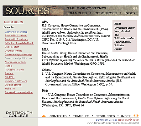 Line lengthThe ideal line length for text layout is based on the physiology of the human eye. The area of the retina that is used for tasks requiring high visual acuity is called the macula. The macula is small, typically less than 15 percent of the area of the retina. At normal reading distances the arc of the visual field covered by the macula is only a few inches wide — about the width of a well-designed column of text, or about twelve words per line. Research shows that reading slows and retention rates fall as line lengths begin to exceed the ideal width, because the reader then needs to use the muscles of the eye or neck to track from the end of one line to the beginning of the next line. If the eye must traverse great distances on a page, the reader is easily lost and must hunt for the beginning of the next line. Quantitative studies show that moderate line lengths significantly increase the legibility of text. Use tables to limit the line length, ideally to ten to twelve words per line. MarginsMargins define the reading area of your page by separating the main text from nontext elements, such as interface elements and other unrelated graphics. Margins also provide contrast and visual interest. Use table cells to establish margins, and use them consistently throughout your site to provide unity. ColumnsOne common use of tables that increases both legibility and functionality of page layouts is a multicolumn layout, with the page divided into columns of main text, site navigation, and perhaps a third column with page-level navigation, pull-quotes, and links to related sites. Multiple columns provide a flexible space for variations in page layout and narrow the text column to a comfortable line length. 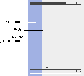
GuttersIn print the space between columns is called a gutter. Gutters keep columns from running into one another: 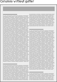
You can use tables to create gutters in three ways: (1) by adding a cell to your table that functions as the gutter, (2) by using the 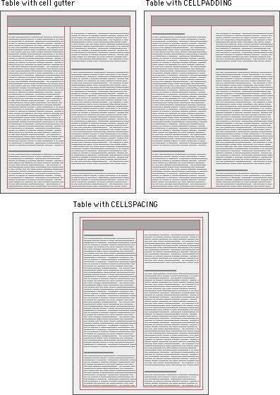
BordersWhen we talk about tables we are not speaking of the beveled beauties that HTML offers to present tabular content. We are using tables to get around the limitations of HTML, and we are using them in ways for which they were not intended. These are invisible tables whose sole purpose is to give us control over page elements, so be sure to set  |
|
|