 |
 | |
| |
|
Characteristics of type on the WebAlthough the basic rules of typography are much the same for both Web pages and conventional print documents, type on-screen and type printed on paper are different in crucial ways. The computer screen renders typefaces at a much lower resolution than is found in books, magazines, and even pages output from inexpensive printers. Most magazine and book typography is rendered at 1200 dots per inch (dpi) or greater, whereas computer screens rarely show more than about 85 dpi. Also, the useable area of typical computer screens is smaller than most magazine and book pages, limiting the information you can deliver on a Web page without scrolling. But perhaps the most distinctive characteristic of Web typography is its variability. Web pages are built on the fly each time they are loaded into a Web browser. Each line of text, each headline, each unique font and type style is re-created by a complex interaction of the Web browser, the Web server, and the operating system of the reader's computer. The process is fraught with possibilities for the unexpected: a missing font, an out-of-date browser, or a peculiar set of font preferences designated by the reader. You should regard your Web page layouts and typography as suggestions of how your pages should be rendered — you'll never know exactly how they will look on the reader's screen. 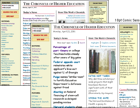  www.chronicle.com www.chronicle.com
|
|
|
|
 PREVIOUS: TYPOGRAPHY contents