Good typography depends on the visual contrast between one font and another and between text blocks, headlines, and the surrounding white space. Nothing attracts the eye and brain of the reader like strong contrast and distinctive patterns, and you can achieve those attributes only by carefully designing them into your pages. If you cram every page with dense text, readers see a wall of gray and will instinctively reject the lack of visual contrast. Just making things uniformly bigger doesn't help. Even boldface fonts quickly become monotonous, because if everything is bold then nothing stands out "boldly."
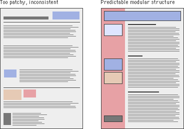
When your content is primarily text, typography is the tool you use to "paint" patterns of organization on the page. The first thing the reader sees is not the title or other details on the page but the overall pattern and contrast of the page. The regular, repeating patterns established through carefully organized pages of text and graphics help the reader to establish the location and organization of your information and increase legibility. Patchy, heterogeneous typography and text headers make it hard for the user to see repeating patterns and almost impossible to predict where information is likely to be located in unfamiliar documents: