by Patrick J. Lynch
and Sarah Horton

10 Forms and Applications
Designing Web Applications
Because web applications place greater demands on the user, it is particularly important to focus on system requirements, avoiding scope creep at all costs. In designing your application, use recognizable interface conventions and provide guidance to help your users be successful.
Restraint and simplicity
Good interface design arises from restraint. All too often, applications are cluttered and complicated by the enthusiasm of their developers, who add in features and functionality because they can and because they might be useful to some users. Users also often get carried away in their requests for features, thinking, Wouldn’t it be great if the application did this, that, and the other thing, and not taking into account the complexity that inevitably results. In the end, users benefit more from simple designs than from a wealth of features. The cost of adding features that benefit a few users is too high to justify the negative effect on overall usability and ease of use. You are better off focusing on the most critical functions of an application and avoiding all nice-to-have or easy-to-add features. Address those critical features with a design that is uncluttered by unnecessary elements.
Design patterns
Design patterns are recognizable patterns for interaction, such as drop-down menus for accessing subsection pages and paging navigation for moving through a sequence of pages. Design patterns are designs that have been introduced and proven effective and then are widely adopted until they become conventions. After widespread adoption, the approach becomes a pattern that is readily recognizable by users, which improves usability. Users can leverage what they know and don’t have to create a new mental model for interaction at each site.
Design patterns for interface elements do not have to look the same, but they do need to share the same interaction model and features. Don’t employ a design pattern but change the way it works. Modifying an existing design pattern is worse than adopting a new approach because it conflicts with the users’ mental model for how the pattern works, and users will have to unlearn and learn how to work with your site (fig. 10.4).
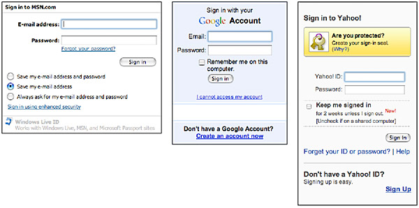
Figure 10.4 — Common design patterns for sign-in boxes.
Controls
html form controls have their basis in the graphical user interface that is used in most modern operating systems. Since these elements are widely used and readily recognizable, users know how to work them, as long as you use them according to convention.
Menus
Menus are helpful for collecting information in a standard format. They work with information where the possible responses are known, such as dates. Using a menu makes for cleaner data collection since the responses can be standardized in both substance and format, whereas users can enter the wrong information, or the right information in the wrong format, in a text input field.
- Select menus have the benefit of providing many choices in a small space, but they can be hard to use. In particular, menus with many options, such as to choose your state or country, are challenging to scan. It’s easier to enter a state or country code than to choose it from a select menu.
- Radio buttons are easy to scan because the options display on the page. However, because a long list takes up screen space, and because long lists are hard for readers to parse, limit your radio button groups to four to six options.
- Checkboxes allow users to make multiple selections. Single checkboxes are also the right control for binary choices, such as yes or no, in which checked means “yes.”
Always set menus to nonactionable defaults to keep users from submitting information that is incorrect simply by neglecting to choose from the menu. For example, make the checkbox default unchecked, and the first item of a select menu a null value, such as “None” or “Select an item” (fig. 10.5).
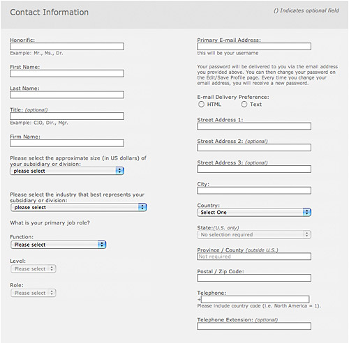
Figure 10.5 — The Gartner signup form offers instructions through field labels and example text, and clearly indicates which fields are optional in the field label. The select menus offer a null value as the default option.
Input fields and text areas
Form fill-in using input fields and scrolling text areas allows users to type information directly into a field rather than choosing from a predefined menu of choices. Fields are required when the information is open-ended and therefore cannot be represented in a menu. Fields are sometime preferable for information that is easier to enter into a field than to choose from a menu. For example, even though dates are predefined, it may be easier to enter the information into a form field than to choose it from a set of menus. “Year of birth” menus, for instance, need to be enormous and can be awkward to manipulate. A simple input field is the easier choice.
Keyboard accessibility
Many users work at the computer using a keyboard without a mouse or by using other input methods, such as a switch device or voice commands, which activate keyboard commands. Some devices, such as cell phones, have only a keyboard. Interfaces that require direct manipulation using a pointing device are inaccessible to these users. For universal usability, all actionable elements must be workable using keyboard commands: directional arrows, the tab key, the return or enter key. Push aside your mouse and work through your web applications and forms using the keyboard only to make sure you are not building in obstacles for keyboard users.
Guiding interaction
A central goal of any design is to be self-explanatory—to tell people how to interact with functional elements. In web forms and applications, the design of the user interface guides users through the functional elements of the page and, using instructions, labels, prompts, and design patterns, explains what is expected and how the page works. The designer’s role of benevolent guide is critical to user success—more important in many ways than designing the functional elements themselves. With gentle guidance, users can recover from mishaps better than when they have to puzzle out a confusing interface on their own.
Field labels
Form labels are essential guides, telling us what information to provide in form fields. html provides a means to attach form labels to form fields, so there is never any mystery about what information is being requested. The <label for> tag associates a label with its element using the “id” attribute:
<label for="departdate">Departing (YY/MM/DD):</label><input type="text" id="departdate" />
When form fields are marked up with labels, that relation of label to field is available to software. For example, users of screen readers can enter a form field and hear its label, along with any instructions contained within the label. Without the label, that information must be gleaned from browsing the surrounding text.
Help and instructions
Contextual help offers answers and guidance within the context of the page. A common implementation of this is the “(What’s this?)” concept used by Amazon to explain new and potentially confusing features. Contextual help is often offered in a second, auxiliary window. This method allows users to get help without having to deviate from the task at hand (fig. 10.6).
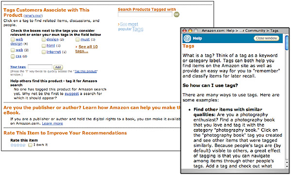
Figure 10.6 — Pop-up help windows allow users to maintain content and focus on a task while they get the help that they need.
A web form often needs to provide instructions beyond simple form labels. Some types of information, such as dates and credit card numbers, for example, need to share a standard format. Ideally, the user can enter the information in a variety of formats, and the system will be smart enough to reconfigure the information to the required format. In reality, however, not all our systems are that smart, in which case we need to ask the user to enter the information in the required format.
A date, for example, can be entered in a variety of formats, but your backend system architecture may require a specific format, such as year, month, and day. Provide an example in the field label, for example, “Departing (yy/mm/dd).” Also, be sure to note which fields are required, and use a universally accessible method. Don’t rely on color, because not all users can distinguish colors. One convention is to use an asterisk (“*”) to denote required fields. To avoid ambiguity, include the word “required” in the form label (fig. 10.7).
Figure 10.7 — Always make it clear to users which elements of the form are required and which are optional.
Do not use field default text for essential instructions. Default text displays within an input field and can provide help and instructions without using precious screen space. However, default text disappears when the user activates the field to enter information, which is just when the instructions are needed most (Was that year, month, day, or day, month, year?). The best location for instructions is on the screen, alongside the corresponding form element (fig. 10.8).
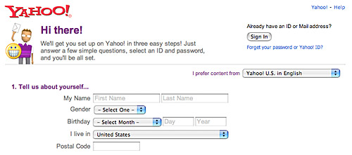
Figure 10.8 — Default field text is not the best option for providing instructions because the default text disappears when the field is activated.
Responding to errors
The best way to handle errors is to keep them from happening, which often means adding functionality to web applications. For example, an email application must address that fact that users may unintentionally delete files. One way to prevent this is to ask users to confirm their choice every time they ask to delete a file, which can quickly turn into nagging. A better approach is to allow users to go ahead and delete but to save all deleted messages in a location where they can be readily retrieved.
Not all errors can be prevented, however, and web application design involves responding to errors in a way that is informative and helps users get back on track.
Providing feedback
Client-side scripting provides effective methods for preventing and responding to errors. These methods are worth exploring, but keep in mind that some users may not enjoy their benefits. Provide other methods—for example, also validate data when a form is submitted—to make sure you respond to all errors.
Form completion is more usable when users get feedback as they work through a form rather than after the fact, on submission. For example, a form that has required fields will be completed successfully the first time if the fields are monitored and the submit button is enabled only when all the required fields have been completed (fig. 10.9).
Figure 10.9 — The best forms actively monitor user input and correct errors as they occur.
When an error occurs, let the user know. This may seem obvious, but many lazy applications simply return the same page when a user submits a form with an error. For example, some login screens simply display the login again when the login fails. Instead, return the page with feedback right at the top of the page, indicating that an error occurred. An alert icon can be helpful in drawing attention to an error message, but be sure to include alternate text with the image (alt="Alert!") so that nonvisual users know that the icon and text comprise an error message. Provide specifics about what happened: “Your password is incorrect” rather than “Your username and password do not match.” Provide this explanation next to the field in question—in this case, next to the password field (fig. 10.10).
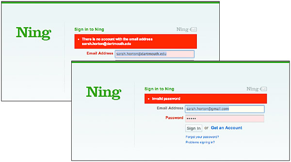
Figure 10.10 — Proximity counts! If the user makes an error, provide specific, descriptive help in the immediate area of the problem.
Explaining errors
In responding to errors, make sure your error messages are tuned to users’ needs. Error messages are too often written in programmer speak, either too detailed and specific or too vague, offering little in the way of explanation and guidance on where to go next (“Operation failed: try again”). Give users just enough information about what happened. They don’t need to know that the error number is “404,” but they do need to know that the page they requested cannot be found on the server. Provide guidance about what to do in response to the error. If the page cannot be found, offer search and a site map to help the user find it, along with links to the main sections of your site (fig. 10.11).
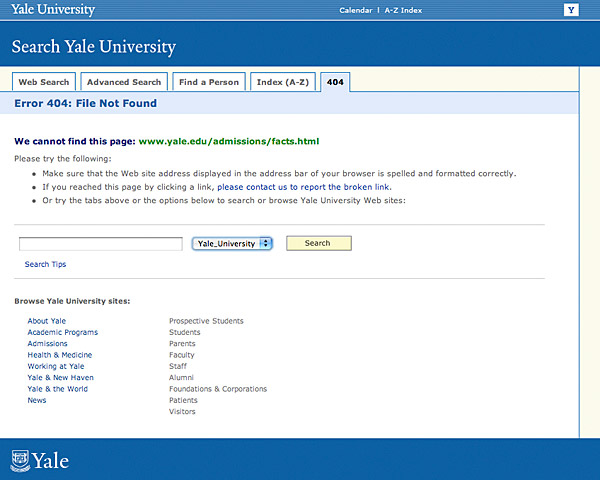
Figure 10.11 — Typing errors, broken links, and missing pages are inevitable. Don’t just point out the “Error 404.” Provide as much help as you can to the user in your “error” screens, with search, navigation, and suggestions.
On the subject of missing pages, use server logs to track failed requests—that is, pages that are being requested but are not on the server. If an important page moves, send users to the new location with a redirect. If a page or section is receiving numerous failed requests, consider adding a link to the section on your custom error page. Be sure to check your links periodically to make sure they are functioning properly.