by Patrick J. Lynch
and Sarah Horton

6 Page Structure
Page Templates
Always start your template work with an internal page, because the internal page template will dominate the site. The home page is important, but the home page is inherently singular and has a unique role to play. Your internal page template will be used hundreds or thousands of times across larger sites, and the navigation, user interface, and graphic design of the internal pages will dominate the user’s experience of your site. Get your internal page design and navigation right, and then derive your home and secondary page designs from the internal page template (fig. 6.8).
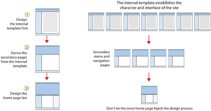
Figure 6.8 — A logical ordering for internal, menu, and home page designs.
Internal page templates
Internal page templates must accomplish these important functions:
- Global and local site navigation: make them logically consistent with the information architecture and structural organization of your site
- Design framework: organize content consistently throughout the site
- Graphic tone: establish the look and feel of the site, ideally with a system dominated by consistent visual elements, but with enough flexibility to create distinct regions within a large site
Types of internal pages
In larger sites containing a variety of content, your internal page template may be a set of templates that vary in details, such as the number of columns, to accommodate the range of content and user interface needs (fig. 6.9).
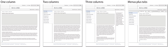
Figure 6.9 — In larger sites the “template” is rarely a single layout and usually incorporates multiple variations to accommodate the full range of content and applications required.
Sites that incorporate web applications, blog or wiki formats, or complex forms may need a simplified template variation that strips away some of the usual site navigation elements. Applications, complex forms, large data tables, and many kinds of highly graphic content (artwork, engineering drawings, repair manual graphics, and so on) usually require as much screen space as possible (fig. 6.10).
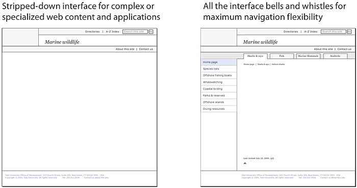
Figure 6.10 — Always include a stripped-down version of the template (left) for large graphics, large data tables, or complex web applications.
Secondary page templates
Most sites are organized in a multitiered hierarchy, with vertical dimensions (home, secondary pages, internal pages) and a horizontal spread of distinct content regions that graphically and organizationally help the reader navigate. Secondary page templates should be closely related to the internal page template but must accommodate these additional functions:
- Establish a tiered hierarchy of header labels that sets the relationship of the secondary page to the home page and larger enterprise site, as well as to the internal pages
- Provide a distinct look that identifies the secondary page as a special “sub-home page” and establishes a clear content theme
Secondary page templates help create a concrete sense of the vertical dimension of sites and may perform varied functions in the tiers between the home page and the internal content pages.
Navigation and submenu pages
Complex, multitiered sites usually need submenu pages to provide an organizing and navigational focal point for major subsections or regions of the site. These submenu pages are effectively the home page for that block of content.
Alternate “front doors” or “landing pages”
Many marketing or communications campaigns that point to web sites require a focused, immediately recognizable page to bring in visitors. These alternate entry points must bear a clear graphic and topical relation to the marketing graphics, featured product, or communications theme, but because they also function as alternate home pages, they should orient visitors to the larger site navigation as well (fig. 6.11).
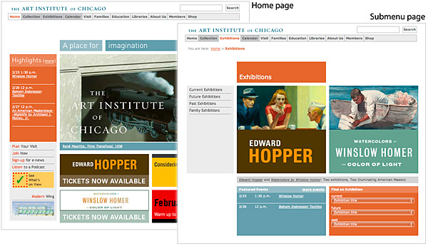
Figure 6.11 — If you are featuring “Exhibitions” in your advertising, send visitors to a special submenu page that matches your ad campaign.
Department or program home pages
Large corporate or enterprise sites require secondary or even tertiary levels of pages that act as home pages for the local department or program. In a multi-tiered site your template system should establish a clear hierarchy of page header labeling and titles so that readers can see the relation of a department page to the larger enterprise (fig. 6.12).
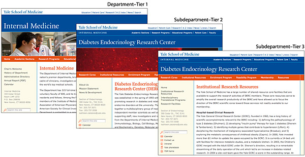
Figure 6.12 — Department site templates should mirror the hierarchical structure of the departments in a carefully planned series of interrelated templates.
The home page
Designing an effective home page can seem daunting, but if you’ve already thought through the fundamentals of your site navigation and have done the hard work of creating internal and secondary page templates, you have a great head start. Designing the home page layout last allows you to acknowledge the unique introductory role of the home page but places the design firmly within the larger navigational interface and graphic context of the site.
Home pages have four primary elements:
- Identity
- Navigation
- Timeliness, or content focus
- Tools (search, directories)
Good home page designs always blend these four factors. How you blend them depends on the overall goals of your site, but most good home pages do not balance all four elements equally. Home pages often have a distinctive theme in which one factor dominates. Amazon’s home page is all about navigation to products. Yale University’s home page projects identity. The Atlantic is dominated by timeliness and content. Google’s famously lean home page is all about tools. An effective home page can’t be all things to all people. Decide what your priorities are, and build a home page that gives the user a clear sense of theme and priority (fig. 6.13).
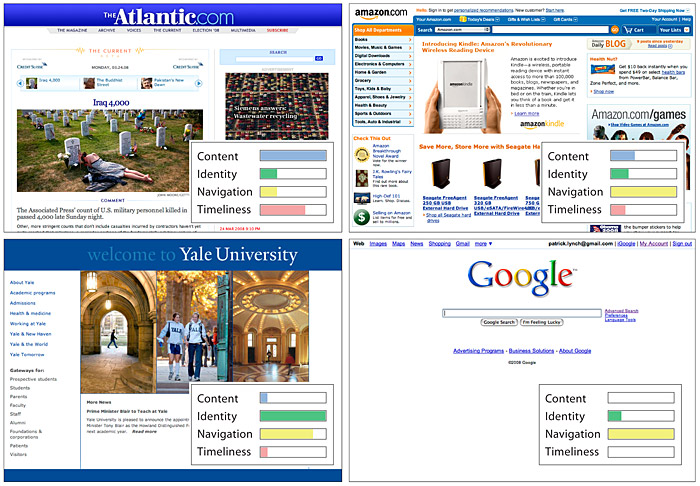
Figure 6.13 — Four home page variations for very different institutions and purposes. Home page designs should always reflect a particular design strategy, depending on the nature and business intent of the web site.
Not all effective home pages have such singular emphasis. For example, Dartmouth College’s home page strongly projects both identity and a lively sense of campus life. Navigation and tools aren’t neglected, but they play a secondary role in the overall page impact (fig. 6.14).

Figure 6.14 — Dartmouth’s home design offers a good balance of identity, timeliness, navigation, and institutional identity.
Taglines
Too many sites project a strong brand image with logos and bold graphic design and then utterly fail to explain themselves to the new user. Unless you own one of the world’s top one hundred brands, always put a brief explanatory comment, or tagline, prominently on the home page, so users understand instantly what you do and what you have to offer them. Taglines should be concise (“Alibris: 100 million items. 10,000 independent sellers. Your marketplace.”), but don’t use a vague company motto. “We bring good things to life” is admirable but doesn’t explain a thing about what General Electric can do for you. Users looking for content, services, or merchandise couldn’t care less about your department’s mission statement, so put that on your “about us” page, not on the home page.
Kiva’s succinct service statement at the top of its home page is essential for a lesser-known brand and a novel service (fig. 6.15).

Figure 6.15 — The purpose of the Kiva site is not self-evident to new users, and the header tag line (“loans that change lives”) becomes a crucial explanation.
Home page content and “the fold”
The roughly 65–75 square inches at the top of a home page comprise the most visible area of the web site. Most users will be looking at your site on 19–22-inch monitors or laptop screens, and the top 6 or 7 vertical inches are all that is sure to be visible on average screens, particularly on the short, wide screens of most laptops. The “above the fold” metaphor refers to the middle fold in classic broadsheet newspapers like the New York Times or Wall Street Journal. Front-page stories above the fold are the most important and visible.
In sites designed for efficient navigation the density of links at the top of the home page should be maximal within the limits of legibility. Judging by two of the top sites on the web, that maximum density is about one visible link per square inch of screen space, or about seventy-five links in approximately seventy-five square inches (fig. 6.16).
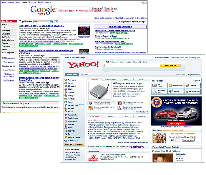
Figure 6.16 — Page designs from two complex, high-traffic news sites.
Of course, it’s not likely that the average site needs anywhere near this much density of information. Some sites, such as the Denver Zoo, are designed to fit on the screen, with little or no need to scroll (fig. 6.17).

Figure 6.17 — The Denver Zoo home page design offers a full range of options on the first screen.
Dropdown menus
When there is a lot of content or merchandise categories to fit on the home page, there is the temptation to use dropdown menus to cram many choices into a small screen area. The space savings, though great, come at a cost to visibility and usability, because most choices are hidden until the user activates the menu. Careful navigation design can yield an effective hybrid strategy, in which you don’t rely on dropdown menus but rather provide them as enhanced functionality for users who choose to explore them (fig. 6.18).
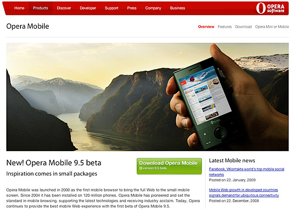
Figure 6.18 — Opera uses classic header-based global navigation, coupled with menus that drop down as you roll over each header category.
Dropdown menus are difficult to implement well using html and css. Although a standards-based html/css dropdown menu will be somewhat accessible and visible to search engines, the standard menu functionality that users expect from their Mac and Windows interfaces is not possible to reproduce using web tools alone. Web dropdowns tend to be slower and less forgiving of errors in mouse positioning than menus on Mac or Windows operating systems. Older users and users with less hand-eye coordination usually hate web dropdown menus, especially because they are often implemented with small font sizes and small cursor target areas.
Avoid dropdown menus that depend exclusively on JavaScript because they may not be accessible to keyboard users. Remember, too, that search engine spiders do not execute JavaScript code on the pages they scan, which is a huge disadvantage because navigation menu items make ideal keywords and linked keywords count heavily in search engine ranking. When using JavaScript to provide enhanced menu functionality, make sure the menus are workable from the keyboard and with JavaScript disabled.
Topical navigation versus path-splitting
Users usually arrive at a home page with specific topical or product interests or functional goals in mind. Most home pages thus feature prominent navigation lists or visual menus of topics, products, and services. Sometimes, however, users identify their interests by their identity or role. For example, it’s common for university sites to “split paths” on the home page into prospective students, current students, parents, faculty, and other groups and then present various submenu pages oriented to the interests and needs of each group (fig. 6.19).
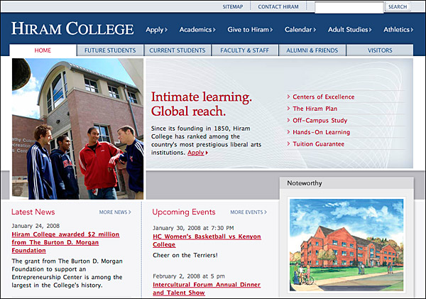
Figure 6.19 — Hiram College’s header tabs “split paths,” offering each major reader group (students, faculty, visitors) a special section tuned to its unique needs.
Web splash pages or “splash screens”
The two most useless words on the web are “Skip intro.” For the vast majority of users, graphic or animated splash screens are an annoying extra mouse click on the way to real content. Splash pages are not accessible in any meaningful way, and if they depend on JavaScript, ActionScript, or other scripting to move the user to the real home page, most web search engine spiders will never get past your splash page, effectively preventing your highest-traffic page from contributing to your search rankings. Don’t ever use an indulgent, functionally useless splash page as “eye candy” at the entrance to your site. Ever.