by Patrick J. Lynch
and Sarah Horton

4 Interface Design
Navigation and Wayfinding
In his book The Image of the City (1960), Kevin Lynch coined the term “wayfinding” to describe his concept of environmental legibility—that is, the elements of the built environment that allow us to navigate successfully through complex spaces like cities and towns. The most fundamental underlying metaphor of the World Wide Web is navigation through a space populated by places we call web “sites,” and thus the wayfinding metaphor is perfect for thinking about web navigation (fig. 4.1).
Wayfinding has four core components:
- Orientation: Where am I am right now?
- Route decisions: Can I find the way to where I want to go?
- Mental mapping: Are my experiences consistent and understandable enough to know where I’ve been and to predict where I should go next?
- Closure: Can I recognize that I have arrived in the right place?
In interviews conducted in various cities, Lynch had local residents draw maps of their cities from memory. The mental maps that residents create are crucial to wayfinding in their environment. An individual’s map of the local environment is unique, but Lynch found that most people’s maps were populated by five types of elements:
- Paths: Familiar streets, walkways, subway routes, bus lines
- Edges: The physical barriers of walls, fences, rivers, or shorelines
- Districts: Places with a distinct identity, such as, in New York, Chinatown, Wall Street, and Greenwich Village
- Nodes: Major intersection or meeting places, such as the clock in New York’s Grand Central Terminal
- Landmarks: Tall, visible structures that allow you to orient over long distances
Although you can readily see the parallels with navigation on the web, the web is a special kind of space that often doesn’t provide the concrete spatial and navigational clues we take for granted in the real world of walking through a town. Web navigation has many similarities to physical movement, but actual travel on the web is magical: you just appear at the next point in your journey from page to page, and there is no experience of the landscape unfolding before you as a series of landmarks.
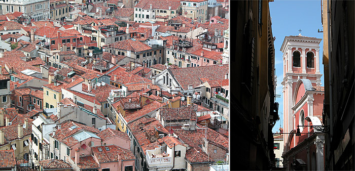
Figure 4.1 — Venice is beautiful, but without the churches and campaniles that tower over the city and provide landmarks for navigation through the neighborhoods, the streets and canals would be a confusing warren of twists and turns to the visitor.
There’s no sense of scale or movement in space
We don’t pass familiar landmarks unless we’re deliberately browsing through a site hierarchy. Most of the time we just suddenly appear in a new place, and the “journey” itself provides no information on our new location.
There’s no compass
There are no directions and often no clear sense of heading a particular direction. This lack of abstract direction is what makes links to home pages so crucial in web navigation: your orientation to home and whether you are heading away from the home page or toward the home page is about all the sense of “direction” there is in many sites.
You are here
All of this argues for concrete, visible, easy-to-understand navigational cues on web pages. Print designers and editors often chafe at the heavy interface framing of web pages—do we really need such a burden of headers and footers and buttons and links? Well, yes, we do. Without that navigation interface, and all the “you are here” markers it provides, we’d all be back to that lost-in-space feeling that was so common in the early days of the web.
Paths: Leading the way
In web sites paths are the consistent, predictable navigational links that appear the same way throughout the web site. Paths can be purely in the user’s mind, as in your habitual navigation through a favorite newspaper site. Paths can also be explicit site navigation elements such as breadcrumb trails that show you where you are in relation to the overall site (fig. 4.2).
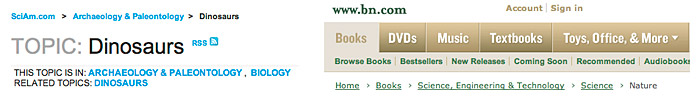
Figure 4.2 — Two examples of breadcrumb trails in site headers.
Districts and edges: The paradox of consistency
Consistency is the golden rule of interface design and wayfinding, but there is a paradox at the heart of consistency: if everything looks the same, there are no edges. How can you tell where you are or when you have moved from one space to another? A well-designed site navigation system is built on a consistent page grid, terminology, and navigation links, but it also incorporates the visual flexibility to create identifiable regions and edges within the larger space. In a corporate site, if you move from one region to another—say, from marketing to human resources—you ought to notice that you just passed an important regional boundary (fig. 4.3).
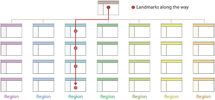
Figure 4.3 — In large sites users should be able to readily see when they have passed important regional boundaries. If all the pages look identical, it’s hard to tell where you are within a large site.
Nodes: The local coffee shop or Times Square?
Coffee used to be easy: it was regular or black. Now with six kinds of mocha skim lattes on offer, coffee has become yet another potential point of stress in your day. In Western societies we equate freedom with a range of choices, but as psychologist Barry Schwartz points out in his book The Paradox of Choice, an overwhelming range of choices causes stress, slows our decision-making, makes us generally less satisfied (did I make the right choice from my eighty-nine options?), and makes us more likely to walk away from making any choice at all. “Give the user choices” is a constant mantra in user interface design, but too many choices delivered simultaneously leave most users overwhelmed and likely to abandon the problem altogether (fig. 4.4).
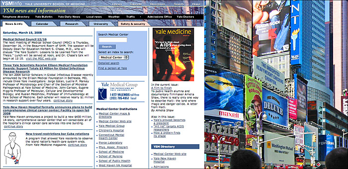
Figure 4.4 — As pages get more complex, you risk overwhelming the user with the “Times Square effect” of too many competing visual stimuli.
Landmarks: “You are here”
Orientation cues are particularly important in the web interface, since users often arrive at a page without having followed a deliberate and repeatable path. For example, one point of web wayfinding that is quite unlike navigation in physical space is search, which cuts across all the normal wayfinding boundaries to provide a view of every occurrence of a keyword or phrase across the web site. Search is more than an automated directory function; search can deliver you directly from one point in a site to another, and that direct connection makes the user all the more dependent on “you are here” cues from the user interface of the site.
Summary: Principles for wayfinding in web sites
- Paths: Create consistent, well-marked navigation paths
- Regions: Create a unique but related identity for each site region
- Nodes: Don’t confuse the user with too many choices on home and major menu pages
- Landmarks: Use consistent landmarks in site navigation and graphics to keep the user oriented
Browse versus search
User interface research shows that about half of web users prefer to browse through menu lists of links to find information, and the other half will go straight to the search box to enter keywords for search. All readers will use both the browse and search features of a site at some point, so supporting both navigation paradigms is important to user interface design. As the web has become larger and more complex, the dependence on search technology has become greater, both for users seeking information and for web publishers hoping users will find their content.
Orientation
Both the browse and search aspects of navigation must support the user’s sense of location and orientation to the major landmarks of a site. Core page components and interface elements (see Interface Design, below) are relevant to both browsing and searching; they establish and maintain a broad sense of a web site as a navigable space and provide a “you are here” sense of local placement within the larger dimension of the site. Breadcrumb trails, tabs or links that change color to indicate the current location, and section titles all contribute to a firm sense of place within a site (fig. 4.5).
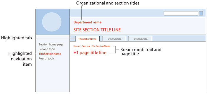
Figure 4.5 — Multiple and complementary “you are here” markers help users stay oriented in complex sites.
These landmark and wayfinding elements are especially important to users who navigate by searching. The browse interface allows users to move gradually through a site, seeing various landmarks as they pass through the site hierarchy (fig. 4.6). Web search allows a user to cut directly into a site hierarchy with no preamble. Users who come to your site from a general Internet search engine like Yahoo! or Google may arrive directly at a page deep within the organization of your site. As web search becomes the way most of your audience reaches your site, the percentage of users who see your home page is decreasing all the time (fig. 4.7).
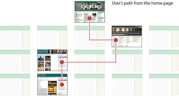
Figure 4.6 — Interface consistency is essential in institutional web design, but distinctive graphic variations in regions of a site can form wayfinding “landmarks” that readers pass by as they browse through the site, much as distinctive real-world buildings, streets, and signs help travelers navigate through towns. www.dartmouth.edu
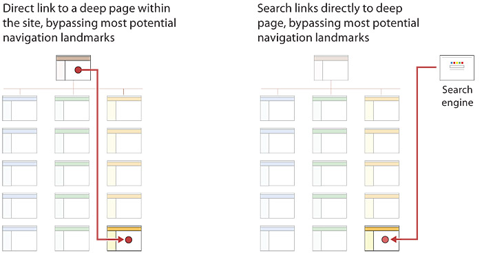
Figure 4.7 — Your home page is not the only gateway to your site. Search engine users increasingly arrive at a site on internal content pages, not the home page.
Supporting web search users
The most fundamental support for users who prefer to search is to make search easily available from every page of your site. Users expect that any site of more than a few pages will have a search feature. Research shows that there are specific areas of the page where users expect to see a search box (fig. 4.8).
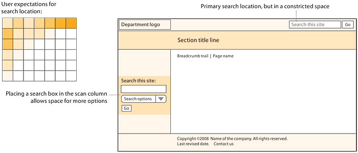
Figure 4.8 — Conventions are your friends. Always put the search box where users expect to find it.
Always be sure you let users know the scope of what they are searching. It’s confusing when users enter a keyword thinking that they are searching only the current web site but then get search results from the whole company or the whole Internet (“Results 1–100 of about 5,100,000,000 for ‘help’”). In simple search forms you can make the scope of the search clear in the field label. Where there is more room on the page the search form can offer more options to control the scope of the search (fig. 4.9).
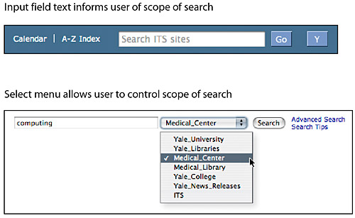
Figure 4.9 — The search options you offer may determine the location of your search boxes. Header search boxes are convenient but are necessarily simple.
To preserve the user’s sense of place within your site, the results of a user’s search query should appear on a page that looks like the rest of the web site. For large institutions, as long as the larger institutional site is well organized and graphically consistent, every small subsite does not need to have a custom search page.
Search is powerful, but web search is no substitute for a coherent site architecture, carefully expressed in your page design and navigation. Ironically, search navigation is heavily dependent on those interface elements and page design features that we think of as part of the standard browsing interface. By cutting out the intermediate steps in browsing through an information hierarchy, search can deliver the user to pages deep inside a web site, where only the “browsing” interface of site graphics, page titles, breadcrumb trails, and navigation links can supply the cues that allow users to establish their “you are here” location within the site.