by Patrick J. Lynch
and Sarah Horton

4 Interface Design
Interface Design
Readers need a sense of context of their place within an organization of information. In paper documents this sense of where you are is a mixture of graphic and editorial organizational cues supplied by the graphic design of the book, the organization of the text, and the physical sensation of the book as an object. Electronic documents provide none of the physical cues we take for granted in assessing information. When we see a web hypertext link on a page we have few clues to where we will be led, how much information is at the other end of the link, and exactly how the linked information relates to the current page.
Even the view of individual web pages is restricted for many users. Most web pages don’t fit completely on a standard office display monitor; there is usually a lower part of the page that the user cannot see. Users of small-screen mobile devices have an even more limited view-port, and a big-picture view of a web page is impossible for screen reader users, who access pages an element at a time. Web pages need to give the user explicit cues to the context and organization of the site because only a small segment of any site is available at one time (fig. 4.10).
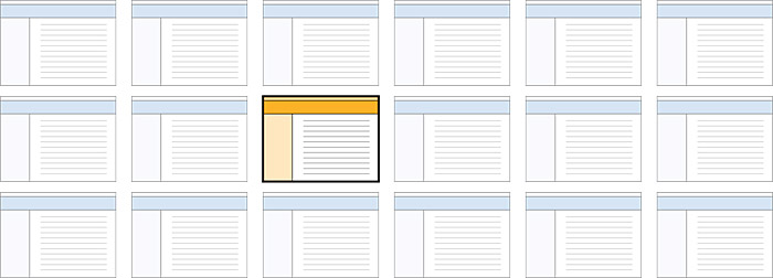
Figure 4.10 — No matter how big your site is, users only see one page at a time.
Clear navigation aids
Most user interactions with web pages involve navigating hypertext links between documents. The main interface problem in web sites is the lack of any sense of where you are within the local organization of information. Clear, consistent icons, graphic identity schemes, page titles and headings, and graphic- or text-based overview and summary screens can give users confidence that they can find what they are seeking without wasting time.
Users should always be able to return easily to your home page and to other major navigation points in the site. These basic links should be present and in consistent locations on every page. Headers provide basic navigation links and create an identity that tells users they are within the site domain.
In the Digital Web Magazine site, for example, the header appears on every page (fig. 4.11). The header is efficient (offering multiple choices in a small space) and predictable (it is always there, at the top of every page), and it provides a consistent identity throughout the site.
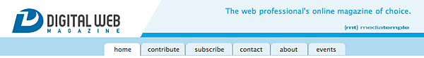
Figure 4.11 — Headers are essential for both site identity and consistent navigation. www.digital-web.com
No dead-end pages
Web pages often appear with no preamble: users can make or follow links directly to subsection pages buried deep in the hierarchy of web sites. They may never see your home page or other introductory site information. If your subsection pages do not contain links to the home page or to local menu pages, the user will be locked out from the rest of the web site (fig. 4.12).
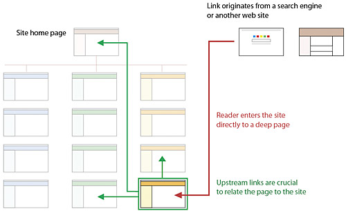
Figure 4.12 — Users can enter a site anywhere and need instant cues to site identity and “you are here” markers.
Make sure all pages in your site have at minimum a link back to the home page or, better yet, a home page link along with links to other main sections of the site. In addition to user interface considerations, these links are crucial for search engine visibility.
Direct access
Users want to get information in the fewest possible steps. This means that you must design an efficient hierarchy of information to minimize steps through menu pages. Studies have shown that users prefer menus that present at least five to seven links and that they prefer a few pages of carefully organized choices over many layers of oversimplified menu pages. Design your site hierarchy so that real content is just a click or two away from the main menu pages of your site.
Simplicity and consistency
Users are not impressed with complexity that seems gratuitous, especially those users who may be depending on the site for timely and accurate information. Your interface metaphors should be simple, familiar, and logical—if you need a metaphor for collections of information, choose a familiar genre, such as file folders. Unusual or peculiar “creative” navigation and home page metaphors always fail because they impose an unfamiliar, unpredictable interface burden on the user. Baffle users with a weird home page, and they will quickly hit the “back” button and move on to the next item on the Google results page, and you’ll have lost a potential reader or customer. Let your content shine, and let the interface recede. Opera is a master of balancing bold content with a minimal but highly usable interface (fig. 4.13).
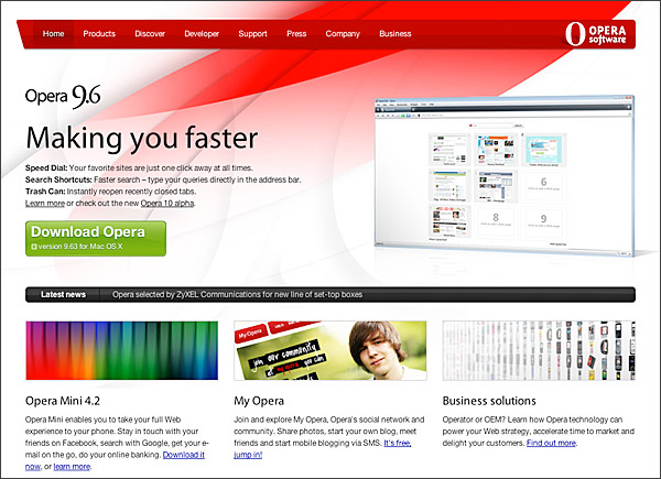
Figure 4.13 — The Opera site is a masterpiece of balancing high functionality with low-key interface elements. www.opera.com
The best information designs are never noticed. Once you know where the standard links are on the page header graphics, the interface becomes almost invisible. Navigation is easy and never competes with content for your attention (fig. 4.14).
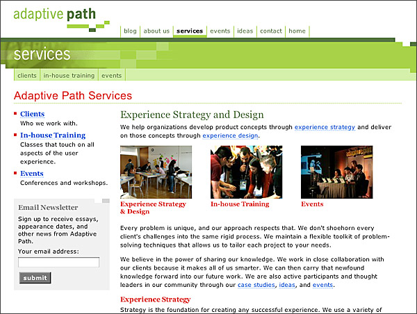
Figure 4.14 — Adaptive Path’s consistent headers show users the site structure at a glance.
For maximum functionality and legibility, your page and site design should be built on a consistent pattern of modular units that all share the same basic layout grids, graphic themes, editorial conventions, and organization hierarchies. The goal is to be consistent and predictable; your users should feel comfortable exploring your site and confident that they can find what they need. The graphic identity of a series of pages in a web site provides visual cues to the continuity of information. The header menu present on every page of the Capgemini site creates a consistent user interface and corporate identity (fig. 4.15).
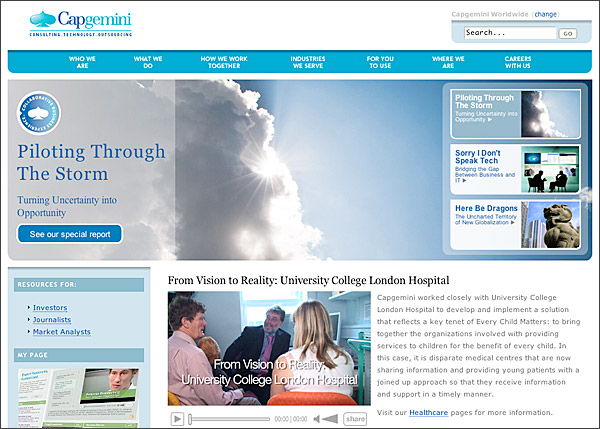
Figure 4.15 — Capgemini offers strong site identity and navigation that never competes with page content for the reader’s attention.
Even if your site design does not employ navigation graphics, a consistent approach to the layout of titles, subtitles, page footers, and navigation links to your home page or related pages will reinforce the user’s sense of context within the site. To preserve the effect of a “seamless” system of pages you may wish to bring important information into your site and adapt it to your page layout scheme rather than using links to send the reader away from your site (but be sure there are no copyright restrictions on copying the information into your site).
Design integrity and stability
To convince your users that what you have to offer is accurate and reliable, you will need to design your web site as carefully as you would any other type of corporate communication, using the same high editorial and design standards. A site that looks sloppily built, with poor visual design and low editorial standards, will not inspire confidence.
Functional stability in any web design means keeping the interactive elements of the site working reliably. Functional stability has two components: getting things right the first time as you design the site, and then keeping things functioning smoothly over time. Good web sites are inherently interactive, with lots of links to local pages within the site as well as links to other sites on the web. As you create your design you will need to check frequently that all of your links work properly. Information changes quickly on the web, both in your site and in everyone else’s. After the site is established you will need to check that your links are still working properly and that the content they supply remains relevant.
Feedback and dialog
Your web design should offer constant visual and functional confirmation of the user’s whereabouts and options, via graphic design, navigation links, and uniformly placed hypertext links. Feedback also means being prepared to respond to your users’ inquiries and comments. Well-designed web sites provide direct links to the web site editor or webmaster responsible for running the site. Planning for this ongoing relationship with users of your site is vital to the long-term success of the enterprise.
Bandwidth and interaction
Users will not tolerate long delays. Research has shown that for most computing tasks the threshold of frustration is about ten seconds. Web page designs that are not well “tuned” to the network access speed of typical users will only frustrate them. Check your web site logs to be sure that you understand your typical user’s location and network connections. If you have many international users, for example, you may want to be more conservative about large graphics on your pages (fig. 4.16).
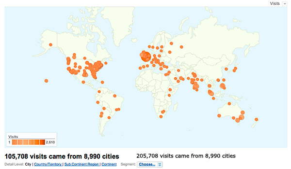
Figure 4.16 — Web traffic analysis programs like Google Analytics are a goldmine of information on who is using your site and what their technical capabilities are.
Also beware of potentially slow dynamic content components in your site, such as rss feeds, text from content management systems, or other data sources that can slow the loading of web pages.
Ideally your company webmaster should be able to supply reports and data on your typical users and their equipment. If you don’t have easy access to this information from your organization’s web server logs, you may be able to use a free service like Google Analytics to better understand your users.
Interface design conventions
Most text-oriented informational web sites are converging on a relatively consistent layout of header, footer, local navigation, and content elements that together make a useful, familiar starting point for web interface designs. In general, people find the familiar easier to use and remember, and if your site follows these familiar patterns, users will quickly adapt and begin to focus on your unique content, features, or products (fig. 4.17).
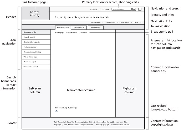
Figure 4.17 — A canonical page layout. Not every page includes every element shown here.
As you design the interface for your site, remember that the ideal web interface should never compete with the page content for the user’s attention. The interface is the frame, not the painting.
What goes in the header area?
Web page headers convey the site identity, provide major navigation links, and often offer a search box. The header is where people expect to see a consistent statement of your organizational identity, and the header graphics and text are probably the most important elements in making a collection of web pages feel like an identifiable “site” rather than a random assemblage of files.
User research shows overwhelmingly that users expect that the top left area of your page header will contain both a visual indication of who you are, plus a link back to your site’s home page. Users also expect that the header may play an important role in global navigation within your site. Important navigation links are often arrayed horizontally within the page header.
“Folder tabs” are ideal when your site has relatively few (five to seven) major navigation categories. If you have more than seven major categories, consider dropping the tab metaphor in favor of a well-organized set of plain text links (fig. 4.18, top). When carefully designed, header tabs can also handle complex navigation (fig. 4.18, middle).


Figure 4.18 — Various header navigation designs and “you are here” markers.
Semantically, header navigation lists should always be marked up as html lists, even if what appears on the page looks more like a collection of folder tab graphics. This semantic handling of header lists has powerful advantages for universal accessibility and helps clarify your site organization for search engines. Designers can use Cascading Style Sheets to style lists of navigation links to look like tabs. Opera’s page headers are minimalist tabs but convey every essential page header function in a compact design (fig. 4.18, bottom).
Right or left columns for navigation links?
According to most user interface and eye-tracking studies, users quickly adapt to content navigation within either the left column or far-right column of web pages—just be consistent in how you lay out your navigation on all pages. Left navigation columns are much more common and therefore have an edge in usability because all web users are familiar with them (fig. 4.19).
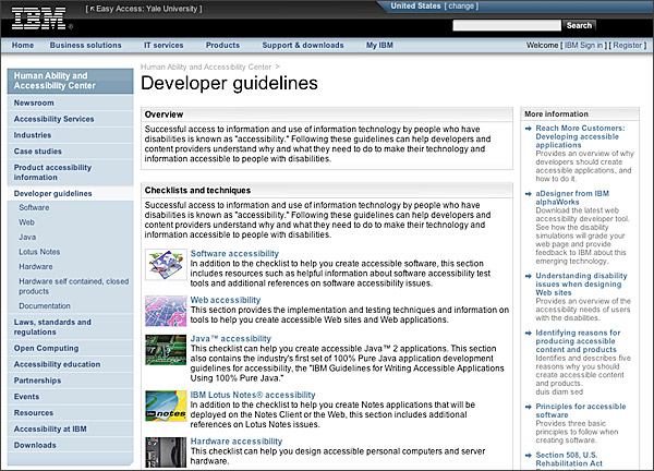
Figure 4.19 — Classic left local navigation, with hierarchical lists.
Right navigation columns are more often dominated by external or more parenthetic “related links” or by advertising. The dominant user expectation that right columns contain advertising suggests that any right-column navigation links you use should look very different from advertising, or your navigation may be ignored by many users.
Breadcrumb trails for navigation
Over the past decade breadcrumb trails have emerged as a powerful yet easy-to-understand navigation device of web pages. The name is derived from the metaphor of leaving breadcrumbs along your path to find your way back where you came from. In practice a breadcrumb trail is a simple hierarchical list of web links showing the structure of a site, usually starting with the home page and ending with the major navigation page closest to your current location within the site (fig. 4.20).
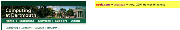
Figure 4.20 — Two examples of breadcrumb trails within or just under the page header.
Each step in the breadcrumb trail is a clickable web link, so users have both a visual indication of their current location within the site and a clickable menu of major navigation sections for the site. In addition to its user interface advantages, the breadcrumb trail plays a potentially powerful role in adding major linked keywords to each web page, increasing the search visibility and keyword relevance of a page.