by Patrick J. Lynch
and Sarah Horton

7 Page Design
Page Width and Line Length
The ideal line length for text layout is based on the physiology of the human eye. The area of the retina used for tasks requiring high visual acuity is called the macula. The macula is small, typically less than 15 percent of the area of the retina. At normal reading distances the arc of the visual field covered by the macula is only a few inches wide—about the width of a well-designed column of text, or about twelve words per line. Research shows that reading slows as line lengths begin to exceed the ideal width, because the reader then needs to use the muscles of the eye or neck to track from the end of one line to the beginning of the next line. If the eye must traverse great distances on a page, the reader must hunt for the beginning of the next line (fig. 7.18).
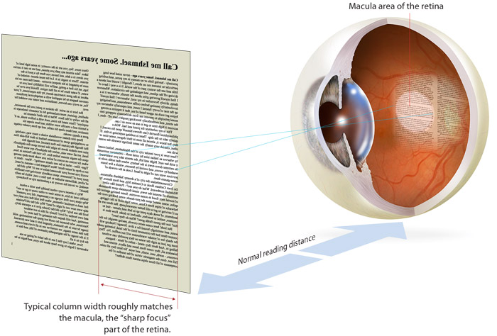
Figure 7.18 — Columns of text work well because they complement aspects of our visual system.
Given the user-defined nature of the web and the vagaries of technology, it’s impossible to control line length in all circumstances. A line that is designed to display a comfortable sixty-six characters per line of standard text will become a narrow, twenty-character line if the user enlarges the default browser text size. A multicolumn layout with fixed column widths can easily become difficult to read with enlarged text.
Universal usability offers a great solution to the line-length problem by ensuring that the page design can fluidly adapt in page width, so that users are not locked into a single view that may not work well for them. Readers can adapt line length in fluid layouts by narrowing the browser window.
Page length
Determining the proper length for any web page is a balance of four factors:
- The relation between page and screen size
- The content of your documents
- Whether the reader is expected to browse the content online or to print or download the documents for later reading
- The bandwidth available to your audience
Researchers have noted the disorientation that results from scrolling on computer screens. The reader’s loss of context is particularly troublesome when such basic navigational elements as document titles, site identifiers, and links to other site pages disappear off-screen while scrolling. This disorientation effect argues for the creation of navigational web pages (especially home pages and menus) that contain no more than one or two screens’ worth of information and that feature local navigational links at the beginning and end of the page layout.
Long web pages require the user to remember too much information that scrolls off the screen; users easily lose their sense of context when the navigational buttons or major links are not visible (fig. 7.19)
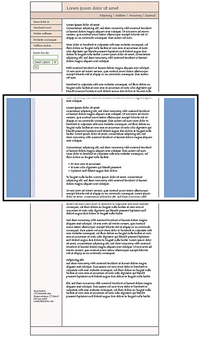
Figure 7.19 — Although average screen width increases every year, screen height in laptops increases much more slowly.
But long web pages have their advantages. They are often easier for creators to organize and for users to download. Web site managers don’t have to maintain as many links and pages with longer documents, and users don’t need to download multiple files to collect information on a topic. Long pages are particularly useful for providing information that you don’t expect users to read online.
It makes sense to keep closely related information within the confines of a single web page, particularly when you expect the user to print or save the text. Keeping the content in one place makes printing or saving easier. But more than four screens’ worth of information forces the user to scroll so much that the utility of the online version of the page begins to deteriorate. Long pages often fail to take advantage of the linkages available in the web medium.
If you wish to provide both a good online interface for a long document and easy printing or saving of its content:
- Divide the document into chunks of no more than one to two printed pages’ worth of information, including in-lined graphics or figures. Use the power of hypertext links to take advantage of the web medium.
- Provide a link to a separate file that contains the full-length text combined as one page designed so the reader can print or save all the related information in one step. Don’t forget to include the url of the online version within the text of that page so users can find updates and correctly cite the source.
- Make long pages friendlier by positioning “jump to top buttons” at regular intervals down the page. That way the user will never have to scroll far to find a navigation button that quickly brings him or her back to the top of the page.
In general, you should favor shorter web pages for:
- Home pages and menu or navigation pages elsewhere in your site
- Documents to be browsed and read online
- Pages with very large graphics
In general, longer documents are:
- Easier to maintain (content is in one piece, not in linked chunks spread across many pages)
- More like the structure of their paper counterparts (not chopped up)
- Easier for users to download and print
Page headers and footers
Many web authors surrender to the giddy thrills of large graphics, forgetting that a web page is not just a visual experience—it has to function efficiently to retain its appeal to the user. Remember that the page builds its graphic impact gradually as it is downloaded to the user. The best measure of the efficiency of a page design is the number of options available for readers within the top six inches of the page.
A big, bold graphic may tease casual web surfers, but if it takes the average reader several seconds to download the top of your page and there are few links to be seen until he or she scrolls down the page, then you may lose a big part of your audience before you offer them links to the rest of your site.
Page headers
Careful graphic design will give your web site a unique visual identity. A “signature” graphic and page layout allows the user to grasp immediately the purpose of the document and its relation to other pages. Graphics used within headers can also signal the relatedness of a series of web pages. Unlike designers of print documents, designers of web systems can never be sure what other pages the user has seen before linking to the current page. Pages on the Creative Commons site include a signature header graphic that includes basic navigation and search features, exactly where most users would expect to find them (fig. 7.20).
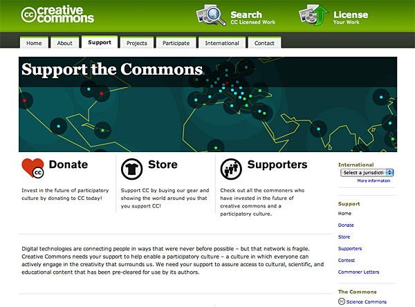
Figure 7.20 — A great example of designing page headers to create consistent site identity and global navigation.
Even if you choose not to use graphics on your pages, the header area of every web page should contain a prominent title at or near its top. Graphics placed above the title line should not be so large that they force the title and introductory text off the page on standard display screens. In a related series of documents there may also be subtitles, section titles, or other text elements that convey the relation of the displayed document to others in the series. To be effective, these title elements must be standardized across all the pages in your site.
Page footers
Every web page should contain basic data about the origin and age of the page, but this repetitive and prosaic information does not need to be placed at the top of the page. Remember, too, that by the time users have scrolled to the bottom of your web page the navigation links you might have provided at the top may no longer be visible. Well-designed page footers offer the user a set of links to other pages in addition to essential data about the site.
The pages in the ibm web site all carry a distinctive footer that covers the basic housekeeping functions of “about,” “privacy,” and other topics and provides social bookmarking links to Del.icio.us and Digg (fig. 7.21a). The much larger Scientific American footer forms a distinct region on each page, covering the basic informational footer functions as well as advertisements for sister publications (fig. 7.21b).
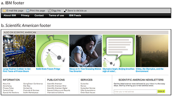
Figure 7.21 — Simple (a) and complex (b) page footers.
Vertical stratification in web pages
A web page can be almost any length, but you have only the area “above the fold”—at the top of your page—to capture the average user, because that is all he or she will see as the page loads. One crucial difference between web page design and print page design is that when readers turn a book or magazine page they see not only the whole next page but the whole two-page spread, all at the same time. In print design, therefore, the two-page spread is the fundamental graphic design unit.
Print design can achieve a design unity and density of information that web design cannot emulate—yet. Regardless of how large the display screen is, the reader still sees one page at a time, and even a large display screen will display only as much information as is found in a small magazine spread.
Design for screens of information
Most web page designs can be divided vertically into zones with different functions and varying levels of graphics and text complexity. As vertical scrolling progressively reveals the page, new content appears and the upper content disappears. A new graphic context is established each time the reader scrolls down the page.
Web page layouts should thus be judged not by viewing the whole page as a unit but by dividing the page into visual and functional zones and judging the suitability of each screen of information. Notice the vertical structure of the New York Times home page. The top screen of information is much denser with links because it is the only area all users will see (fig. 7.22).
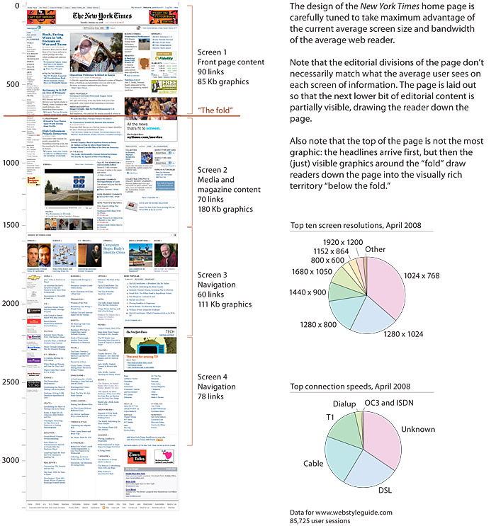
Figure 7.22 — Vertical stratification into multiple functional screens of information.