by Patrick J. Lynch
and Sarah Horton

7 Page Design
Design Grids for Web Pages
Consistency and predictability are essential attributes of any well-designed information system. The design grids that underlie most well-designed paper publications are equally necessary in designing electronic documents and online publications, where the spatial relations among on-screen elements are constantly shifting in response to the user’s input and system activity. When used inappropriately or inconsistently, the typographic controls and graphics of web pages can create a confusing visual jumble, without apparent hierarchy of importance. Haphazardly mixed graphics and text decrease usability and legibility, just as they do in paper pages. A balanced and consistently implemented design scheme will increase users’ confidence in your site (fig. 7.23).
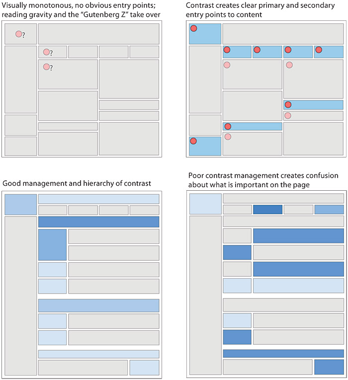
Figure 7.23 — Even when the page grid is solid, good design depends on creating a hierarchy of contrast and viewer attention, so that a few focal areas of the page become entry points and the other page materials are clearly secondary. Without contrast management the design can look like many random elements competing for the reader’s attention.
The business logic of design grids and templates
Regular page grids—and the module and program efficiency and consistency they create—are the core element of cost-effective design programs for larger enterprises. One of the most famous and successful design grid systems ever produced has been used by the National Park Service for more than thirty years. Massimo Vignelli’s Unigrid design system organizes and systematizes a huge array of park service paper publications (and now online pdf documents), from single-page brochures to large park maps and posters. Thanks to the strong, consistent Unigrid design program, the National Park Service has saved many tens of millions of dollars over the decades by not reinventing brochure and map design with every new print project (fig. 7.24).
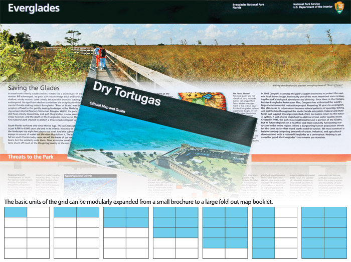
Figure 7.24 — The National Park Service design grid for print publications. Thinking in a strategic, modular way about design can save a fortune in the long run.
Grids and templates on the web
Grids for page templates on the web are a more complex matter because the web is a fluid medium with many possible display conditions and a constantly changing technology base. The fundamental principles of consistent modular design programs still apply, but web page grids must necessarily accommodate a wider range of visual possibilities than their print counterparts. Print design grids are driven largely by fixed positioning and paper sizes. Web templates also create a regular, repeating structure of design patterns that consistently organize identity, navigation, content, and technical functionality, but they do it in a much more fluid, flexible medium than paper printing.
A good web template program establishes not just the visual look and feel of particular pages in the site but also specifies how regular patterns of xhtml, css, include files, and more complex application or content functionality will all merge using well-established, well-documented, and consistent standards throughout the site. And, like Vignelli’s Unigrid system, a good enterprise template system can save millions of design dollars that might otherwise be wasted in reinventing web publishing with each new corporate or enterprise site.
Templates and the enterprise
For maximum efficiency in web publishing, all large enterprises should have an existing, well-designed, well-documented set of web page templates that incorporate:
- The global identity of the enterprise as an organized part of a larger enterprise identity program across all media
- Global enterprise navigation features that tie smaller sites and programs to the larger institution
- Well-designed, carefully validated xhtml and css code
- Consistent semantic nomenclature for all xhtml and css containers and page elements
- A consistent, enterprise-wide typography program
- Accessibility standards that meet and ideally exceed requirements
- Compatibility with, at minimum, a basic web content management tool such as Adobe Contribute or, ideally, an enterprise-wide web content management system
The Yale University page grids are a system of page formats in both fixed-width and fluid page forms. The templates define a consistent set of web identity, user interface, department identification, and typography standards for major university academic and administrative sites. The pages specify the locations of standard identification elements, content column widths, and a system of unique page element id nomenclature, and they provide a consistent set of typographic standards via a master set of enterprise-wide style sheets (fig. 7.25).
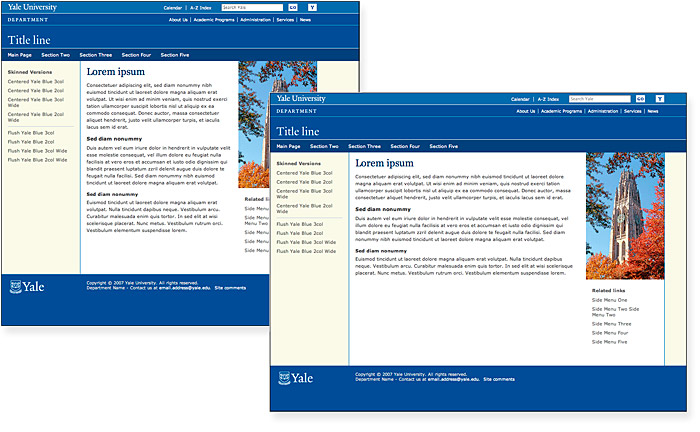
Figure 7.25 — Fixed and fluid elements in Yale University’s web template system.
Typography is a key element in template design
Consistent web typography has a huge but subtle effect on establishing coherence across a wide range of enterprise web sites. In a site with a strong typographic identity, most users will never explicitly notice why a wide range of related sites produces a cohesive web experience. Consistent web typography can bind those disparate sites in a way that still leaves enormous design flexibility to meet many functional needs and, with css techniques that use a master enterprise-type style sheet, is technically trivial to accomplish.