by Patrick J. Lynch
and Sarah Horton

8 Typography
Typefaces
Each typeface has a unique tone that should produce a harmonious fit between the verbal and visual flow of your content. With the first versions of html, web authors had no control over typefaces (“fonts” in personal computer terminology). Fonts were set by the browser, so pages were viewed in whatever font the user specified in his or her browser preferences. Modern versions of html and css allow designers to specify typeface. This is useful not only for aesthetic reasons but also because of the differing dimensions of typefaces. A layout that is carefully designed using one typeface may not format correctly in another.
In specifying typefaces you should choose from the resident default fonts for most operating systems. If you specify a font that is not on the user’s machine, the browser will display your pages using the user-specified default font. Bear in mind, too, that users can set their browser preferences to display all pages in their favorite font.
Legibility on-screen
Some typefaces are more legible than others on the screen. A traditional typeface such as Times Roman is considered one of the most legible on paper, but at screen resolution its size is too small and its shapes look irregular. Screen legibility is most influenced by the x-height (the height of a lowercase “x”) and the overall size of the typeface.
Adapted traditional typeface
Times New Roman is a good example of a traditional typeface that has been adapted for use on computer screens. A serif typeface like Times New Roman is about average in legibility on the computer screen and has a moderate x-height. Times New Roman is a good font to use in text-heavy documents that will probably be printed by readers rather than read from the screen. The compact letter size of Times New Roman also makes it a good choice if you need to pack a lot of words into a small space.
Designed for the screen
Typefaces such as Georgia and Verdana were designed specifically for legibility on the computer screen; they have exaggerated x-heights and are very robust compared to more traditional typefaces in the same point size. These screen fonts offer excellent legibility for web pages designed to be read directly from the screen. However, the exaggerated x-heights and heavy letterforms of Georgia and Verdana sometimes look massive when transferred to the high-resolution medium of paper.
Typefaces for other media
Much of our attention is focused on the screen version of our pages, but we also have control over how a page looks when printed on paper. Print offers a far richer palette of options when it comes to selecting a typeface; many more typefaces look good on paper than the relatively few that are readable and attractive on-screen. In contrast, there is no point specifying a typeface for handheld styling since most devices have only one font.
Choosing typefaces
The most conventional scheme for using typefaces is to use a serif face such as Times New Roman or Georgia for body text and a sans serif face such as Verdana or Arial as a contrast for headlines. Various studies purport to show that serif type is more legible than sans serif type, and vice versa. You can truly judge type legibility only within the context of the situation—on the screen, on paper—as users will see your web page.
You may use either a variation of the serif font or a contrasting sans serif face for the display type. It is safest to use a single typographic family and vary its weight and size for display type and emphasis. If you choose to combine serif and sans serif faces, select fonts that are compatible, and don’t use more than two typefaces (one serif, one sans serif) on a page.
The most useful fonts that ship with the Apple Macintosh and Microsoft Windows operating systems are reproduced here, differentiated by their effectiveness on-screen and on paper. Remember that many Macintosh users who have installed Microsoft Office will have Windows fonts installed on their systems (fig. 8.9).
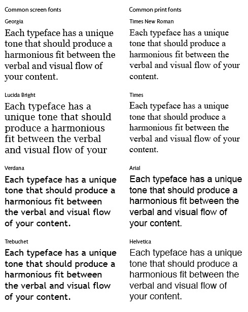
Figure 8.9 — Common Apple Macintosh and Microsoft Windows screen and print fonts.
Specifying typefaces
You can specify any typeface for your web pages, but many computers have only the default operating system fonts installed. If the typeface you specify is not available on the user’s computer, the browser will switch to the default font (generally Times New Roman or Times). To increase the chances that the reader will see your preferred typeface, you can specify multiple fonts for each style. The browser will check for the presence of each font (in the order given), so you can specify three or four alternates before the browser applies the default font, for example, “Verdana, Geneva, Arial, Helvetica.” As a last-ditch effort you can end your font declaration with a generic font designation such as “serif.” That way, if the browser cannot find any of the listed fonts, it will display the text in an available serif font:
p { font-family: "Times New Roman", Georgia, Times, serif }
Notice that multiword font names such as Times New Roman must appear within quotation marks in your specification. Also note in the font example below that although “Trebuchet” and “Trebuchet ms” are the same typeface, the exact name you specify in the font list matters. If you want both Macintosh and Windows users to see the typeface Trebuchet, then use both names in your font declaration:
p { font-family: "Trebuchet MS", Trebuchet, Verdana, Arial, sans-serif }
A good way to make sure that your type settings are functioning correctly is to set your browser’s default proportional font setting to something that is obviously different from your intended font. For example, set your browser’s default font to Courier if you are not using Courier in your document. When you view your page, anything that appears in Courier must not be marked up properly.
Type size
Scalable text is essential to the goals of universal usability. To ensure scalability, use relative units to control the typography—type size, margins and indents, leading—on the page. Use graphic text sparingly, and always offer a text equivalent. Text rendered to graphic form is no longer text but image and thus cannot be manipulated—enlarged, colored—as plain text can. Graphic text is also invisible to search engines, so without alternate text the most important words on your page may be invisible to search.
With css, designers have many methods for setting type size. We recommend setting the body text to the default text size defined in users’ browser settings and setting all text variants (such as headings, captions, and links) using relative units, such as ems or percentages. An em in the web context is the same as the font height, which makes it a relative unit and therefore flexible. For example, if the user-set default is 16 pixels, than a two-em text indent would be double, or 32 pixels. But if the user used the text zoom feature of the browser to change the text size to 18 pixels, the indent would change to 36 pixels to reflect the larger type size:
p { font-size: 1em; text-indent: 2em; }
As you might imagine, this flexibility can send page layouts into disarray. Most web page layouts are not designed with large type in mind. For example, fixed layouts that limit the text column to a specified width are typically designed to accommodate standard or small type. Indeed, at large type sizes a fixed-width column may contain only a few words, which makes the text awkward to read. For best results with resizable text, use a flexible layout that transforms gracefully to accommodate larger type sizes (fig. 8.10). (For more on fixed and flexible layouts, see chapter 7, Page Frameworks.)
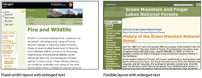
Figure 8.10 — Enlarged text can send fixed-width layouts into disarray (left). Flexible “liquid” layouts (right) respond more gracefully when users enlarge text.
Different operating systems display type differently, even when the same typefaces are being used. In general, type displayed on Windows web browsers will look slightly larger and sometimes lighter in weight than the equivalent face on the Macintosh. This difference in font rendering can affect your page layouts and the overall “type color” of your page.